
The Texture of Colour

(image: Laurence Kubski).
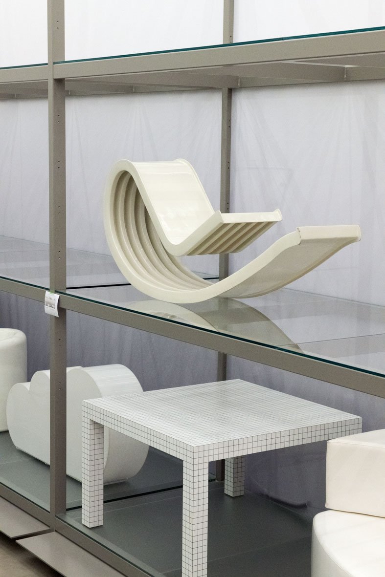
There are more than 400 objects on display at any one time in the Vitra Schaudepot. Its crisp, house-shaped silhouette, designed by Herzog & de Meuron, encases a glowing white room stacked with practical metal shelving, arranged just so. All filled with furniture, of course.
The Schaudepot, which opened in 2016, began life displaying a cross-section of the Vitra Design Museum’s permanent collection, all arranged chronologically. More recently, however, in a desire to apply different lenses to its holdings, the Schaudepot’s curators have decided to use “focus topics” as a method of sampling the museum’s 20,000-plus holdings. For the first topic, the museum exhibited Spot On: Women Designers in the Collection from May 2021 to the same month this year – a display that overlapped with Here We Are! Women in Design 1900 – Today, a temporary exhibition hosted at the Vitra Design Museum. While Here We Are! focused on broader socio-political and design histories, Spot On showcased pieces from the permanent collection by women designers, and used the occasion as an opportunity to acquire work from the likes of Inga Sempé, Reiko Tanabe, Matali Crasset, and Gunjan Gupta.

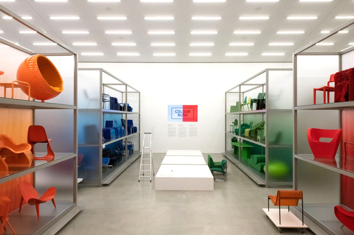
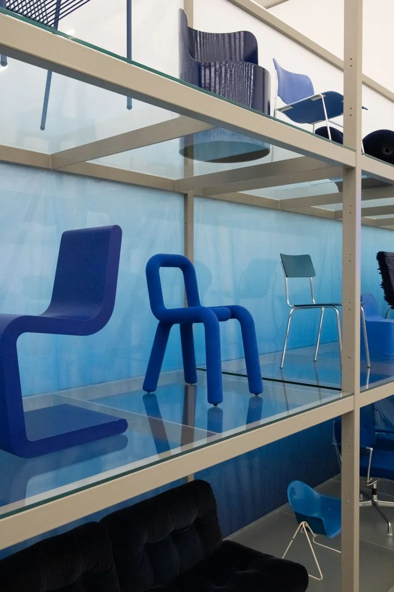
If Spot On was partly an attempt to explore and redress a political imbalance in the collection, the latest exhibition in the Schaudepot is more abstract in its ambitions: Colour Rush! is a “simple, sweeping gesture” that will categorise the museum’s holdings by colour alone. “It’s a really straightforward approach,” explains Susanne Graner, the Vitra Design Museum’s head of collection and archives. “You don’t have to know the history of the objects, or the age, or even who the designer is. It’s just [there] because of its colour.” The idea, then, is that Colour Rush! will be a visual extravaganza that can appeal to a wide range of audiences. Anyone can come in to enjoy its chromatic spectacle, but, for those more familiar with design history, its curators hope the display will also provide an opportunity to reflect on patterns and make impromptu connections across time periods through colour. “For the first time we’ll include in the high shelves pieces from the collection that aren’t furniture,” says collections curator Nina Steinmüller, who was Graner’s co-curator on the exhibition. “We have a big collection of electronic devices, such as the red Valentine typewriter [Ettore Sottsass Perry A. King (1969)], old streamline style televisions from the late 1940s, and Dieter Rams’s pieces. We’ll show how colour was used in different design areas, not only in furniture.”

To achieve the visual impact Colour Rush! required, Graner and Steinmüller considered it essential to get a third party on board: a practising designer who could find connections within the Vitra Design Museum’s collection based on their understanding of and expertise in colour. Additionally, the pair wanted a co-curator without significant previous experience of standard museological display practices. “We wanted a young designer, who isn’t yet famous for their exhibition design,” says Steinmüller. “Somebody with a new and fresh view. A designer’s approach to a museum’s collection is different from that of a scholar or a historian. Designers select objects based on other criteria and will also arrange them differently.”
Sabine Marcelis, a designer based in Rotterdam whose furniture and lighting typically employs sleek cut forms and pastel-refracting resins, fit the criteria. Marcelis had become known to the pair when they acquired her cast resin Candy Cube (2014) for the museum’s collection, although Graner had initially come across Marcelis’s work elsewhere. “The first time I encountered one of her objects was in Connie Hüsser’s exhibition Objects with Love [Biennale Interieur, Kortrijk, October 2018] where she exhibited this pink column,” says Graner. This piece, Candy Column, was designed by Marcelis for Side Gallery in 2018, using highly polished cast resin to create a glowing cylinder of Pepto-Bismol pink. “It was really good. I remember thinking: ‘What the hell is that?!’” Graner laughs. “It was something I had never truly seen before in such clearness and straightness, and this playfulness with colours and form. That is when I got intrigued.”

Marcelis is, in Graner’s words, “someone who has a gut feeling about colour,” who could provide the curatorial team with a fluency in its use. “We really wanted someone free of all curatorial impact and who could create a display fitting to their vision [of colour],” Graner explains. “Otherwise, it would have ended up as a very curated project where we’d have tried to find explanations for why everything is there – which is not the intention.” In this sense, the exhibition is proudly ahistorical, a point Marcelis echoes. “As a designer, my work is very much about colour and material,” she says. “I don’t really inject super-deep concepts – it’s not a super-academic way of working.”
The decision to offer a sweeping historical survey that doesn’t abide by chronology was a curatorial challenge for Graner and Steinmüller, who frame Colour Rush! as a research experiment. The aim was “to group objects together that wouldn’t normally be shown next to each other,” Graner notes, “[because] usually you choose objects as a result of their history, their story, material or process.” So physical and subjective is the nature of colour, by contrast, that she doesn’t expect to understand the findings of the overall process until the exhibition is installed. “I think it’s something that’s still in progress. So far, we’ve only got the digital layout on paper. We haven’t seen the final result yet.”
In an unusually hands-off approach, Steinmüller and Graner left the selection of objects to Marcelis. “Of course, even before contacting Sabine, the first step was to find out how many yellow, green, blue, purple, black and white pieces of furniture we have,” explains Graner. They presented Marcelis with an initial selection of 900 pieces that covered a basic selection of colours. Some shades were thin on the ground – yellow, pink and purple all required further research – while others were heavily represented. “Earlier on [in the timeline] we had more brown, black and natural colours, because of wood, metal and textiles,” says Graner. “Then, in the 1960s it starts to get really colourful. But if you look at the objects from today, a lot of young designers play around with sustainable materials and we’re starting to see [more muted shades in] wood and biodegradable resins.”

Determining the final selection proved delicate. Do you show the colours represented in the museum’s collection or offer a wider spectrum of shades that explore more broadly how colour has been approached through the history of modern and contemporary design? At first, Marcelis took her cue from the collection as presented to her. “It’s super interesting, because there’s just so much black,” she says. “Also red and orange – loads of them – and brown and white. Those were the ones that immediately stood out. OK, well, we have to use those colours.” Pieces such as Studio 65’s ruby red Bocca/Marilyn sofa (1970) or Verner Panton’s tangerine Living Tower (1968/69) are remembered as much for their striking colours as their surprising forms, and proved obvious inclusions. “The idea was to find the complementary colour to the red and the orange,” continues Marcelis, explaining that the design of the exhibition was based on “the way that colour is perceived on the colour wheel. Purple as the opposite to yellow, blue as opposite to orange, and so on.”

It was also important to Marcelis that the exhibition hang together as a cohesive colour exercise. “We were thinking about how you experience the space when you walk in, because there is some translucency to it,” she says. “We have big curtains hanging down between the shelves, but they’re not opaque because we wanted to keep the idea that you see the full collection. So we also had to think about how these colours mix when you place them behind one another.” This meant, for example, that one side of the exhibition’s sections are “categorised more in colder colours – blue, green, and white – so they can mix together and avoid creating a gross brown colour! On the other side, you have all these warm tints that seamlessly flow together.” The result is that the colours contrast left to right as you move through the space, but, when looked at straight on, the hues complement one another.

While an attempt was made to display each colour equally, some sections remain smaller. “Yellow and purple were definitely the colours there were least of in the collection,” says Marcelis, a little sadly. “It was actually very difficult to find enough purples and pinks.” As such, these shades exist in smaller clusters. Marcelis has also left room for outliers. “I definitely didn’t want to leave out transparent furniture,” she notes, “so those [pieces] occupy a spot on the floor in between the colours because they’re kind of a non-colour.”
Talking to Marcelis it becomes clear that curatorial rules were established from the outset. A good example is the approach to multicoloured objects. “We made a very strict rule for ourselves that the only additional colour featured on an object [we would allow] would be either a metal base, for example, or white or black,” she explains. “No other colours – so none of these items display more than the core colour of where they’re categorised – because that was a way of anchoring the way we were working. Otherwise, there is way too much.”

It seems a shame, I press, since some objects’ multicoloured-ness is key to their design – they’re important studies in colour themselves. Pieces such as Gerrit Rietveld’s Red Blue Chair (1918– 1923) or George Nelson’s Marshmallow Sofa (1956), for example, have survived in popular memory as inseparable from their multifaceted colourways. Marcelis stands firm, however. “At the end of the day, the exhibition is really about that colour within that design and not the combination of that colour with another colour,” she explains. “Aesthetically, you create a stronger statement if, in the green section, there’s only green and in the red section, there’s only red. We were quite strict on that.”
But while monochrome displays were an important constraint, materiality was something that Marcelis was eager to mix and match. Part of the challenge, she explains, was “just trying to get a really good range of materials. I don’t think this would have been very interesting if it were all upholstered furniture.” This desire to preserve colour purity while ensuring material diversity helped steer Marcelis when she was choosing between different versions of the same design. “We might have a piece in blue flocking, but there’s also a yellow plastic version, or a wooden version,” she explains. “Then the decision was more about which material and colour combination was the most interesting to showcase.” It’s a consideration seen in Marcelis’s own work. Single colours are paired with materials in her pieces to reflect light in very specific ways: a matte resin makes her Soap Table (2018) ever so slightly fluorescent; stretched, knitted upholstery bounces light off her curving donut Boa pouf (2021); and a thick slick of yellow lacquer glistens on top of the pale, wooden interior surfaces of her Candy Cubicle desk (2020). All these works indicate her understanding of how the interplay of texture and light can distinctly change the look of a single colour. “The way that I like to work with colour is not just how it looks on paper,” she says. “It’s more, how do you experience colour in the material?”
The end result of Colour Rush! hints towards certain patterns in design history. The orange portion, for example, features pieces that share a somewhat eerie family resemblance. “What was funny with that section,” says Marcelis, “was that it was the only colour where we actually felt like these pieces were coming from a similar place.” She points to an exhibition plan of the show’s orange section, which features the Panton Living Tower and Naoto Fukasawa’s Chair (2007). “The objects are all a bit moulded and organic, but still quite solid,” explains Marcelis. “We wanted to group those together just to show that, ‘Hey, there is some kind of style happening here,’ but none of these pieces are from the same designer or even from the same era.” In this section, you can see juicy, curved orange forms echoed across seating and furniture, stretching through the 60s and 70s to the 2000s. Similarly, the team say, the exhibition may flag certain historical considerations as visitors wander through the space. “What [trends] came with the first uses of plastic in design? And what options did designers have using different colours at the beginning of the century?” says Steinmüller. “When you stand in front of a plastic object and next to it is one made out of leather or fabric, you realise how different the colour looks in different textures and surfaces. What does it tell us about the materials? Why do designers decide to work with certain materials and use them in particular ways?” The team want the viewer to be present in the moment: to really look and observe what is going on in the visual language.

If much of colour’s treatment in design ultimately comes down to personal taste, there’s a sense in which the Vitra Schaudepot exhibition does not need to get bogged down in history. Instead, its impact lies in the physical. This is captured in Graner’s reflection on the archival material that features alongside the exhibits, detailing different colour systems developed by designers. “Most designers or artists who work with colour or develop their own colour system criticise the standardised industrial colour systems,” she says. “They try to add a quality to colour which may have been lost during industrial colour production. Designers such as Sabine, Verner Panton, Hella Jongerius, or Le Corbusier have all tried to go back to the natural quality of colour and work with it in a very specific way, rather than just using the already available industrial synthetic colours.”
Outlining historical connections in colour can only get you so far – there’s an element that’s missing if you don’t experience it in person. In honour of this, the exhibition is itself an exercise in experimenting with colour, with the Vitra Design Museum´s collection acting as the material that Marcelis is manipulating. The museum’s team are happy to give themselves up to this process, partly as it has allowed them to re-discover “objects that were previously virtually unknown or at least somewhat hidden,” as Steinmüller describes it, and provide these objects with “the space to glow”. Part justification, part reflection, Graner sums up the process thus: “A lot of designers use colour in their objects, [so] why not speak visually about colour and design?
Words Evi Hall
Photographs Laurence Kubski
Colour Rush! is on display at the Vitra Schaudepot until 14 May 2023.
This article was originally published in Disegno #33. To buy the issue, or subscribe to the journal, please visit the online shop.