
Sugar/No-Sugar
Image courtesy of PepsiCo.
Mirinda!
Goût fraise and boisson gazeuse, sat pertly on the corner shop shelf, gleaming. It’s pink and chaotic (and, presumably, French), with graphic fuchsia strawberries that bob on curlicues of sticky-rose viscera. Overhead, the lights catch the aluminium of the can, bringing out its fizz-pop best in chunky green lettering that declares “Mirinda”, a jaunty leaf replacing the dot on the second i. Mirinda!
I want to drink Mirinda!
I don’t know what Mirinda is!
One of the organisation’s mobile workshop spaces (image: courtesy of Mobile Makers).
That’s besides the point: the only thing I need to know is that Mirinda is for sale at Loco Local, on display with all my pals. It’s sat next to Tango Berry Peachy, whose pink and honey trappings are slashed across a matte black can. Berry Peachy is a near neighbour to Dr Pepper, whose white on burgundy best suggests all the gravitas of a medical professional. Next up is Fanta Limón, effervescent in their Euro vibes, sat alongside the silvered elegance of Diet Coke, who is a multipack can not to be sold separately. Uh oh, unspecified corner shop retailer.[1] Hunkered down in the basement shelves, meanwhile, are teenage cans of Monster and Relentless, gothically brooding. Sat haughtily above, slim and Mediterranean, San Pellegrino Pompelmo. And on the very top shelf, far left, is the drink that started it all: Coca-Cola.[2] Our fizzed Methuselah.
If someone wanted to know about contemporary design, I think they could do worse than look at the drinks section in a corner shop (although stay out of Loco; I don’t like it when it’s busy). The soft drink displays in these places are trash-gorgeous, bursting in colours, noise, logos, and design. It’s the perfect distillation of the commerce and consumerism that bestrides the wider field, while also showcasing the sophistication and ingenuity of the design strategies that have grow up to enable this. “Iconic” is a term I dislike in design writing, but the branding of drinks such as Coke and Pepsi is a rare occasion in which it’s merited – Coke red and Pepsi blue are identifiable the world over, as are the former’s swirling script and the latter’s tricolour globe. These products exist amongst an obscene level of competition[3] – even if many of the smaller, seemingly independent brands are actually owned by the Coca-Cola Company or PepsiCo – and at a price point that means that people slip rapidly between drinks. “[Choices] concerning carbonated soft drinks can easily be fluid (pardon the pun),” writes Judith Levin in her illuminating book Soda and Fizzy Drinks: A Global History, “because the choice of a fizzy drink does not involve a long-term or expensive commitment to any product or identity[...] choosing a soft drink isn’t like buying a car, and we can drink Ramune Hello Kitty today, Irn-Bru tomorrow and Bionade Zitrone Bergamotte soda the day after, without consequences.” Which is why a corner shop is one of life’s great pleasures. Multiple shelves of functionally identical cans, all trussed up in different shreds and patches of design so as to vie for attention in an effervescent market. Some promise energy, others no-sugar, maybe CBD, caffeine, no-caffeine, but all are telling you something, even if that something is as banal as Fanta now coming in Fruit Blast flavour.
What I’m saying, I suppose, is that Coca-Cola and its brood are supremely successful design objects[4] products that are distributed worldwide, sold from every point of retail imaginable, and available with such ubiquity that many restaurants don’t even bother putting them on the menu – it’s simply assumed that they’re for sale. Regardless of the context – department store food hall, crummy bodega; Michelin starred restaurant, neighbourhood café – sodas are present. They are among the most widely distributed designs of the 20th and 21st centuries, into which vast quantities of advertising, branding, graphics and packaging design have been poured –all in aid of selling a product that, truth told, we know isn’t very good for us. “[Coca-Cola] is a story,” noted journalist Bob Hall in 1977, writing in the cultural journal Southern Exposure, “of the most incredible mobilization of human energy for trivial purposes since the construction of the pyramids.”
I wonder if Bob ever tried a Mirinda?
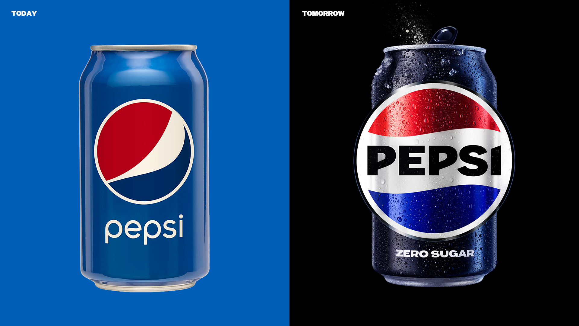
The previous Pepsi branding (left), as compared to the redesign (Image courtesy of PepsiCo).
I drink fizzy drinks every day. Come 1pm, I like to leave my desk and take it to the Max, by which I mean I buy a 75p can of Pepsi Max from the shop. Max!
I love Pepsi Max. On a normal day, I’ll supplement my 1pm beverage with another can or bottle later in the evening,[5] because Pepsi Max is absolutely delicious and offers a brief note of fizzed excitement in an otherwise humdrum life – which can’t come as a shock to you, given that a sentence ago I admitted to structuring my day around a can of Pepsi. It’s not just Pepsi Max that provides this thrill either. I love the rest of the gang too: Coke, Fanta, 7up, Sprite. They’re all terrific, each and every one of them, and I have absolutely no idea what any of them taste like.
I mean, what does Coca-Cola taste like? What even is Coke, because the ingredients list isn’t helpful at all: “Carbonated Water, Sugar, Colour (Caramel E150d), Phosphoric Acid, Natural Flavourings Including Caffeine.” The drink’s name, picked in 1886 by the Coca-Cola employee Frank Robinson, was once descriptive of the kola plant and coca leaf that were included within Coke’s original formulation, but the company no longer uses either of these ingredients, and I doubt the drink ever tasted much like them anyway.[6] Admittedly, I haven’t tried either, which I regret in the case of kola, and am grateful for as regards cocaine, because I’m clearly already addicted to Pepsi Max so probably shouldn’t start on anything harder. But the more general point is that Coca-Cola is quite monolithic. For a drink made up of many different ingredients, it tastes almost atomic: it’s just Coke. Sweet, tart... brown? Pepsi is a little sweeter, but also overwhelmingly brown, while the other drinks all taste pretty much the same too, providing you mildly adjust the ratio of sweetness to tartness, and replace “brown” with whatever colour that drink is: orange, yellowish, transparent. They’re basically the same product, which Levin describes as “a beverage made of water, fizz and something sweet”. I like how simple this is, because it shows how complex selling them must be. Back in 1920, the advertiser Archie Lee inadvertently summed up this overwhelming sense of familiarity. “It is hard work,” Lee wrote to his parents, “giving a different dress to many stories about the same thing.” Lee was speaking about the work of advertising Coca-Cola,[7] but he might as well have been discussing soft drinks period: they’re the same thing in a different dress.

Image courtesy of PepsiCo.
That gets to the heart of soda, insofar as soft drinks actually are very different because it’s the dress that people are buying anyway. What prompts me to buy a Pepsi Max every day isn’t the taste (honestly, slightly watery and unpleasantly synthetic now I think about it – God I want one), but because I like its teenage-moody black branding; I like the inanity of “Max” as a synonym for “no-sugar”; I like the pleasing crack-hiss of the can; I like the nostalgia of having had it at the cinema when I was little; and I like the idea of having a treat a day for 75p a pop. Other people will have different reasons for liking these drinks, I’m sure, but I suspect that most will swirl around factors like these, rather than zeroing in on a particular flavour profile. “All foods are embedded in culture,” explains Levin, adding that “for carbonated sweet drinks, their symbolic meanings are far more complex than the water, gas and sugar that form their corporeal substance.” In the interests of transparency, I’ve been drinking a Pepsi Max throughout those last three sentences.
When it comes to soda, the drink itself is not offering you anything meaningful on a physical level, bar maybe a hit of sugar or caffeine. “Many of us live in a world of consumer goods that do a lot more than is necessary,” Levin writes. “We’re sated – hence the ever-widening diversity of drink flavours, packaging and advertising.” But even the attachments that we form to particular formulations as a result of this panoply of design are frequently misleading. “[In] blind taste tests,” Levin continues, “consumers not only reliably fail to distinguish their favourite cola from any other, but they sometimes fail to distinguish cola from ginger ale.” Anecdotally, I can confirm that. In the early days of Disegno, Design Reviewed’s sibling title, the publication’s three editors did a blind taste test of Coca- Cola, Diet Coke, and Coca-Cola Zero, examining our claims to variously prefer Diet and Zero. It was a slow, delicious day. Of the three participants, two inadvertently identified regular Coke as their favourite, while only the third correctly selected Diet.[8] The point being, it’s not necessarily the drink that you’re actually responding to, but rather its connotations, associations, and the ways in which it has become tied up with your own sense of identity. “I’m always going to be searching for emotion,” Pepsi’s advertising guru Phil Dusenberry once told reporters. “In an age when most products aren’t very different, the difference is often in the way people feel about [them].”
It’s an odd aspect of the field, but the drinks themselves are basically the side- hustle, secondary to the more serious matter of typefaces, graphics, distribution and adverts. In a legal dispute with bottlers over changes to Coca-Cola’s formulation in the 1980s, the company’s CEO Roberto Guizeta argued under oath that Coca-Cola should be understood as whatever the company said it was, answering “Correct” when quizzed as to whether an earlier, only recently abandoned formulation of Coca-Cola was therefore no longer Coke. That wasn’t just legal posturing either.[9] In researching his book For God, Country and Coca-Cola, the author Mark Pendergrast was inadvertently given a copy of an early formulation of the Coca-Cola recipe: something that the company has always kept secret, cryptically labelling the flavours that give Coke its taste “7X”. Learning from the recipe that said Xs were oils of orange, lemon, nutmeg, cinnamon, coriander, neroli and – most likely – vanilla, Pendergrast asked a company spokesperson what would happen if he published the recipe. Wouldn’t rivals “decide to go into business in competition with The Coca-Cola Company?” The exchange that follows is great. After Pendergrast suggests the name Yum-Yum for a knock off,[10] Coke’s spokesperson is impressively blunt about its chances for success. “What are they going to charge for it?” he asks Pendergrast. “How are they going to distribute it? How are they going to advertise it? See what I’m driving at? We’ve spent over a hundred years and untold amounts of money building the equity of that brand name. Without our economies of scale and our incredible marketing system, whoever tried to duplicate our product would get nowhere, and they’d have to charge too much. Why would anyone go out of their way to buy Yum-Yum, which is really just like Coca-Cola but costs more, when they can buy the Real Thing anywhere in the world?”
Like I said, it isn’t about the drink.
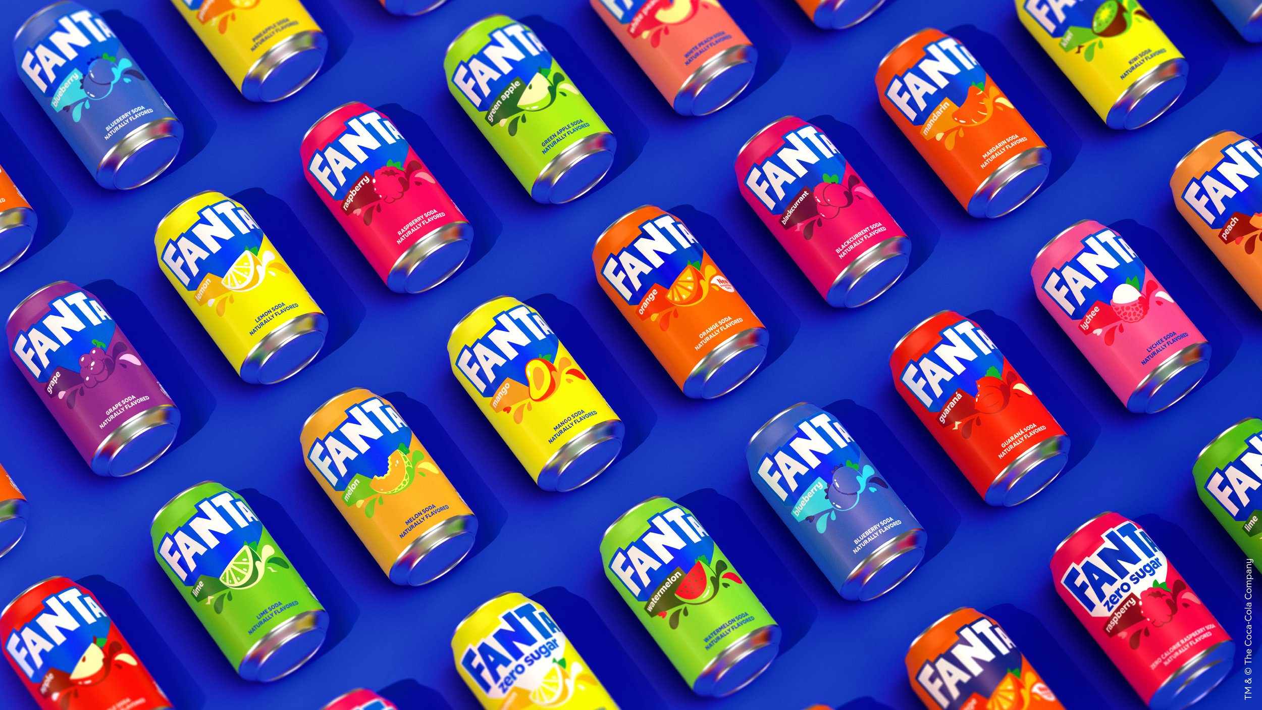
Image courtesy of The Coca-Cola Company.
I’ve been thinking about this stuff a lot recently, because 2023 has been a weird year for soft drinks. Within a couple of months of one another, Pepsi, 7up, Fanta and Mirinda (!)[11] have all announced complete redesigns encompassing packaging, logos and all brand assets, while Coca-Cola and Sprite did the same thing in 2021 and 2022 respectively. Suddenly, every big-name soda seems to be rebranding. There must be something in the water.[12]
The redesigns, to my soda-addled eye, are all very nice. They make me want to drink the stuff, anyway, so that’s the first hurdle cleared, even if said hurdle is alarmingly low. *Immediately opens a can of Sprite Zero.*
Most of the rebrands focus on stripping away the excesses of their earlier designs, while still retaining the emphasis on flat design that entered the industry’s palette in the mid-2000s and 2010s.[13] The new designs have a continuity with what has come before, but they’ve also ditched a lot of the graphic perkiness that had emerged in recent years: the cute illustrations of citrus wedges plastered across 7up have been deemphasised; the big red disc across Coke’s formulations jettisoned; the sea of thrashing pink gore on Mirinda drained. Indeed, many of the rebrands are billed as acts of graphic restitution: designs that recover abandoned elements from the drinks’ pasts, or which eliminate more recent additions to create simpler reflections of the brand. In part, this move is a concession to the fact that these drinks are now sold and advertised through multiple physical and digital channels, so designs need to be simple enough to work at thumbnail size, while also being capable of scaling up into something richer in-person. Pepsi, for instance, has abandoned the smile motif that has featured in its globe logo since it slipped into the drink’s design under a 2009 rebrand by Arnell Group.[14] Instead, the brand has turned to a simpler, bolder roundel that recalls its designs from the 70s and 80s, and which looks like something you’d see slapped on the side of an oil barrel (in a good way). It’s beautiful work and, as such, I intend to single- handedly fund the Loco-based portion of its global distribution strategy.[15]
“In approaching the new design, we asked ourselves: how do we take everything we love about Pepsi and its past, and create something that transcends?” replies Mauro Porcini, PepsiCo’s chief design officer, when I ask about his work on Pepsi and 7up – the latter of which builds its new design around graphic slabs of green tones. “With the new visual identity we created, we’ve borrowed equity from our history and blended modern elements that signal our bold vision for the future.” Brand-speak, undoubtedly, but it nonetheless captures something of the challenges that emerge when giving a different dress to the same product, particularly given that these drinks have long – and frequently cherished – brand histories.[16] Paramount in Porcini’s thoughts, he acknowledges, was creating a design that lends itself to both physical and digital marketing: the logo intended to do double duty as a digital sticker that can be slapped atop photography and films on social media. “It’s important for our brands’ visual identities to flow freely between the increasingly digital world and the physical world,” he says. “In digital spaces, the revitalised and distinct design introduces movement and animation into our visual system.”

Image courtesy of The Coca-Cola Company.
Fanta, meanwhile, has sought to develop its previous 2017 redesign by Studio Koto with the introduction of a more cohesive design identity across its many flavours. The result, which has been developed by The Coca-Cola Company’s design team in conjunction with creative agency Jones Knowles Ritchie (JKR), uses an elegant colour coding system that brings rationality to the portfolio, without skimping on the sense of fun that probably should be present if your product is basically fruity-fizz syrup. Orange is orange, raspberry raspberry, peach peach, and so on, but with clever use of secondary and tertiary colours to make the whole thing a bit more complex than just naming fruits. “Could we keep that sense of play which was a bit unconventional,” asks Lisa Smith, executive creative director at JKR, “but do it in more of a strategic way?” Smith and her team’s design is essentially a wayfinding system that helps customers find Fanta from among its many fruit soda rivals, while also providing clearer identification within its own absurdly bloated range of flavours. I’m not even sure how many flavours Fanta has worldwide, but online sources suggest more than 200 over the course of its history. In the promotional images for the new design identity, I can count at least 20, including a kiwi flavour that I’m sure is truly horrible, but would absolutely love to try. Its colour? Inexplicably, yellow.[17]
Whereas the other drinks in the Coca- Cola portfolio – the Coke and Sprite families – have more obviously pushed towards cleaner, minimal designs (shifting their logos to the top of the cans, and leaving more of the surface area free of graphics), Fanta faces a different challenge. “The others are so minimal, whereas we have to celebrate flavours,” says Smith. “So there’s language and illustration and there’s pop and there’s a fizz.” JKR’s design has retained much of the irreverence of Studio Koto’s earlier work – which was inspired by paper craft and saw the studio make its iteration of the logo out of paper cutouts before digitising it – but has also aimed to adjust the former’s focus on a younger market. “We wanted something that was aged up and broader in its appeal,” Smith notes. The new design is recognisably a continuation of what came before, and Fanta remains busier than Coke and Sprite, but the general aim of the new design is one that aspires towards the essential. “We believe in this Oscar Wilde- coined term of being yourself,”[18] Smith says. “We want Fanta to be its best self, so we did a global audit of its previous designs and then retained elements or optimised them – it wasn’t just throwing everything out with the bathwater and creating something new for the sake of it.”
When I ask Smith why these redesigns have all come at once, she suggests I shouldn’t read too much into it.[19] “There’s a lot of stuff coming out at a similar time, but there is definitely more coincidence than anything about that,” she explains. “Some of these projects happen fast, other take a very long time.” But there is at least one respect in which these designs all seem to be responding to the same thing. Each of the redesigns positions the zero sugar formulations of the drinks front and centre, or else narrows the gap between the drinks’ sugar and zero sugar versions.

Image courtesy of PepsiCo.
7up’s zero sugar version, for instance, reverses two shades of green from the main design and adds a small “Zero Sugar tab”,[20] while Pepsi Zero Sugar’s can (which is the North American version of Pepsi Max and therefore, to my mind, an abomination for not declaring Max!) is the same as mainline Pepsi’s, but black instead of blue. Zero Sugar was used as the lead drink in the rebrand’s marketing campaign, and is now prominent enough in the overall product range for its black tone to have been added to Pepsi’s logo for the first time in the company’s history. “From a design perspective,” Porcini notes, “the addition of black in Pepsi’s visual identity was a creative choice to bring more boldness and contrast to the logo, while also representing Pepsi Zero Sugar.”
The Coca-Cola Company drinks are even more explicit in the similarities between their sugar/no-sugar variations. Fanta’s are identical bar switching the logo from white on blue, to blue on white; while both Sprite and Coca-Cola simply shift their script from white to black. In Coke’s case, the switch is particularly notable. When launched in 2005, Coca-Cola Zero was presented as its own drink: it had a blac can, with a name that suggested an identity that stood apart from mainline Coke. Today, however, its can has been adjusted so that it currently stands as a mere variant on its progenitor’s Coke-red packaging, while its name was tweaked back in 2017 to become Coca-Cola Zero Sugar.[21] The intention, it seems, it to stress that Zero Sugar is not a distinct drink that forms a carbonated Holy Trinity with Coke and Diet Coke, but rather that Zero Sugar just is Coca-Cola, every bit as much as the original. “It’s definitely a strategy to have them closer,” says Smith of the same move having been made within the Fanta design. “It’s an A or a B thing, instead of feeling like its own thing. More and more often, Zero Sugar will be put as the lead product. I think there’s a lot of us who like Zero Sugar, but want to feel like you’re still buying into that brand.”
This shift is pretty clear if, like me, you’re spending a lot of time with the cans in Loco. The sugar/no-sugar versions of Sprite and Coke sit side by side on the shelves and are largely indistinguishable when you’re absent- mindedly grabbing your 5pm fix.[22] As regards 7up, well, I don’t even know where to begin. The two cans’ reversed shades of green look beautiful, but the designs are so similar that telling them apart at a glance is, I believe, impossible for human beings. It’s like asking a dog to detect irony. But then, as Smith has explained, the name of the game isn’t drawing distinctions – companies are specifically trying to bind these drinks closer together. And that’s fine, but not how things used to be done. When Coca-Cola first explored a no-sugar drink in the 1960s, for example, its CEO John Paul Austin explicitly forbade use of the suggested Diet Coke title. “To lend the magical Coke name to any other soft drink was heretical,” Pendergrast notes, with this proposed secondary use of the parent identity seen as likely to “dilute the brand” and “confuse consumers”. As such, Coke’s eventual no-sugar soda was christened TaB.
When Diet Coke was finally introduced in 1982, it employed a different flavour profile to Coca-Cola (it tastes like a piece of zinc has been dissolved in Coke – unsurprisingly, I absolutely love it) and adopted an alternative brand identity that has since come to be based on the idea of blue-collar men swallowing Diet Cokes while being peered at through windows by white-collar women. But sexy-swallow- based differentiation belongs to an older brand playbook. Today, sugar and no-sugar sodas are rapidly merging in terms of both their flavour and their design values. Coca- Cola Zero Sugar is explicitly marketed as tasting identical to Coca-Cola[23] and while Smith assures me that subtle colour reversal shows up in consumer testing as the most straightforward mode of visual differentiation between drinks (“We tried out all different versions and the clearest one for consumers was when you flipped it”), I’m not so sure – I think this is probably only true if you’re sticking to the competing criterion that the zero sugar version not feel “like its own thing”. To my eye, the zero sugar formulations are just becoming the mainline drink and this worries me, because I really don’t want them to take away the Max! on the side of my can.
Image courtesy of PepsiCo.
Given everything I’ve said, you may be surprised to learn that I vehemently dislike the regular versions of most sodas. They’re nasty, thick, headachey things, which make your teeth feel wooly and tentative, as if you’ve done something orally sinful. In general, they’re just too decadent to work as a regular treat, particularly given that a single can of many sodas contains more added sugars than the daily maximum recommended by the World Health Organization (WHO). “If governments tax products like sugary drinks, they can reduce suffering and save lives,” said Douglas Bettcher, director of the WHO’s Department for the Prevention of NCDs (non-communicable diseases) back in 2016. “They can also cut healthcare costs and increase revenues to invest in health services.” Which takes some of the gloss off having a Fanta Limón.
Bettcher’s recommendation seems to be being heard. As of early 2020, Levin notes, around 40 countries have specific taxes on sugary drinks, with Mexico, France, Hungary, Chile, Samoa, South Africa, the United Arab Emirates, Norway, India, Peru, the UK and Ireland among them. In an exceedingly rare display of national competence, the UK seems to be at the vanguard of this movement, with its version of the tax taking the rare step of tracking in accordance with the amount of sugar included in a drink. “This has resulted in national and international brands reducing the amount of sugar in drinks to be sold in the UK,” Levin explains. “Irn-Bru by more than 50 per cent, San Pellegrino by 40 per cent.” Which is generally good news, but also brings complexities. Many of these laws, the UK’s included, target sodas but not fruit juices, which actually contain an equivalent amount of sugar to Coke and its ilk. “[To] tax a fizzy drink differently from a fruit juice,” Levin notes, “is a value judgement about soda.”
But, then, you live by the sword, you die by the sword. Soda’s whole schtick is selling products based upon the different values that we attach to essentially identical drinks, so it’s a bit fiddly for brands to begin complaining when this process starts to run in the reverse direction.[24] Zero sugar versions of sodas are now a faster growing market than their sugar equivalents, with one suggested explanation for this being that younger consumers are more sugar averse than previous generations. “The modern war against fizzy drinks is part of the opposition to the seeming power of sugar,” Levin writes, and this war is being fought differently on different fronts. With fruit juices, it’s easy to think of the constituent sugars as natural, healthy even, whereas their presence in fizzy drinks frequently carries different, less favourable connotations. Levin observes that soft drinks can be “familiar and reassuring, full of sugar and meaning”, but sugar is full of meaning too. It is an ingredient tied up with health scares, with monoculture farming, and with the shameful history of the transatlantic slave trade. Sugar, notes scholar Ulbe Bosma in his book The World of Sugar, is an ingredient that has “fundamentally changed how we feed ourselves, has deeply affected human relations through its close relationship with slavery, and [which] has caused extensive environmental degradation”. The ingredient’s present ubiquity in industrially produced food and beverages, he adds, means that its entanglement with “modern consumption, global inequalities, and the emergence of modern capitalism,” are all part of its meaning. For many, processed sugars are the defining ingredient of fast food, of mass manufacture, of corporate America – the list goes on – and fizzy drinks have been pressed into service as its standard bearer. Coca-Cola executives have notoriously described their product as “the nearest thing to capitalism in a bottle” and as being “the sublimated essence of America”, with the drink’s heavy use of sugar being a major part of this. Is it any surprise to learn, then, Levin points out, that “Coca-Cola encounters resistance among people who – symbolically, metaphorically, literally – don’t want to drink that.”
Image courtesy of PepsiCo.
I suppose this is why a lot of the newer drinks I’ve seen on the shelves of Loco are specifically Not-Cokes: drinks that define themselves in contrast to their more corporate rivals and which are “being sold, in part,” Levin notes, “on the basis of what’s not in them”. Dalston’s, for example, bills itself as a “soda with soul”, which contains “no refined sugars”, “real fruit” and “sparkling water”.[25] The Dalston’s drinks are “made by chefs”
and come in faintly faffy flavours such as “Real Squeezed Rhubarb” and “Real Pressed Elderflower”. On each can, the brand’s graphics show stylised hands doing said squeezing and pressing, and I assume that the overall impression it’s aiming for is of a drink that is altogether more legible than the sense of mystique cultivated by its corporate rivals. In contrast to what Pendergrast calls Coke’s “air of mystery, with a touch of sin”, Dalston’s wants to suggest that it’s a soda that is simultaneously artisanal, local, and transparent about the ingredients it contains. It’s “real”, in other words, whereas Coke and its ilk are represented, by comparison, as being synthetic in every sense.
Dalston’s isn’t the only soda pulling this trick.[26] Levin notes that “Posh Pop makes ginger beer with chilli, pear and elderflower”; Dry Soda produces “lavender and rhubarb fizzy drinks”; GuS (Grown-Up Soda) sells “Meyer lemon, pomegranate and blackberry fizzy drinks”; and Glam Cola is “a somewhat bitter, colourless, clear, cola-lemonade-ginger-flavoured drink” that “describes itself as ‘elegant’” and which is additionally “vegan, halal, kosher and without phosphoric acid”. Purdey’s range of sparkling fruits juices, meanwhile, “[believes] in burning bright, not out,” according to its website. “By harnessing the power of nature within all our drinks, Purdey’s Natural Energy range has been created with you in mind.” This power of nature, it would seem, largely consists in featuring “natural fruit sugars” and bunging some ginseng in there – the wellnessification of contemporary soft drinks every bit as absurd as the 1885 claim by Pemberton French Wine Coca (Coke’s immediate predecessor) to be “the most remarkable invigorator that ever sustained a wasting and sinking system”. All of the new breed of sodas seem to underscore the fact that fizzy drinks sell not purely because of their flavour, but also as a result of their cultural and social connotations, and the manner in which they flatter our own sense of identity. Market research conducted by the advertising agency Litas back in 1984, for example, found that the average Coca-Cola drinker lived in a “traditional reality based on early experiences, stereotypes and cultural generalizations”, and believed that the world was ruled by “certain self-evident truths.” That’s almost certainly psycho-babble, but there may be something in it regardless – a sense that we pick the sodas we do because of what they embody. Either way, there’s good fun to be had in imagining how your average Purdey’s drinker views the world and their place in it. If its online marketing copy is anything to go by, the word “thriving” will feature heavily.
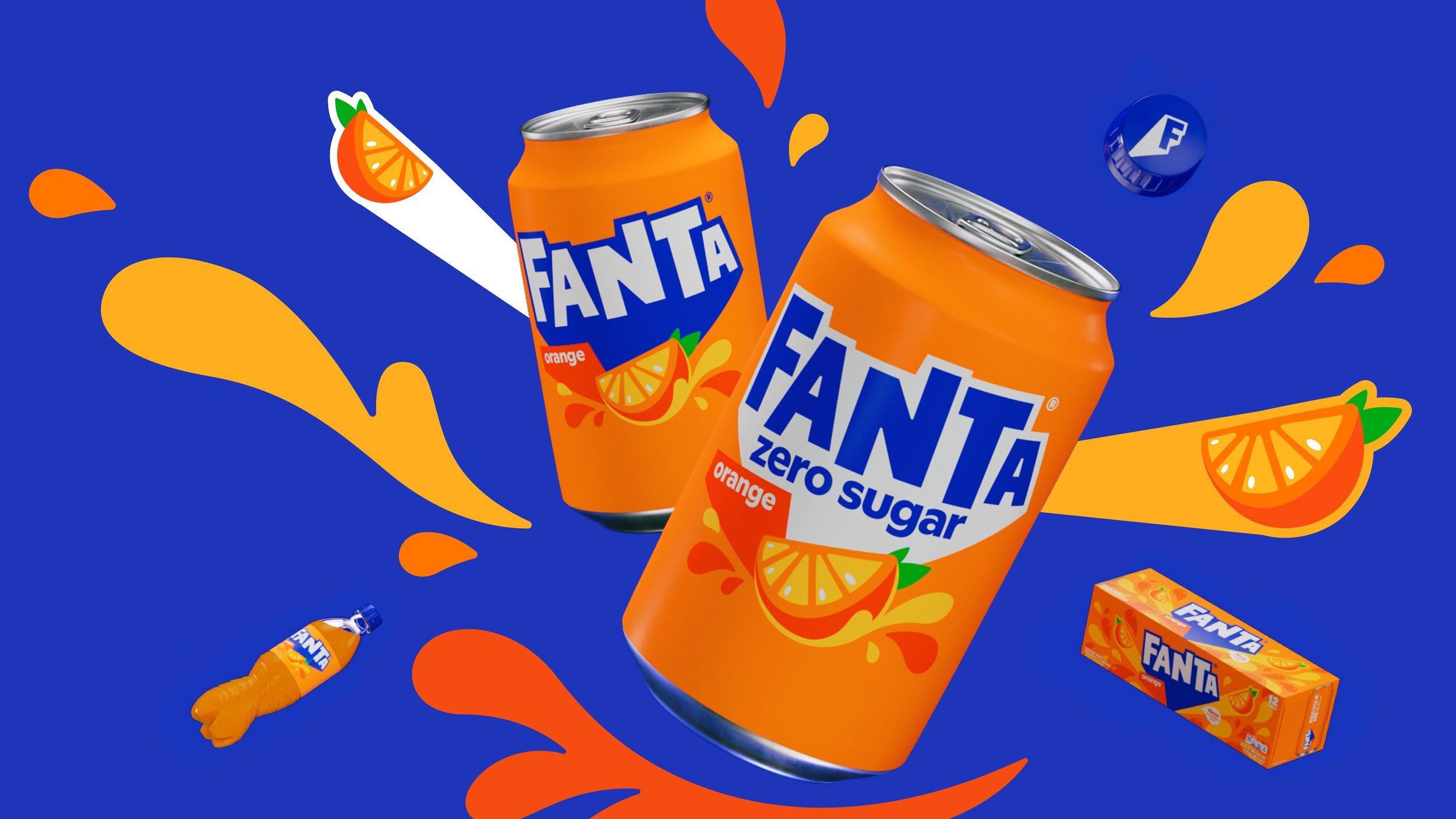
Image courtesy of The Coca-Cola Company.
These changes to consumer tastes are not absolute. It’s not as if the entire soda market has suddenly given way en masse to drinks that act as if they’re bottled by hand in inner-city orchards. But the increasing presence on shelves of drinks that want to talk about ingredients, and which aim to move away from the idea of sodas as sugary bellywash, does suggest that changes are afoot. Across the industry, there is a greater attention towards what goes into the drinks we buy, and greater preferences as to what should not go into them. Just as importantly, there is a greater appetite for communicating this through design. “We’re always listening to our fans,” says Porcini of the way in which a behemoth like PepsiCo, which posted revenues of $86.392bn in 2022, navigates some of these changes to its products. “We have a strong suite of capabilities in place that help us stay years ahead of their changing preferences, and the signals are clear that zero sugar is where they’re headed.”
Well, if there’s anything that sodas do, it’s follow the market. After all, the drinks themselves are nothingy: they’re changeable and secondary, vectors for the overarching brand, rather than sacrosanct recipes in their own right. “We’re selling smoke,” the Coca-Cola ad man Paul Foley is said to have once quipped. “They’re drinking the image, not the product.” So if no-sugar is the image that consumers want, then no-sugar is what they’ll get, because it really isn’t about the drink itself and, actually, never has been.
“I don’t care if the consumer wants carbonated sweat in a goatskin pouch,” Pepsi’s CEO Alfred Steele told his salesforce back in the 1950s. “If so, this side of the room go looking for goats and this side start running fiercely
in place.” Which is not the worst idea in the world now that I think about it. Get the design right, the marketing in place, and I can see it selling. Maybe a health drink: all a bit natural, all a bit tangy like kombucha or kefir, designed to deliver essential, natural fluids into your body, wrapped up in packaging sourced from sustainably managed herds.
You know: goût de chèvre and sueur gazeuse, sat leathery on the corner shop shelf, bristling. It’s brown and musky (and, presumably, fetid), with hairs that twitch as curlicues of sticky-aqua perspiration roll within. Overhead, the lights warm the hide, bringing out tanning scents from the recesses of stamped lettering that declares “Carbonated Sweat in a Goatskin Pouch”, a droplet of sweat replacing the dot on the second i. Carbonated Sweat in a Goatskin Pouch! I want to drink Carbonated Sweat in a Goatskin Pouch!
I know what Carbonated Sweat in a Goatskin Pouch is!
[1] That should cover me legally. Please ignore the fact I just said it was Loco Local.
[2] A clarification: Coca-Cola wasn’t the first drink of its kind by any means, having grown out of a long history of health tonics and precursor sodas (it itself was based on a drink called Vin Mariani), but it does seem to have been the first to fully tap into the mixture of advertising, design and distribution that is now distinctive of fizzy drinks.
[3] And always have done. In his excellent book For God, Country and Coca-Cola (to which this essay is indebted), Mark Pendergrast lists a number of the early competitors/knock-offs that Coca-Cola faced. The list is long, and reproducing it in full is a bit self-indulgent, but I can’t help myself because I love it so much; it reads like poetry, albeit poetry about selling syrup: “Afri-Kola, Cafe-Coca, Candy-Cola, Carbo-Cola, Celery-Cola, Celro-Kola, Charcola, Chero-Cola, Cherry-Kola, Citra-Cola, Co-Co-Colian, Coca and Cola, Coca Beta, Coke Extract, Coke-Ola, Cola-Coke, Cola-Nip, Cold-Cola, Cream-Cola, Curo-Cola, Dope, Eli-Cola, Espo-Cola, Farri-Cola, Fig-Cola, Four-Kola, French Wine Coca, Gay-Ola, Gerst’s Cola, Glee-Nol, Hayo-Kola, Heck’s Cola, Jacob’s Kola, Kaw-Kola (‘Has the Kick’), Kaye-Ola, Kel-Kola, King-Cola, Koca-Nola, Ko-Co-Lem-A, Koke, Kola-Ade, Kola- Kola, Kola-Vena, Koloko, Kos-Kolo, Lemon-Ola, Lime-Cola, Loco-Kola, Luck-Ola, Mellow-Nip, Mexicola, Mint-Ola, Mitch-O-Cola, Nerv-Ola, Nifti-Cola, Noka-Cola, Pau-Pau Cola, Penn-Cola, Pepsi-Cola, Pepsi-Nola, Pillsbury’s Coke, Prince- Cola, QuaKola, Revive-Ola, Rococola, Roxa-Kola, Sherry-Coke, Silver-Cola, Sola-Cola, Standard- Cola, Star-Cola, Taka-Kola, Tenn-Cola, Toka- Tona, True-Cola, Vani-Kola, Vine-Cola, Wine Cola, Wise-Ola.”
[4] Commercially and creatively; I’m not getting into the issue of sustainability or the wider ethics of this stuff.
[5] Which, having put it down in writing, sounds uncomfortably like the feeding pattern of a baby.
[6] In 1959, the Coca-Cola Company’s president Robert Woodruff described the drink’s title as a “meaningless but fanciful and alliterative name”. In part this was likely an effort to get away from the legally problematic but persistent idea that Coke was full of coke, but the 1880s undeniably had a real taste for alliteration. There were also products such as Goff’s Giant Globules, Copeland’s Cholera Cure, and Dr Pierce’s Pleasant Purgative Pellets. I’d like to try them all.
[7] Which he was very good at given that he was the man who created the red Coca-Cola Santa.
[8] And that third participant, dear reader, was me. The champion.
[9] Although it was a bit – Guizeta was trying to secure more favourable terms for the company in its contracts with bottlers.
[10] Which was not just a flight of fancy: Yum Yum was the name that Coke’s founder John Pemberton gave to the rival soda he developed having sold his original business.
[11] Apparently it’s PepsiCo’s long-running Fanta rival – I had never heard of it before (nor had anyone else in Design Reviewed’s office), but I now see it absolutely everywhere. Mirinda!
[12] Probably fuckloads of sugar.
[13] Which scoured the field of the Y2K bombast that had dominated in the late 1990s and early 2000s, and which I quite miss if I’m totally honest – overblown is a good aesthetic match for soda.
[14] A design whose brand manual reportedly leaked on Reddit in 2009, and which is so insane that many still believe it must have been a hoax because there’s no way professional designers could be that mad. The document is freely available online and is absolutely amazing – it includes mention of “Pepsi Energy Fields” that mirror magnetic fields, and its proposed brand identity claims an aesthetic lineage stretching from vastu shastra, via Vitruvius, onto the Modulor, before finally arriving at Pepsi. Personally, I think they were definitely that mad.
[15] My very favourite Pepsi can is the class of 1991: a white can with blue typography, whose only embellishment is a graphic red ribbon sat vertically beneath the logo. Bring it back, you cowards!
[16] This isn’t hyperbole. People absolutely lost their minds, for example, when Coca-Cola introduced New Coke in 1985. Here is one response, reported by Pendergrast, that was sent to Coke’s offices in protest at the change: “My littele sisther is cring because coke changed and she sayed that shed is not going to stop cring every day unitl you chang back. . . . I am geting tryer of hearing her now if you don’t chang I’ll sue evne if I’m just 11.” It sounds like one of the Jack the Ripper letters.
[17] Just as we went to print, my colleague Lara Chapman revealed to me that there are, in fact, yellow kiwis: a complete game changer, from which I am unlikely to recover for some time.
[18] I’m not totally sure which quote she means, but at a guess it’s “To realise one’s nature perfectly – that is what each of us is here for.”
[19] Too late! I’m 3,690 words in!
[20] They pretty much all do this, but it gets boring typing it out each time, so just assume that they all have “Zero Sugar” written discretely on the can somewhere.
[21] Whereas Zero is a name – a dorky one, admittedly, but a name nonetheless – Zero Sugar is a description. Other drinks have also made this change: 7up Free has become 7up Zero Sugar; Pepsi Max has transitioned to Pepsi Zero Sugar in the North American market; and both Sprite and Fanta replaced “Zero” with “Zero Sugar”.
[22] I was not entirely honest earlier about how often I’m having a soft drink.
[23] It doesn’t, but a 2007 advert for Zero featured Coca-Cola’s lawyers attempting to sue the drink for “taste infringement”.
[24] Although, of course, they have, with Coke’s then-CEO Doug Daft labelling proposals to tax fizzy drinks back in 2003 as being “absurd and outrageous”.
[25] Which seems an odd thing to trumpet given that all sodas are basically fizzy water with things dissolved in them, but which doe go some way to suggesting a healthier drink. It also goes some further way to suggesting a much more middle-class drink.
[26] Although it’s worth noting that this isn’t the only game in soda town. A whole range of new energy drinks such as Prime have forsaken any notion of “authenticity” or pretences towards health consciousness in favour of designs that feed upon ideas of hyped-up masculinity and swaggering machismo. They come worryingly close to being a kind of liquidised Andrew Tate.
Words Oli Stratford
This article was originally published in Design Reviewed #2. To buy the issue, or subscribe to the journal, please visit the online shop.