
A Neotenic State of Mind

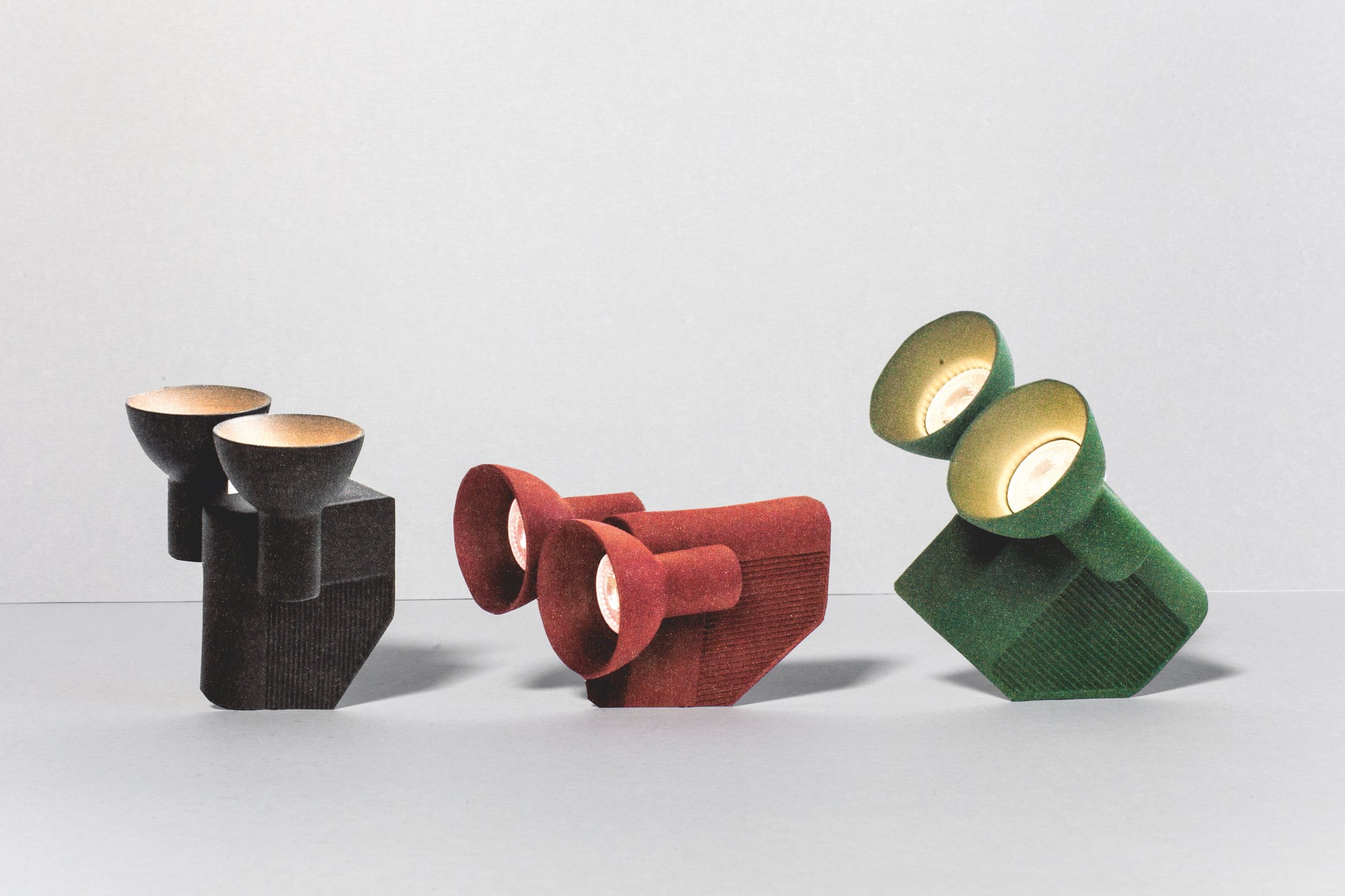
Sam Son easy chair (2015) by Konstantin Grcic for Magis; 7m chair (2016) by Ara Thorose; Neotenic light (2018) by Jumbo. (image: Teresa Giannico).
Human beings are subconsciously moved by big eyes, round heads, chubby cheeks and pudgy extremities. It is widely believed that when we see them, a dark recess in our brains – the amygdala – initiates a surge of nurturing affection, telling us that we are encountering a child and should conduct ourselves accordingly. Only, the amygdala is evolutionarily quite old and easily fooled. We experience similar sensations whether we are looking at baby humans, baby animals, cute cartoons, or even inanimate objects such as tables or chairs
My first encounter with this phenomenon took place a few years ago on the streets of Brooklyn. A friend and I walked by a parked Volkswagen Beetle with vinyl decals resembling human eyelashes above the headlights. My first reaction was one of disdain – decorating a car to resemble a face felt tasteless to me. But when I looked at my friend, she was squatting in front of the vehicle, entranced. In her words, the car was “adorable.” And that’s precisely what VW intended when it undertook to redesign the vehicle in 1994. Knowing full well that people see faces in automobiles, VW increased the relative size of the greenhouse (which we read as a cranium) and the headlights (which we read as eyes) in the New Beetle (1997-2011). These exaggerations reflect proportions in juvenile animals, which typically have large heads and eyes in relation to body size. It turns out that what my friend was responding to was not a tacky decal, but an abundance of childlike forms – something that touched her on an emotional level.

The Chubby chair (2018) by Jack Rabbit Studio.
Scientists have known about this phenomenon for a long time. In 1872, Charles Darwin speculated that the affection we feel for infants might be due in part to “inherited habit”. In The Expression of the Emotions in Man and Animals, Darwin wrote: “Although the emotion of love, for instance that of a mother for her infant, is one of the strongest of which the mind is capable, it can hardly be said to have any proper or peculiar means of expression; and this is intelligible, as it has not habitually led to any special line of action. No doubt, as affection is a pleasurable sensation, it generally causes a gentle smile and some brightening of the eyes. A strong desire to touch the beloved person is commonly felt; and love is expressed by this means more plainly than by any other. Hence we long to clasp in our arms those whom we tenderly love. We probably owe this desire to inherited habit, in association with the nursing and tending of our children, and with the mutual caresses of lovers.”
In 1949, the Austrian zoologist Konrad Lorenz built on this idea, theorising that juvenile features were “innate releasing mechanisms” to elicit nurturing and affection in the viewer. After cataloguing the morphological differences between juveniles and adults of different animal species, Lorenz postulated a “kinderschema” that included “a relatively large head, predominance of the brain capsule, large and low-lying eyes, bulging cheek region, short and thick extremities, a springy elastic consistency, and clumsy movements”. He went on to theorise that our response to these traits is transferrable between forms – we feel an involuntary sense of disarming tenderness whether we see a human baby, a seal pup, or even a particularly anthropomorphic rock scree. Lorenz concluded that the imperative to nurture our young is so deeply coded in our biology that it is inescapable, even when misapplied to animals or objects.

Terracotta furniture (2016) by Chris Wolston.
“Neoteny” is the word that science has used to describe the prolongation or retention of these childlike features. It was coined in 1885 to describe the (now critically endangered) Mexican axolotl salamander. Unlike most amphibians, the axolotl does not undergo metamorphosis; rather than shedding its juvenile gills and moving to the land, it retains them and keeps to the water. The word was bandied about in evolutionary biology circles during the 20th century and peaked in usage during the 1980s, when the academic and pop scientist Stephen Jay Gould used neoteny to explain everything from cartoon characters to the humanisation of our species (bigger brains, flatter faces). In 1981, he wrote: “If humans evolved, as I believe, by neoteny[…] then we are, in a more than metaphorical sense, permanent children.”
It is now believed that Gould overstated his case. Neoteny is probably not the driving force in human evolution, but the past decade of clinical trials has lent considerable support to Lorenz’s theory that neoteny’s effects on the brain are both subliminal and transferrable. A 2005 study conducted at Emory University in Atlanta used MRI technology to catalogue brain activity while subjects were shown photographs of baby animals. According to the findings, the images stimulated rapid-response activity in the middle area of the orbital frontal cortex, an area of the brain associated with pleasure and positive emotions. The speed at which this took place suggested that the response preceded cognition.
Olo light (2016) by Jean-Baptite Fastrez for Moustache.
If, as these findings suggest, neoteny’s effects truly are both subliminal and transferrable, it might be a profitable lens through which to view contemporary design. Unlike broader terms such as “cute” or “kawaii” – which include aspects of size, colour, helplessness and nostalgia – neoteny is strictly confined to childlike morphology. In other words, it deals exclusively with those juvenile features with the potential to affect us neurochemically. And while contemporary designers are more likely to describe their work in terms of material expression or machine processes, emotional effect has begun to creep into the discourse as the stoicism of 20th-century cool yields ground to the empathy of 21st-century cute. Stockholm-based studio Front, for instance, recently launched its Resting Animals collection for Vitra, a set of animal forms executed as furniture or ceramics that probe at the emotional impact figurative objects can have. “The education in taste that we get as designers takes us away from the figurative or childlike,” explains studio co-founder Sofia Lagerkvist. “The sensible part of our brain says, ‘I’m not supposed to like this,’ but the emotion associated with figurative objects is so strong[…] We wanted to create something that was on the fine line between sculpture and something that provokes a softening of the heart.”
From a historical perspective, the animation industry was probably the first design discipline to employ neotenic design strategies in a concerted manner. At Walt Disney Studios, neotenic techniques were evident in animators’ work as early as the 1920s. Thanks to Gould, we know that various artists drew characters such as Mickey Mouse progressively “younger” with each successive film appearance, exaggerating the size of his head, eyes and cranial vault. “The Disney artists transformed Mickey in clever silence, often using suggestive devices that mimic nature’s own changes by different routes,” wrote Gould. “To give him the shorter and pudgier legs of youth, they lowered his pants line and covered his spindly legs with a baggy outfit[…] The length of Mickey’s snout has not altered but decreasing protrusion is more subtly suggested by a pronounced thickening. Mickey’s eyes have grown in two modes: first, by a major, discontinuous evolutionary shift as the entire eye of ancestral Mickey became the pupil of his descendants, and second, by gradual increase thereafter.”
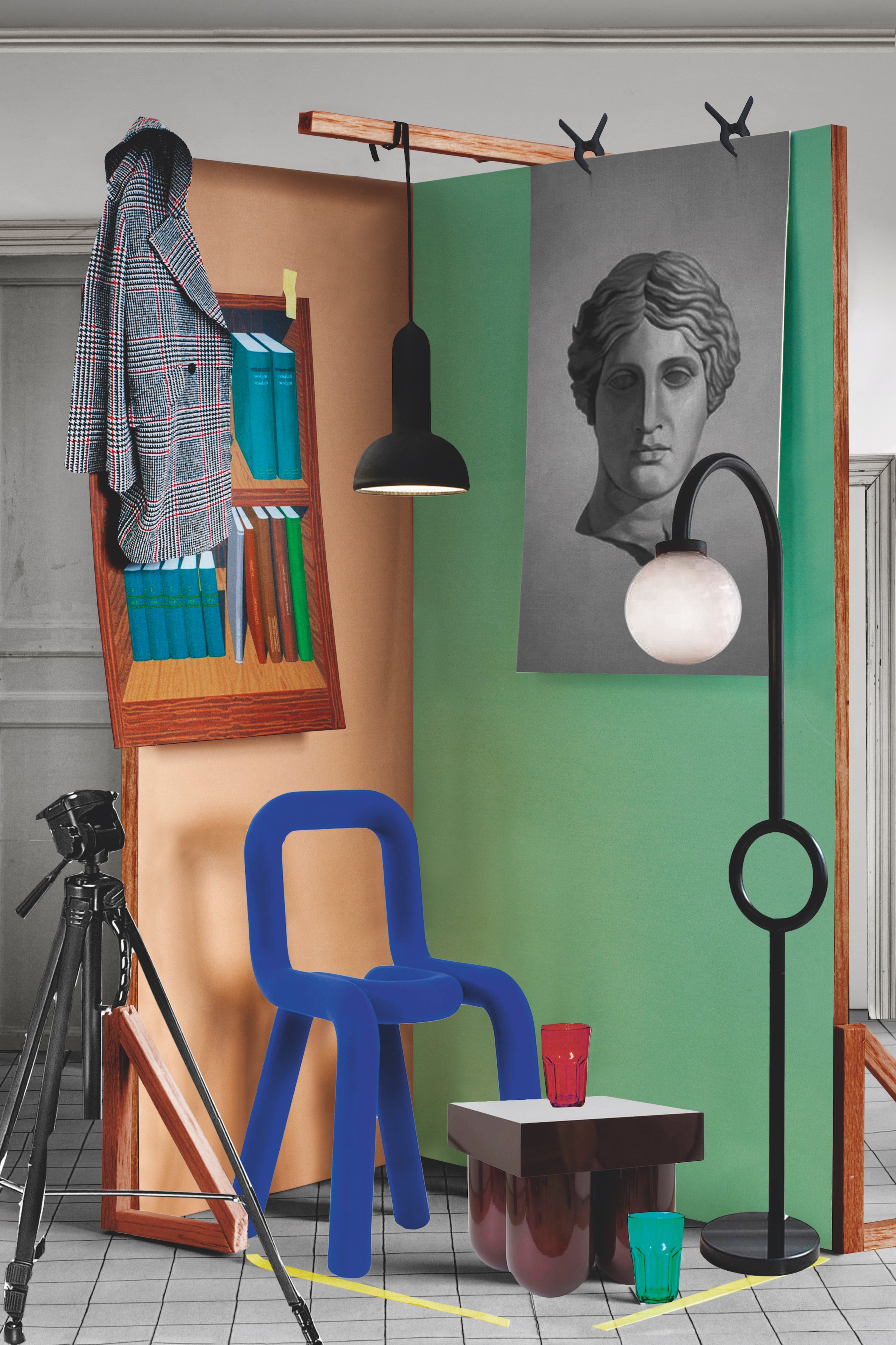
Bold chair (2009) by Big-Game for Moustache; Torch suspension (2008) by Sylvain Willenz for Established & Sons; Set No. 5 cocktail table (2018) by Müsing–Sellés; Vima floor lamp (2016) by Haha.
Since the early days of animation, neotenic design techniques have been used to shape everything from Alessi toiletries to Prada keychains. Most recently, neotenic forms have been made manifest in furniture and lighting design. The past decade has seen a proliferation of dumpy tables, chubby chairs and stocky light forms. And while very few of the designers responsible for these objects will concede that they set out to produce a childlike design, the resulting forms conjure juvenile associations that elicit an emotional response.
So what are the key features of neotenic furniture design? Obviously, we have to see personhood in the object in order to recognise childlike shapes. Zoomorphism, then, is a prerequisite, although not a sufficient one. Front’s Animal Thing collection for Moooi (2006) – a selection of lifelike animal sculptures converted to serve as furniture – is a good example. Although they are zoomorphic, the animal forms are mature and do not incorporate any childlike qualities. There are three features that are common to neotenic furniture design objects, however: thickened forms; soft or rounded terminations; and monomaterials.

Aballs table lamp (2013) by Jaime Hayon for Parachilna.
At its most basic, a pudgier version of a familiar form will read as a baby version of that form. When Swiss studio Big Game set out to develop its Bold chair for Moustache (2009), the practice started by looking at tubular steel chairs from the Bauhaus. According to Elric Petit, Grégoire Jeanmonod and Augustin Scott de Martinville, the trio behind Big Game, “all the tube chairs from the Bauhaus include a piece of wood or plastic”. The studio sought to reduce the archetype to its most basic expression by eliminating the non-tube parts. In order to dispense with wood seats and plastic backrests, Big Game increased the thickness of the tube form by encasing the steel in cast-foam and sheathing the resulting composite in knit fabric. The resulting chair is pudgier than its predecessors – possessing what Lorenz might have considered “short and thick extremities”. Due to the termination detail of the knit, which is stuffed between the steel tube and the encasing foam, the feet of the Bold chair appear to be filleted or rounded. Finally, although constructed from several different materials, Bold appears as if it were made of one single material – one single thought or idea.
While typological precedent was not as much of a guiding influence, a similar interest in reduction drove Sylvain Willenz to develop the Torch light for Established & Sons (2008). According to Willenz, “Torch is made up of the least possible components. A body, diffuser, electrical bits and a cable[…] No screws.” In Torch, all of the “guts” are encased in a single, flexible, cast-rubber sleeve. This slightly textured wrapper helps to foster the idea of the object as zoomorphic – as if it were sheathed in a skin. The encapsulation also has a secondary effect: it makes the lamp appear sausage-like, especially where its body meets the cord and where the cord meets the ceiling canopy. This rounding and softening of the transitions conjures up childlike shapes and gives the object what Lorenz might have referred to as a “springy elastic consistency”. When the cord is coloured to match the rubber sleeve, the light appears as if it were made of one material growing from the ceiling, an organic gesture that gives the creation a juvenile quality.

Concrete lamp by Jonas Wagell for Menu; Baby Bear armchair (2016) by Pierre Yovanovitch; Roly Poly chair (2014) by Faye Toogood for Driade.
Occasionally, we can read a childlike face in an industrial design object. Not only is this the case with the VW New Beetle, but also with Konstantin Grcic’s Sam Son chair for Magis (2015). Grcic set out to create a “big volume in a very light way”. The studio experimented with zodiac boat construction methods, hoping to create an inflatable armrest. When the material proved unsuitable from an industrial manufacturing perspective, Grcic substituted moulded plastic for the PVC tube and retained the sausage-shaped armrest. “I thought if we used a very soft plastic and moulded it, we would come close to the zodiac sausage concept,” says Grcic. “There was this soft, suspended seat hanging beneath the sausage armrest [but] in the end, the chair is made from one material, one process, and is perceived as one thing. The more it was one thing, the more I began to see a character in the object: a face, two large eyes in the armrest, a friendly smile in the seat.”
Not only does Grcic’s explanation of Sam Son suggest Lorenz’s “large and low-lying eyes”, but it also touches on perhaps the most important quality of neotenic design – the potential of form to elicit empathy or pathos. Grcic named the chair accordingly. “There is something of a misfit in [a] cartoon character and the name ‘Sam Son’ reflects that as well,” he says. “I couldn’t call it ‘Joe’ or something like that. ‘Joe’ is a nice name, but this creature came from another world. Sam Son is nice and easy to say, to pronounce, and it triggers a sort of sympathy[…] The naming came later in the process. It came from looking at the computer screen. It became this cartoon that we could animate. That made it very strongly become a cartoon instead of a piece of furniture.”

Dot table lamp (2016) by Sylvain Willenz.
Grcic is not alone in his interest in cartoons. Not only did Big Game and Sylvain Willenz share a studio space in Brussels from 2005 to 2008, but both firms independently cite the Ligne claire cartooning style pioneered by Hergé, the author of The Adventures of Tintin, as a formative influence. Big Game goes so far as to credit Hergé with achieving the “maximum expression with the minimum line”. Perhaps, then, neotenic form is not so much an intentional design decision as a by-product of an abiding fascination with caricature. To reduce an industrial design object to its essential form, it seems that contemporary designers are using bolder strokes, rounded forms and fewer materials.
The fact that we can now see juvenile form as mature design might have something to do with the artist Takashi Murakami’s Superflat concept (2000) – the idea that the explosion of Japanese anime and manga culture has helped to collapse preexisting distinctions between mass-market consumer goods and fine art. Murakami postulates that his nation’s Second World War defeat and subsequent occupation by the US turned his compatriots into perpetual children. In his 2005 essay ‘Earth in My Window’, parts of which read as if Gould himself had penned them, he writes: “Whatever true intentions underlie “Little Boy,” the nickname for Hiroshima’s atomic bomb, we Japanese are truly, deeply, pampered children.” If the proliferation of anime and manga culture has elevated the cartoon to the level of fine art, then design need no longer be cool or sophisticated to elicit our attention – it can look cute and maintain some degree of cultural gravitas. The preponderance of the cartoon might also explain why we might recognise pudgy and anthropomorphic forms as childlike, when we might have considered them “abstract” in the 1940s, “pop” in the 1960s and 1970s, “postmodern” in the 1980s and 1990s, or “blobby” in the early 2000s.

/‘º^º’\ (2017) by Dowel Jones and Local Design for Kvadrat and Maharam.
If, like my friend in Brooklyn, you have found yourself making cooing sounds in the presence of an object, you may have experienced the emotional effects of neoteny firsthand. Research conducted at the University of Virginia suggests these joyful noises are evidence that an abundance of juvenile sweetness can cause us to release affective energies away from the object and towards ourselves. The researchers find that “cuteness is as much an elicitor of play as it is of care. It is as likely to trigger a childlike state as a parental one.” They go on to state that “regardless of whether the cuteness response originally arose to increase the welfare of one’s own offspring, it is not best characterised as a direct releaser of caretaking behaviours, but rather as a direct releaser of human sociality.” This means that we may be self-limiting our higher brain functions in the presence of childlike or cartoonish things, easing back on adult judgement and anxiety. If such forms do in fact increase play and “affiliative” tendencies, then neotenic design might become one of 21st century’s best strategies for connecting people to the objects around them on an emotional level.
Words Justin Donnelly
Images Teresa Giannico
This article was originally published in Disegno #22. To buy the issue, or subscribe to the journal, please visit the online shop.