
Minimal Colour

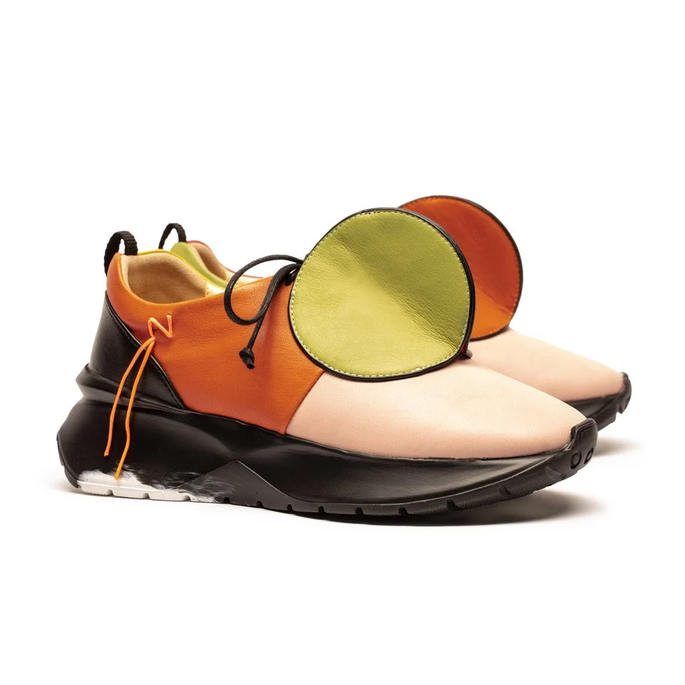
The DOT Morag, designed by Tracey Neuls and Morag Myerscough (image: courtesy of Tracey Neuls).
There is something beetle-like in the new DOT Morag trainer, a collaboration between footwear designer Tracey Neuls and artist and designer Morag Myerscough – its leather is stitched into a jewelled carapace, its colours gleaming bright and sharp. “Emotive design is really, really important,” Neuls says. “I always think of our shoes as pets – people will keep them for years.”
The trainer, a special edition of Neuls’s 2024 DOT design, draws its name from the stitched discs of leather that rise pertly from its upper. In previous iterations of the design, these dots have been executed in tones of moss, parchment or black, but in Myerscough’s asymmetrical take on the form these have been replaced with patches of lime, pink, orange and yellow. The Dot takes on fresh hues, transforming its two halves into gleaming elytra.
“I use pink and yellow as my neutral colours, and then I put other ones around them,” says Myerscough, whose work across graphics and installations has become known for its use of vibrant, clean, optimistic colours, using this palette as a vehicle for messaging surrounding social cohesion and belonging. “When I started to think about traditional trainers, and how colourful they are, it just made sense that Morag would be the collaborator in this,” Neuls explains. “She is the queen of colour.”
DOT was initially designed by Neuls as an effort to create a more sustainable take on a sneaker. Neuls’s eponymous brand, which launched in 2000, produces all of its footwear in Portugal, handcrafting its pieces using leather from small tanneries and opting for chrome-free or vegetable dyes in favour of chemical alternatives in a bid to create more ecological designs. “But when it comes to trainers, the landfill issue is gigantic,” says Neuls. “It’s not as if [a trainer] sole is made from leather – there’s an [ecological] impact to them.” As such, DOT required two years of research and development in order to create a sugarcane EVA foam sole, in place of the petroleum-based alternatives widely used across the industry. “But it’s still important to make something timelessness,” Neuls adds. “Because then you get complete wear out of it. You can do sustainable stuff, but if it’s still incredibly trend driven, then that naturally has a life cycle. I really feel like these shoes don’t have that.”
Central to Neuls’s aim is fostering a sense of connection between her design and its wearers. In the case of the DOT Morag, colour is the pathway towards this. Whereas many designs that seek to achieve a lower environmental footprint translate this into a literal aesthetic – restricting themselves to a hessian-sober palette of earth tones and shades of green – Myerscough’s edition of Neuls’s shoe luxuriates in poster-paint style colour. “In the past, it may have been seen as very difficult to take [leather] and make it into a less natural looking material,” Myerscough explains, “But vegetable dyes can actually give very strong colours and not everything sustainable has to be of a certain colour. We need to be able to buy responsibly, but also buy what we want, and not live within just one visual context.” As such, the DOT Morag is intended to step lightly, yet fabulously, on the Earth. “It's about, ‘Do you spark a smile?’” Neuls asks. “I think colour can bring that joy.”
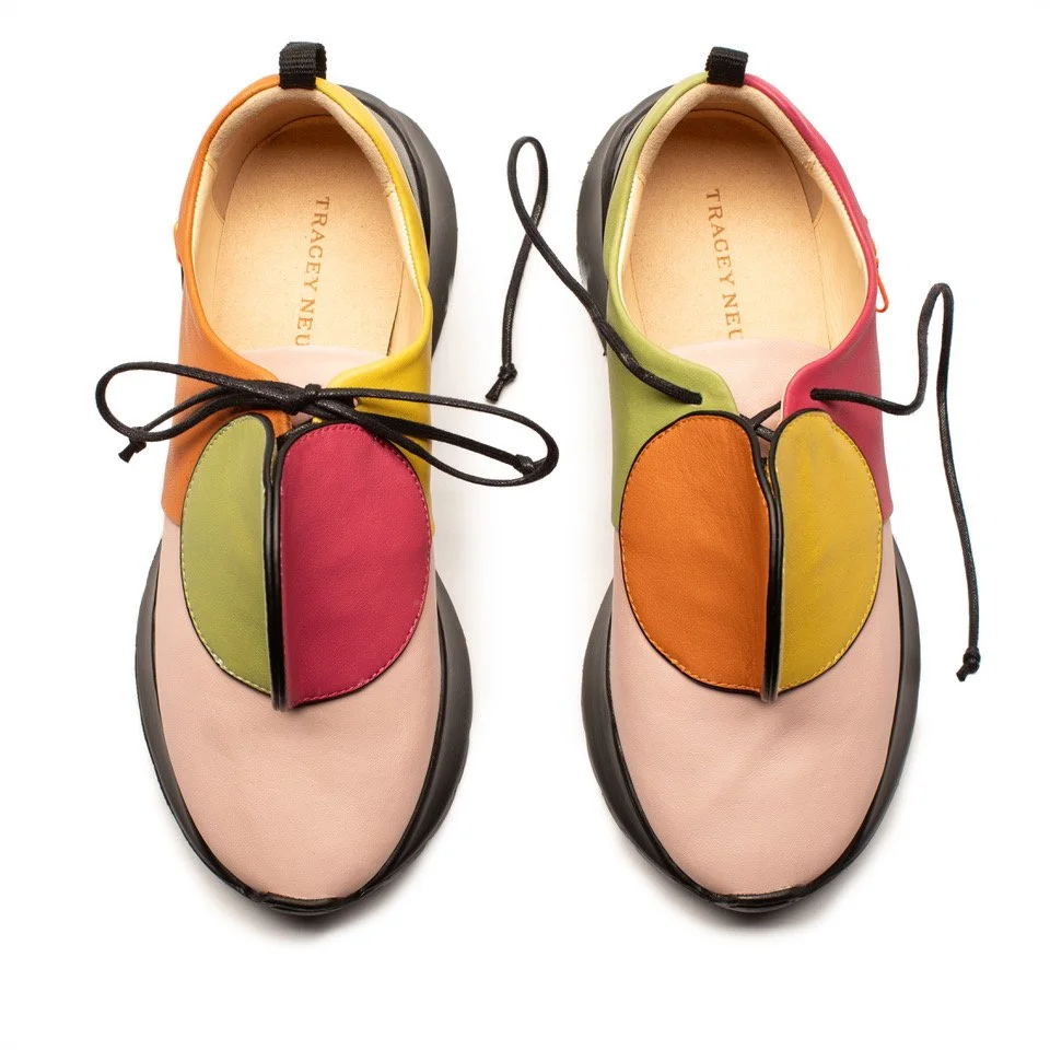
In spite of the vibrancy of DOT Morag’s colour, however, there is restraint in Myerscough’s design. The colours used are all existing ones that Neuls could readily source within Portugal, as fits the wider design approach of her brand. “They’re not quite primary colours, but they are accessible,” Neuls notes. “It's not like Morag was mixing together some Farrow & Ball ‘Hippo’s Breath’ or whatever. On the scale that I work at, it would have been impossible to make bespoke colours in terms of minimum orders.” Moreover, Myerscough resisted the potential to print DOT with a pattern – she is well known, for instance, for a striped motif – believing that this would have pushed the shoe into the territory of becoming an artist’s collectible, rather than a wearable piece of footwear. “I love a lot of clothes, but it’s always about, ‘Would I wear it?’” she explains. “I'm not sure I’d want to wear a pair of shoes with my name or something written on it. With [DOT Morag], it can be part of the wider range – I want people to buy it because they like the particular colourway, rather than it looking like a ‘Morag stripe’.”
In this regard, Myerscough has leant into Neuls’s design, creating a colour treatment that seeks to emphasise the original, rather than overlay it. “There’s lots going on in my shoes, but for the most part, I feel like they’re quite minimal,” Neuls acknowledges, “and I think that Morag approached colour in the same way.” The use of colour within the DOT Morag is bold but sensitive, restricted to a different solid shade for each panel. The shoes may be bright and cheery, but their colour is never gratuitous. “It’s already a very graphic, sculptural shoe, rather than one that needed a pattern,” Myerscough adds. “So the design was very instant. Maybe if I’d only had the [flat] templates, I would have thought that I needed to work harder with pattern, but Tracey actually gave me a white pair to work with — I just played around with the physical shoe and put together the colours I felt would work.”