
LDF 2026 Round Up
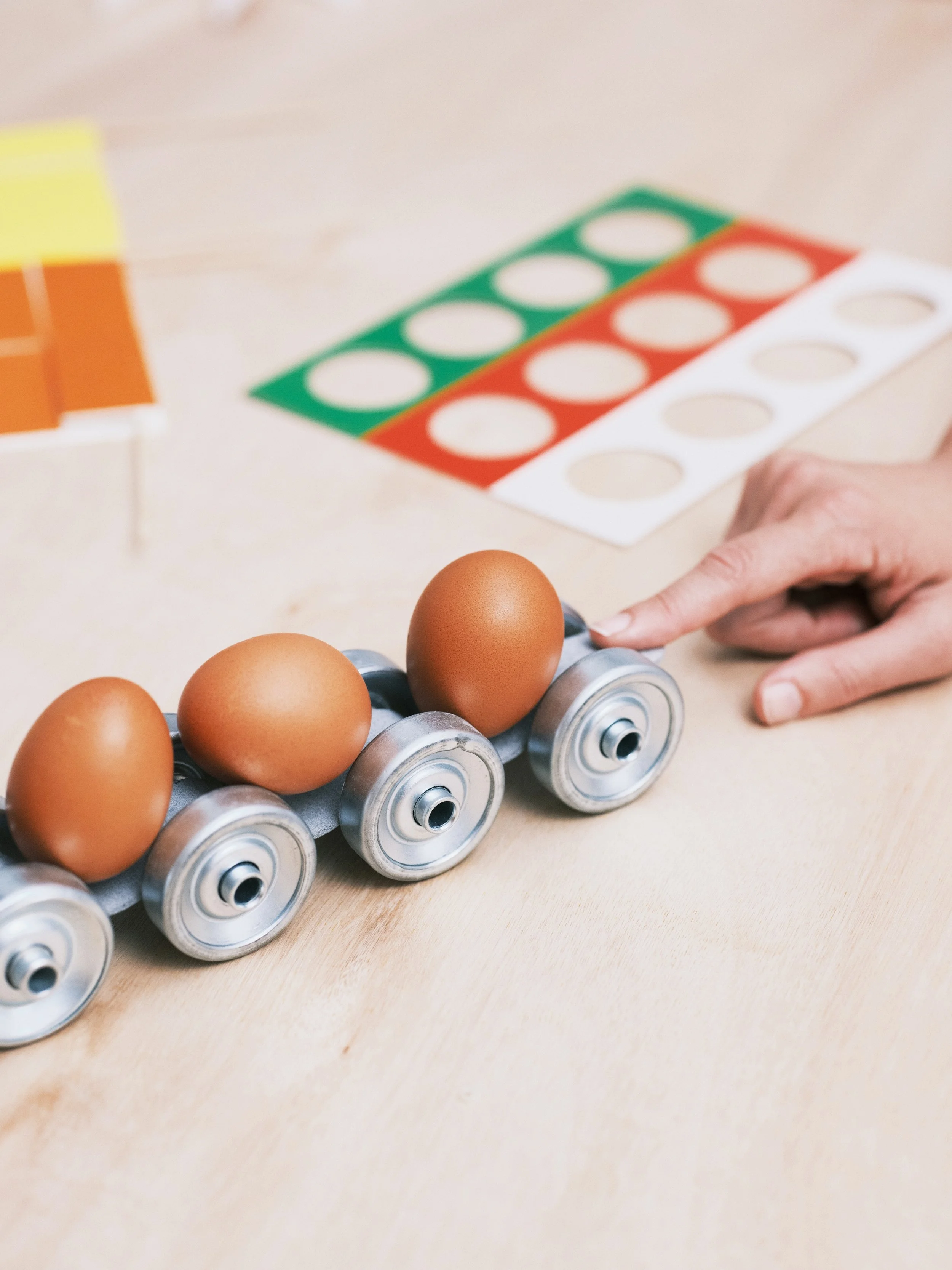
Isabel + Helen’s train designed to make eggs spin when pulled (image: Isabel + Helen).
Last week saw London given over to the 2026 edition of the London Design Festival (LDF), an annual celebration of the discipline that can often offer a window onto the industry’s current preoccupations, limitations and tendencies.
Throughout the week, the Disegno editorial team explored the city, visiting as many exhibitions, launches and installations as we could. Below, we’re sharing a curated collection of some of the initiatives that interested us most – installations and events that variously touched on issues of industry access, narrative, representation and more.
Read on to find out more.
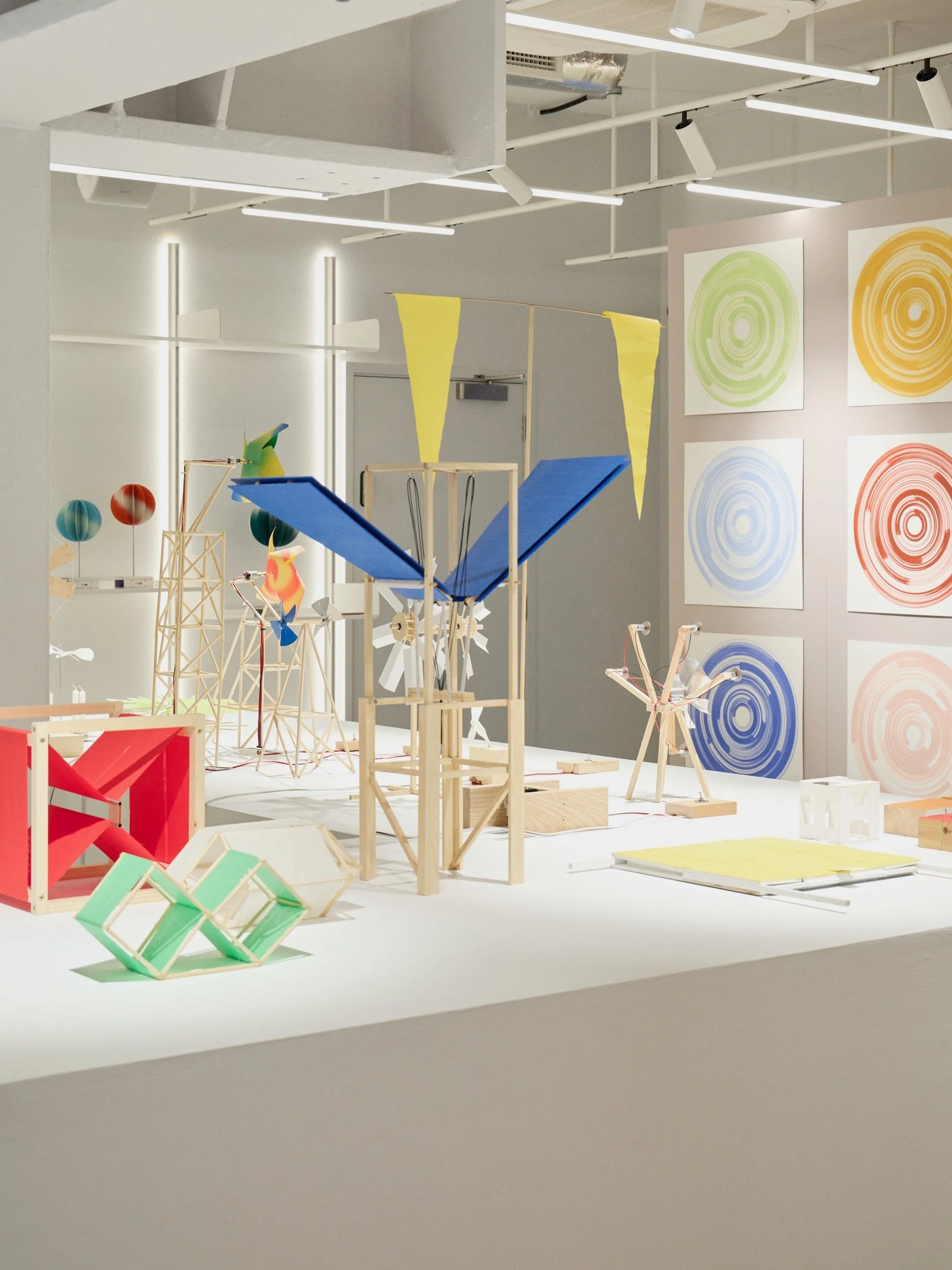
Behind-the-scenes models and maquettes from 10 years of Isabel + Helen’s practice (image: The Conran Shop).
Motion Sickness
Design studio Isabel + Helen’s Motion Sickness exhibition at The Conran Shop brought an injection of whimsy and childish delight to LDF proceedings. Celebrating 10 years of the studio’s work, the display featured models and maquettes of the pair’s kinetic sculptures, each scaled down to the size of a toy. The show featured models of 60ft turbines designed for Coachella in 2025; silver fans that later became wearable wind generators mounted on models during a runway show at the V&A in 2023; and two yellow flags that chase each other like birds for an Hermès window display in 2021. These illustrious projects were interspersed with self-initiated ideas, such as a wooden train designed to hold a line of eggs that dance and twirl when the wheels turn. Meticulously engineered, the duo’s work is pleasingly analogue – process videos of their rotational paintings, for example, show paintbrushes clipped onto long sticks which swipe across a wooden board while it twirls like a lazy Susan, creating an effect that resembles wine rings left on a table after a party. “Their work is rooted in a shared curiosity for experimentation and what design can become; the resulting outcomes are driven by human input, an in-real-life antidote to the transience of the digital world,” the exhibition text writes. At the show, meanwhile, Isabel + Helen provided this same antidote by inviting participation, with the display not only sparking ideas about the marvels one could make with a few lollipop sticks and some tissue paper, but giving audiences an even easier way to join in by providing simple instructions about how to interact with the objects. Given that audiences are often encouraged not to touch design displays, the invitation to blow, flick, pull, spin and set the room alight with movement was both unusual and welcome – a positive step towards the festival’s ambition of bringing design to as wide an audience as possible.

Mitre & Mondays created an installation for AHEC that told the story of the forests the wood was sourced from (image: Thomas Adank).
Wood for the Trees
The American Hardwood Export Council (AHEC) has long been a staple of LDF, commissioning both leading and emerging designers to create thought-provoking structures, objects and furniture out of the North American timber that the organisation exists to promote. At a time when budgets within design have often been constrained, AHEC has proven an ambitious and generous commissioner, enabling landmark installations such as Stefan Diez’s Vert structure for urban greening. If earlier projects often explored the environmental and structural benefits of timber, however, recent years have seen AHEC place greater emphasis on provenance, linking the materials that it promotes to the ecosystems and communities from which they are extracted. Following on from its 2025 documentary film Forested Future, detailing the communities (variously human, animal and plant) who live in the United States’ eastern hardwood forests, AHEC has used its 2026 installation for the festival to take a similarly holistic perspective. Designed by Mitre & Mondays, and built by Benchmark, Wood for the Trees was an installation that sought to tie construction materials to the environments from which they are sourced, engendering care for forests by seeking to immerse visitors in a woodland environment. Using elegantly simple joinery techniques, Mitre & Mondays developed a series of wooden totems, benches and stools out of timber boards, recasting the pieces to resemble the soaring trunks and fallen logs of the forests from which they were sourced – an effect compounded by a suspended tree canopy of veneer sheets. It proved an effective and beautiful treatment of furniture design as scenography, drawing visitors into the narrative of the forest and allowing for an accessible route into the stories that AHEC wishes to tell – all of the timber used in the exhibition, for instance, is No. 1 Common, a grade of high-quality timber that is radically underutilised at present due to cosmetic “blemishes” such as knots or grain variation. If AHEC has previously excelled at telling the technical story of timber, Wood for the Trees is a good example of how the organisation has adapted its remit to broaden what that story is: no longer simply a narrative about a structural material, but also the story of the ecosystems, communities and usages that surround it.
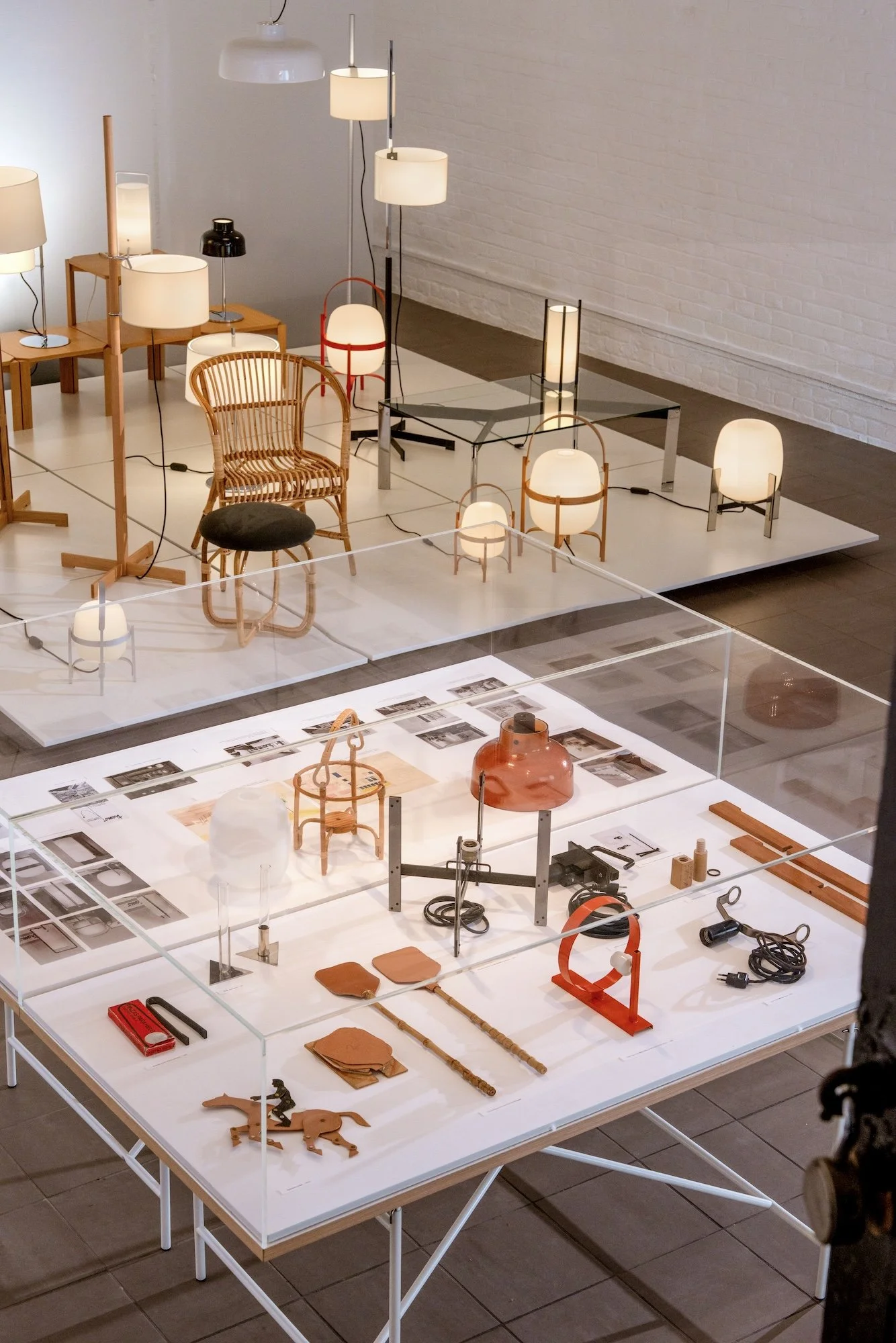
twentytwentyone’s show celebrated the work of postwar Spanish designer Miguel Milá (image: courtesy of twentytwentyone).
Miguel Milá. A Life in Design
Design festivals have a vested interest in valorising the contemporary, so it is always a welcome respite from the onslaught of newness when an exhibition looks towards the discipline’s past instead. Hosted by twentytwentyone in collaboration with Spanish lighting brand Santa & Cole, Miguel Milá. A Life in Design provided a generous and thoughtful celebration of its subject, the postwar Spanish designer Miguel Milá (1931-2024), examining his more than 60-year career in the field. Often hailed as a “designer’s designer”, and long championed in the UK by Jasper Morrison, Milá is only now coming into wider appreciation thanks to Apartamento’s 2022 monograph – a recognition that should be further enhanced by twentytwentyone’s exhibition, which intelligently balances a display of Milá’s furniture and lighting with archival material that is enriching and informative, without overwhelming the material beauty and intelligence of the designs on display. Although a historical exhibition, A Life in Design makes a clear case for Milá’s ongoing relevance to the field, exploring themes in his work that find resonances with contemporary practice: his capacity to immerse his design within a craft tradition in response to material scarcity (as seen in his 1965 woven rattan Salvador armchair); expertly balance expressive form with careful, rigorous construction (as with the 1962 Cesta lamp); and overarching recognition that designs for the home are less interesting in themselves as sculptural objects, and more engaging for the impact that they have on the lives of their users, and the atmospheres that they can help to create. While A Life in Design was, then, a welcome trip into an understudied part of 20th-century design history, it was also a well-crafted assertion of the field’s ongoing value in the 21st century.

Design Everything’s exhibition at Aram explored the inventiveness of emerging designers facing limitations of time, space, and funding (image: Kane Hulse).
Design Everything With Limitations
In a healthy industry, annual festivals and design weeks would provide an opportunity for established designers and new practitioners to stand side-by-side, exhibiting work that is mutually enriching through comparison – speaking in broad brushstrokes, the polish and precision of the former interacting thoughtfully with the energy and inventiveness of the latter. Over the past three years, however, the not-for-profit Design Everything collective has produced sterling work that highlights the extent to which the design industry is not healthy: companies and institutions regularly turn to a small pool of familiar names, with less established designers denied the opportunities and platforms that would allow them to demonstrate their worth. Running concurrently to the festival (but, pointedly, not an official part of it), Design Everything With Limitations is an exhibition that serves as something of a magnum opus for the group: an open display of more than 100 new designers in the prestigious gallery space at Aram, all of whom have produced work while labouring under constraints of time, funding, space, materials and equipment. Styled as a fictional designer’s flat (the site of production for many emerging practitioners), the space is a cornucopia of new, experimental works that visitors are free to use and interact with casually, stripping the design field of its frequent suggestion of preciousness or abstraction from day-to-day life, as well as offering a celebration of the labour that goes into the creation of any kind of design (it is worth noting, for instance, that the constraints under which the exhibiting emerging designers labour are the same as those that many established designers also still deal with). The works on display are beautiful and worthy of celebration, but more impressive still are the structures through which Design Everything is working to create pathways towards recognition for its members – in the face of inequity in the field, it is heartening to see a new generation of designers create their own forms of representation instead.

The Ncheta Collective recreated their memories of Nigerian parlours and exhibited their designs in the context of the objects and spaces that inspired their work (image: Andy Stagg).
Our Parlour
Rows of shoes sat outside Our Parlour, an exhibition hosted by Ncheta Collective, neatly placed alongside packets of soft slippers which could only have been provided by the most thoughtful of hosts. “We wanted to invite people to step into our memories of the parlours we grew up in as Igbo women,” says Zoë Chinonso Ene, a designer who cofounded the collective alongside creative director Chinasa Chukwu, photographer, curator and art director Christina Nwabugo, and food designer Ogochukwu Igwilo. “We wanted to exhibit our work alongside the objects, smells and sounds that we are inspired by, but also in the kinds of spaces which they exist in naturally, rather than isolating them in an exhibition.” Ene’s Nchọ, a version of the traditional strategy game, was mounted elegantly on the parlour’s wall and available for visitors to play, while her metal IO stool held up a reading lamp in a cosy nook. Archival images curated by Chukwu dotted throughout the space showed the smiling faces of the collective’s families, and the exhibition was anchored in material cues from their memories, such as large leather couches, glass coffee tables, and kitschy art referencing the Bible. The space was intended to be surreal, with the dining room’s terracotta walls and green lime wash mural referencing the red sands and lush vegetation of southeastern Nigeria, and the table, shelves and mantelpiece filled with Chukwu’s ceramics inspired by traditional instruments, where gourds are reimagined as vases and horn instruments as candle holders. “This isn’t a traditional literal representation of a Nigerian parlour. We can't claim to do that because people are different,” Ene says. “I wanted to really clarify that for the visitor, to say, ‘This is not museum staging.’ What we’re trying to do is more about the feeling.” Opening with a house party, the collective’s programming included game nights, vinyl DJ sets, reading sessions and communal meals, and ended with an estate sale, bringing a warmth and domesticity to LDF that the festival’s various exhibitions and product launches often lack.
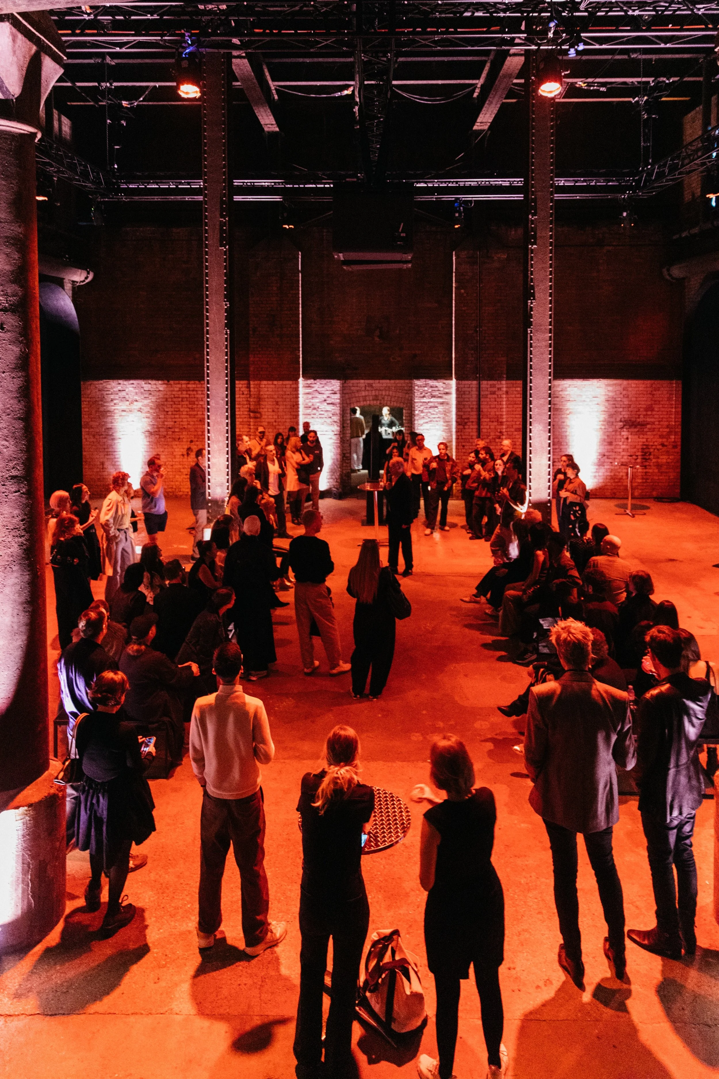
Sound systems manufacturer L-Acoustics hosted a sound installation inside of the newly reopened Wapping Hydraulic Power Station (image: Iona Wolff).
The Art of Sound
Wapping’s former Hydraulic Power Station became a new venue for the London Design Festival this year after opening to the public for the first time in over a decade, welcoming visitors into a space filled with gigantic green water tanks and rusted hooks the size of a toddler’s head. Sound systems manufacturer L-Acoustics invited multidisciplinary artist Max Cooper to devise a spatial audio installation in the boiler house, a high-ceilinged room where coal was once burned to produce steam and power the engines that pumped water through London’s hydraulic power network. Speakers with thin necks that craned slightly towards the centre of the room circled two long benches, where visitors were invited to enjoy the work of sound artists Chris Watson, Hollie Buhagiar and Helen Lyon under the glow of red lighting, the building’s heritage colliding with the installation like a club night crossed with a school trip. Watson’s piece was the most fitting to its surroundings, providing an auditory voyage down the Humber estuary in Hull, the city which hosted the first public hydraulic power network in Britain. Beginning in Trent Falls with the sound of a cargo ship horn, the audio journeys through bursts of birdsong, the delightful screams and megaphones of Hull Fair, and the cheers of Craven Park during a Hull Kingston Rovers home game, ending with the howls of grey seals as the river meets the North Sea. Sitting in silence in a dark, cool industrial building provided a welcome tonic for the hectic energy of LDF, with many visitors lying down on the floor with their eyes closed, allowing themselves to be transported by space and sound.

Henry Svenden’s Lover’s Hold is made up of steel plinths supporting an oozing resin and fibreglass sculpture that resembles bodies (image: Sarah Duncan).
Lover’s Hold
Viscous black material drips off designer Henry Svendsen’s loveseat like the murky tendrils of the subconscious mind, pooling onto the floor of the V&A’s medieval and renaissance room. The piece builds off Svendsen’s collection of kink-inspired furniture made from brushed metal and black leather, which used abstract shapes that resembled saddles or bike handles to invite viewers to decide what each piece could be used for. “I was also looking at this idea of the plinth and of how, in the art world, you have these huge bronze and marble sculptures that lean on plinths," Svendsen said in an interview with Dezeen about the collection, which invites people to lean, grab or sit on the furniture as if they were posing on their own plinth. ”And I thought, if you take away the figure from that plinth, what are you left with?” Here at the V&A, Svendsen’s sculptures are surrounded by sculptures on plinths – from Giambologna’s marble rendition of Samson Slaying a Philistine to Pietro Francavilla’s statues of Greek gods – and his cold-cast resin and fibreglass material drips from steel structures designed to resemble these stands. Instead of elevating a classical image, however, his plinths support a sculpture that resembles bodies languishing on top of each other, which is designed to evoke the fleeting intimacy of public cruising sites. Svendsen’s piece acts as a visceral counterpoint to Giambologna and Francavilla’s figurative sculptures of naked men, bringing the energy of queer desire into the traditionally desexualised and heteronormative space of the museum.
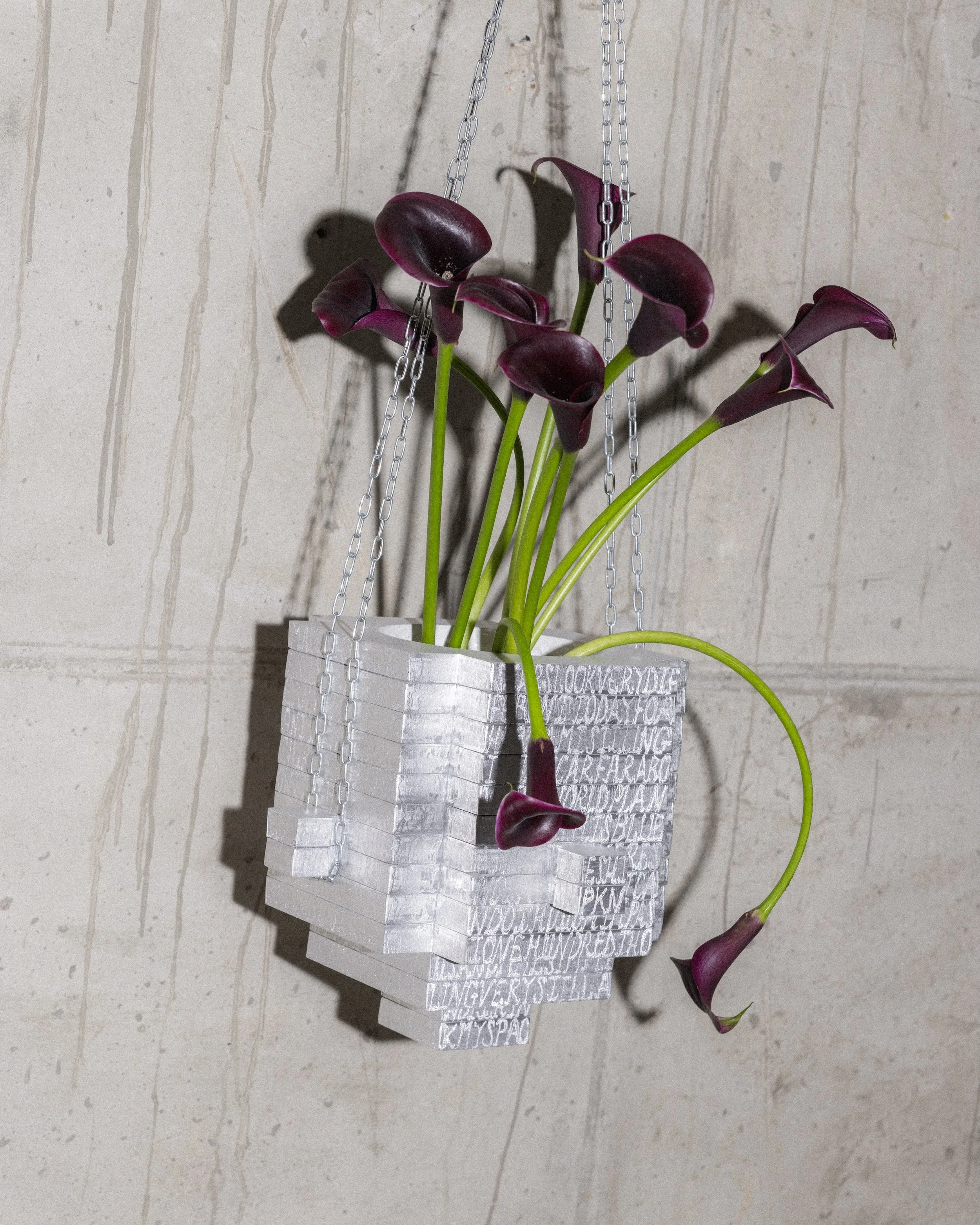
Design gallery Slancha asked 10 designers to create a contemporary version of the hanging basket, with designer Romain Basile Petrot engraving his aluminium piece with the lyrics of David Bowie’s Space Oddity (image: Slanca).
Hanging Baskets
Design gallery Slancha launched its first exhibition at LDF last year, Car Boot Sale, a show that celebrated qualities that are rarely at the forefront within design: approachability, eclecticism and oddness. “We got so much good publicity and such a good turnout,” says Findlay Macdonald, who cofounded the gallery with Harvey Everson. “We were a bit intimidated by trying to do that again.” For this year’s festival, the gallery has expanded to two shows – Travel Light, which maintained the open-call format of last year’s show, filling a stall at The Hoxton with accessibly priced objects such as Lewis Duckworth’s chunky aluminium coat hangers and George Exon’s silver ice cream spoons, and Hanging Baskets, where the founders asked 10 designers to reimagine a familiar typology. “We were looking for an overlooked object,” Everson explains, “and my folks are keen gardeners, so it’s a bit of a personal thing as well.” Hosted in the basement of clothing shop Awaykin, the show had more of a typical gallery feel, with higher-end objects on display. Martha Mcguinn’s basket made up of intricate laser-cut stainless steel triangles referenced the shapes of Gothic architecture, while Marc Sweeney’s planter hung from the 4ft-high ceiling like a chandelier. “We had rough guidelines that we gave people size-wise, but some people started throwing them out the window,” Macdonald says. Standing apart from these more ornate examples, Nicolas Zanoni’s wall planter made from yellowed industrial polystyrene waste resembled mottled skin, while Romain Basile Petrot provided a more humorous example of embellishment by engraving the lyrics of David Bowie’s ‘Space Oddity’ onto his aluminium basket. Both Travel Light and Hanging Baskets reiterated Slancha’s skill at making design feel easily understandable, contemporary and fun, providing a space where the field can shed its more pompous trappings and welcome the strange, the casual, and the unexpected.

Bethan Laura Wood adds a new lilac shade to Bocci’s 14p portable lamp (image: Ed Reeve).
Labyrinth Dreams
In comparison to other festivals and design weeks, LDF has rarely flourished as a space for product launches – the result, perhaps, of a relative paucity of domestic brands and the steady erosion of the trade fairs that used to accompany the festival’s programming. This is not in itself a problem (different festivals can specialise in different expressions of design) but does result in a situation in which the field’s commercial underpinnings are often disguised behind thinly veiled installations and exhibitions, rather than more direct displays of new work that are available for sale. It is often a pleasure, then, when a brand does opt to use the festival for an unashamed product launch, as was the case this year with material-led Canadian glass lighting brand Bocci. Bocci’s 14p portable lamp began life as an experiment, but has since proven a commercial success, with the line’s initial batch quickly selling out and the lamp now available in four different shades of glass. To launch the fifth variant during the festival – a soft purple – the brand turned to designer Bethan Laura Wood to create display plinths that might show the product at its best. Driven by a desire to ensure “the protagonist is the 14,” Wood’s curiously geometric plinths proved a light touch, framing the lamp without overshadowing it, and were designed to recall something of the fantasia of Labyrinth (1986), in which David Bowie’s Goblin King Jareth juggles crystal balls that Bocci’s design recalls. In this sense, Wood’s design was well-matched to the 14p, whose designer Omer Arbel has previously acknowledged, for instance, that a central appeal of the lamp is its fantastical “magical orb” quality. In a week that celebrates the cultural and intellectual elements of design, there is also value in acknowledging its commercial and sensorial aspects too – sometimes a beautiful lamp, beautifully displayed and ready to buy, is enough.
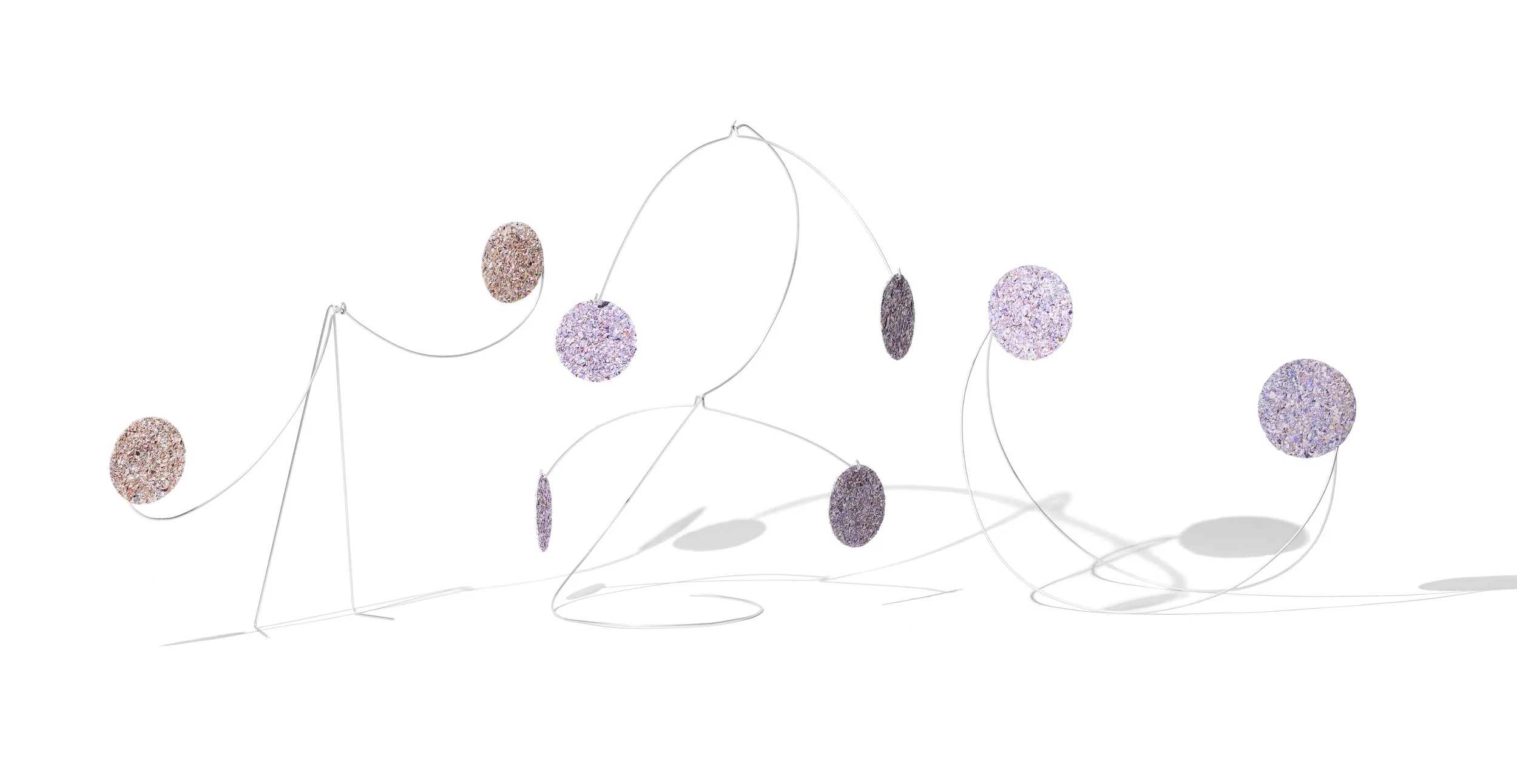
Studiomama’s sculptures weighted with panels of shredded banknotes formed part of the Bank of England Museum’s group exhibition, which explored questions of value (image: Dennis Pedersen).
A Kind of Exchange
If much of the design that is exhibited during the festival is flashy and Instagram-friendly, then A Kind of Exchange, a group exhibition staged by the Royal College of Art in conjunction with the Bank of England Museum, served as a welcome reminder that richer, more knotty interpretations of design do not always lend themselves easily to capture by camera phones. Prompted by the bank’s role as a driver of financial exchange (with the institution having made its waste banknotes – both shredded polymer and paper – available to exhibiting artists as materials), the exhibition is a display of work that examines the wider questions of value and connection that this raises. The results, unsurprisingly, proved fascinatingly complex. Adam Knight’s (RE)MONIAC, for instance, offers a critical study of inequality, neoliberalism and trickle-down economics, recreating the 1949 MONIAC computer, an analogue device that modelled economies using the flow of water, but now equipped with a foam cast of Margaret Thatcher’s hands that seem to tightly grip its fiscal flow. Elsewhere, architect Sam Jacob imposed a recreation of Sol LeWitt’s Forms Derived from a Cube atop a mortgage document, entangling architectural production with the financial systems that enable it, while Studiomama has created stability sculptures that are weighted with panels of shredded banknotes, their financial value recast in tremulous, precarious physical form. Staged in the museum’s space in Bank, A Kind of Exchange fell outside of the festival’s traditional beaten path, and its works proved too multilayered to admit of easy visual summary in slick photographs for social media. Nevertheless, in a week dedicated to public consumption of design, it is helpful to recall that the field need not always be digestible and readily accessible – sometimes, design can also tackle topics that are complex, loaded with sociopolitical value, and which do not admit of easy summary.
Words Oli Stratford and Helen Gonzalez Brown