
From Rouge to Rage
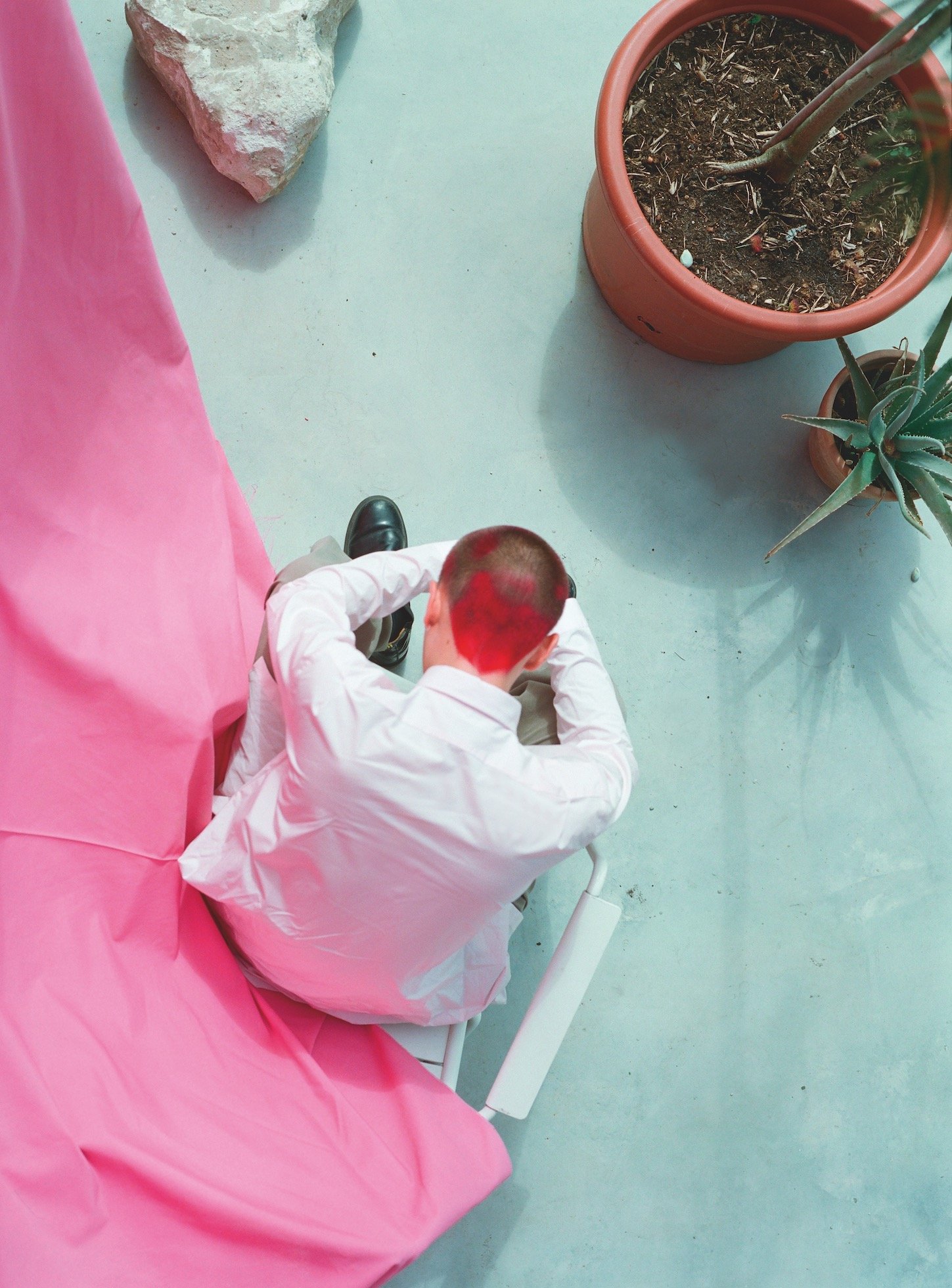

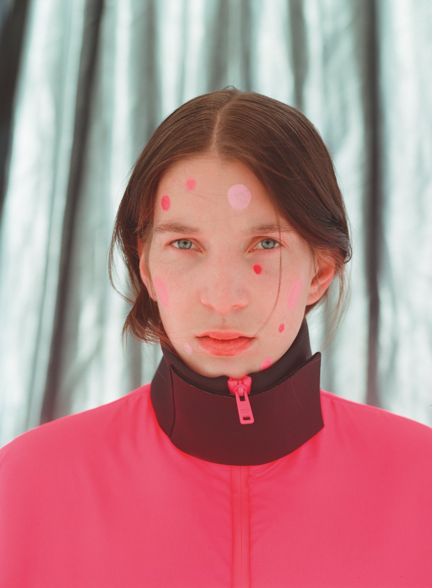
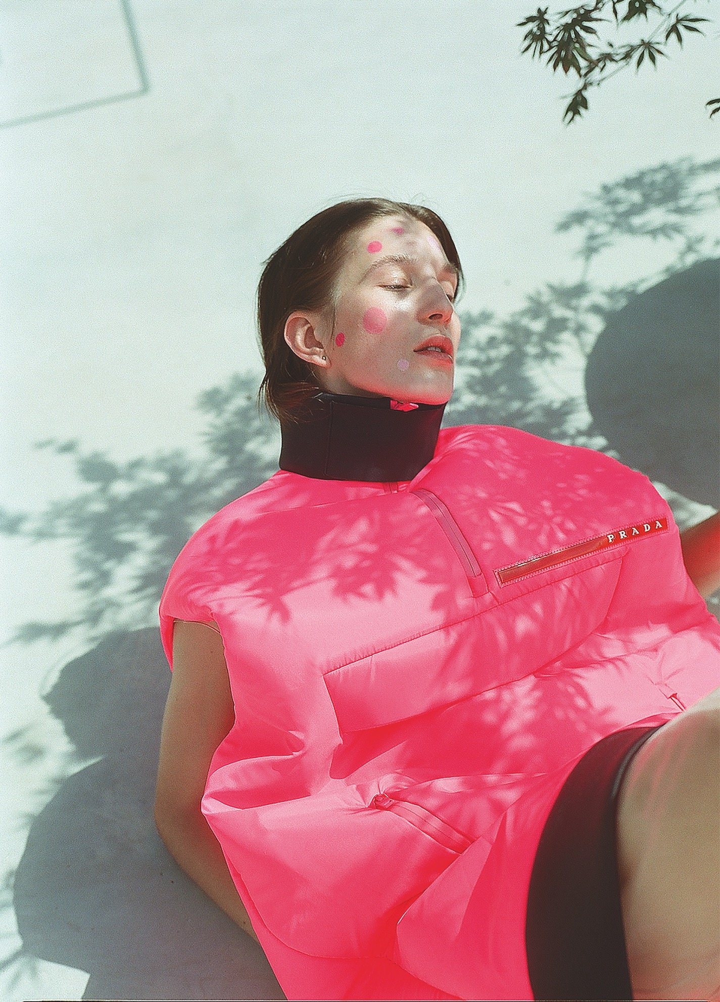
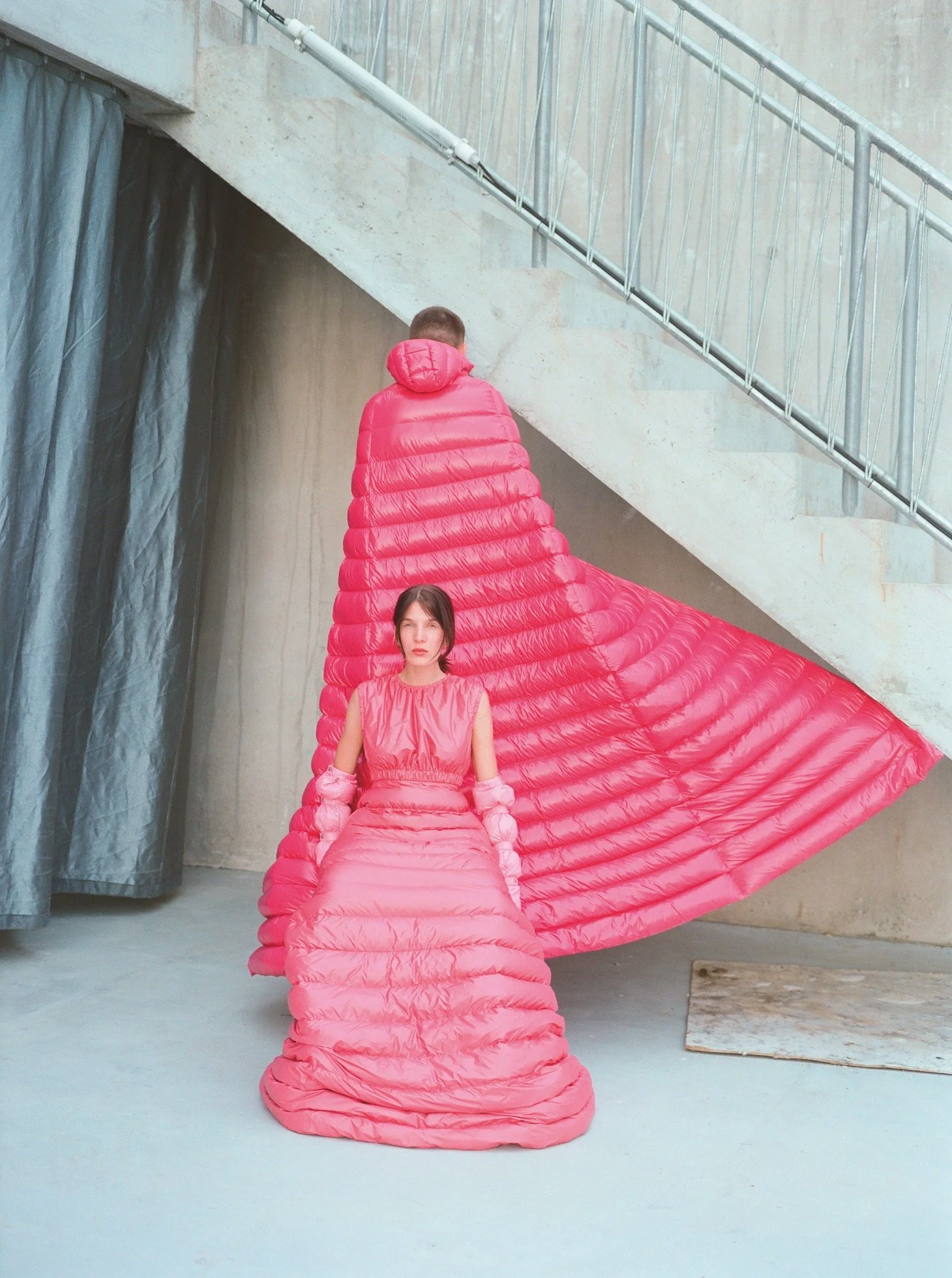
Round about January 2016, we became very interested in the colour pink. And we weren’t alone: the streets were full of pink pussyhats, placards, and other forms of protest gear, all mobilised in response to Donald Trump’s inauguration. This politicisation was all the more striking because a particularly inoffensive version of the hue – originally marketed as rose gold, but now universally known as “millennial pink” – had dominated recent fashion cycles. As design historians, we were fascinated by how the colour could take on drastically different meanings, all of which were nonetheless totally legible to the general public. So, we looked into it.
Given its topicality, we decided to take our interest to social media. The result was our Instagram account, @unthinkpink – “exploring a sensitive subject” – which we have since tried to edit in the associative spirit of the avant-garde fashion designer Elsa Schiaparelli, whose favourite version of pink, a deep fuchsia, she once called “shocking.” A portrait photograph of her, tinted deep pink, serves as our mascot.
About 600 posts in, we have made a few new discoveries, some of which won’t come as a surprise: people really seem to like fashion. And cool chairs. And shiny ceramics. But alongside the eye candy, we have been able to get into some fascinating byways in the history of the colour. For example, we were surprised to learn that there was no fixed conception of pink until the 18th century. In one way, this makes sense. English doesn’t have a comparable term, for instance, for a light blue (although languages such as Russian, Greek, and Modern Hebrew, do have specific words for that colour). But it is still intriguing to consider why pink emerged with its own distinct, fleshed-out personality, round about the 18th century.
One point of origin is technical in nature. A bright pink enamel was invented to paint glass, most likely in Germany, in roughly 1670. When this colourant made it to China, it was applied to porcelain, which was then re-exported, before being imitated in turn by European ceramic manufacturers. The products of this cultural boomerang eventually came to be called famille rose, and they were intrinsic to the rococo taste, which also featured an iconography of blush-cheeked figures – cherubs, children, ladies and gentlemen alike.
Madame de Pompadour, Louis XV’s favourite mistress, famously loved pink, and she had a pink porcelain china service made at Sèvres, for which the manufactory developed a new colour, inevitably dubbed Rose Pompadour, in 1757. Yet frivolity and style were not synonymous with femininity during this period. In Madame de Pompadour’s time, pink was more apt to be associated with luxury than with a particular gender. It would take more than 150 years before girls started wearing pink and boys started wearing blue.
Babies and toddlers had been dressed primarily in white throughout the 19th century, owing to its practicality. White clothing could easily be boil-washed and bleached without fading. It was also the colour of innocence. Though we endow children (possibly to their detriment) with strong, visually-coded gender identities today, in Victorian times, gender was understood as an aspect of adult sexuality, and thus something to keep at bay during childhood. Pale colours, including pink, blue, pale yellow and pale green, were interchangeable choices for nursery décor and clothing throughout the first decades of the 20th century.
It was the emergence of colour as a new marketing tool by manufacturers, department stores and advertisers during the 1930s, 40s and 50s that ultimately cast pink as the universal feminine hue. It became the colour of choice for little girls’ toys and clothing (Barbie first appeared in 1959), as well as for certainproducts aimed at women. Appliance-makers soon borrowed the colour from car design and produced pink stoves, refrigerators and dishwashers, with flooring companies and countertop-makers like Armstrong and Formica producing surfaces to match. Tupperware already came in pink in the 1950s. Clothing and cosmetics in the colour were plentiful, and foods such as cake icing and Jell-O could add pink to a party spread thanks to postwar innovations in food science. It was also First Lady Mamie Eisenhower’s signature colour.
None of this was an accident. At the very moment when women were thanked for their wartime service and dismissed from the assembly line in 1945, their return to the home front became part of a massive marketing effort, calculated primarily to sell houses and the durable goods needed to furnish them. The rescripting of pink as feminine and girlish was part of a concerted campaign to encourage US women to dedicate themselves to lives as homemakers. Pastel colours subtly but unmistakably marked the postwar home (and, by extension, the postwar housewife) as totally childlike, dependent and in need of a husband for support.

Now, with the protest movements of recent years, we arrive at a forceful twist in this tale. To some extent, pussyhats and related uses of the colour are simply a strategic re-appropriation of a stereotype. Rather like the rehabilitation of the word “queer” in the LGTBQ+ community, women use pink simply to claim identity on their own terms.
Yet there is some complexity here. A century ago, the suffragettes used a colour scheme of purple, white, and green (symbolising royalty, purity and hope). If contemporary feminists wanted their own symbolic lineage, that would be the obvious choice; instead they have gone for a colour that is at once more charged with sexism, and less stable in its references. After all, it was AIDS activists associated with the ACT-UP movement in the 1980s who first used pink to dramatic political effect, reclaiming the pink triangle used by the Nazis to designate homosexuality as an emblem of empowerment. Conversely, as many activists of Asian, African and other ethnic heritage have pointed out, pink vaginal iconography is itself exclusionary. It’s a more than fair criticism. The only rejoinder might be that pink, these days, has come to stand not for any one gender or ethnicity, but for fluidity and tolerance itself – until, of course, it comes to stand for something else.
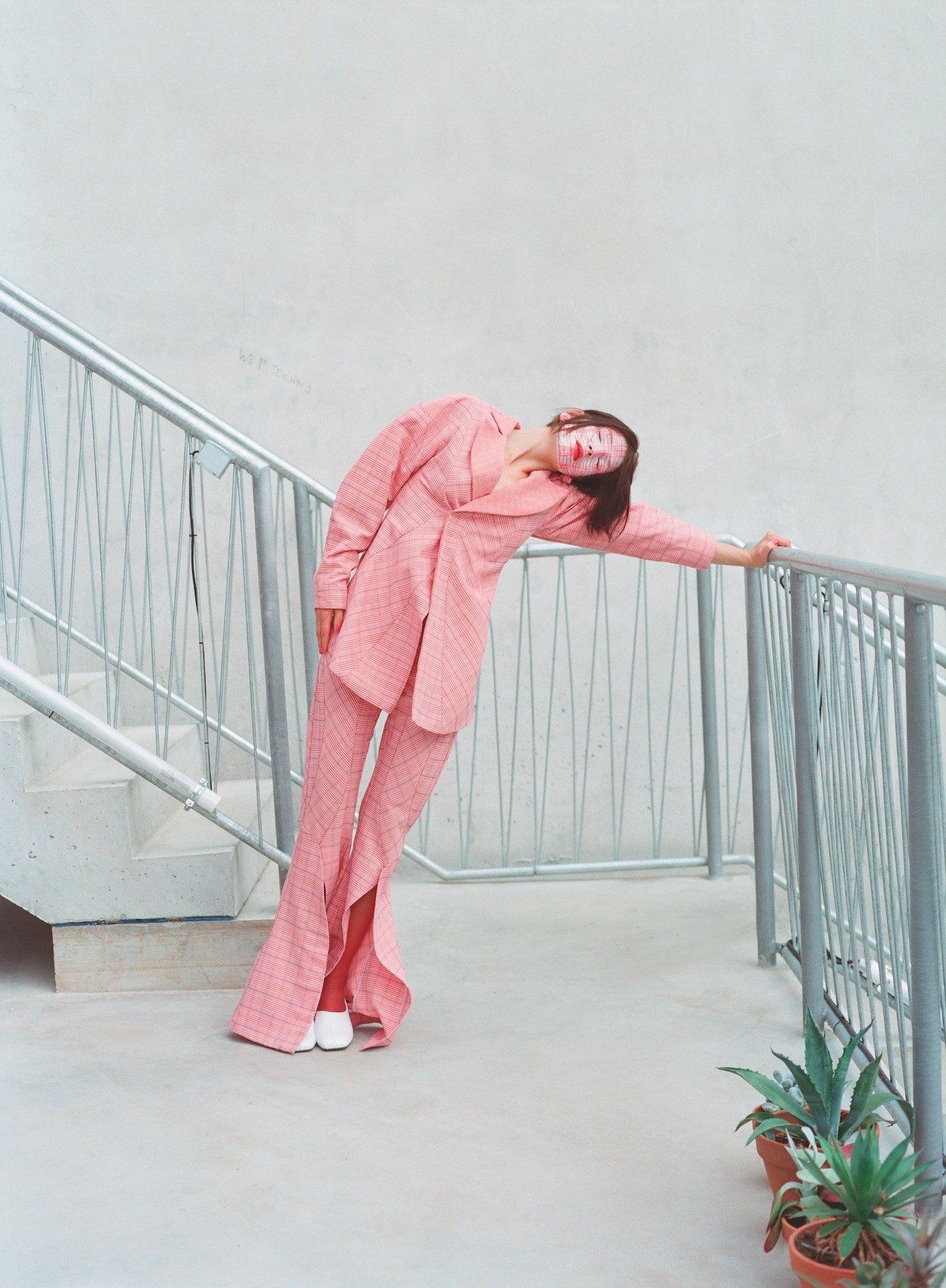
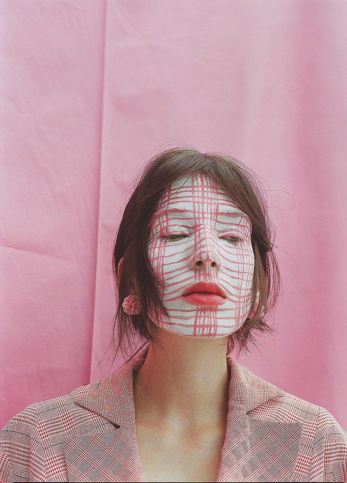
Words Glenn Adamson and Sarah Archer
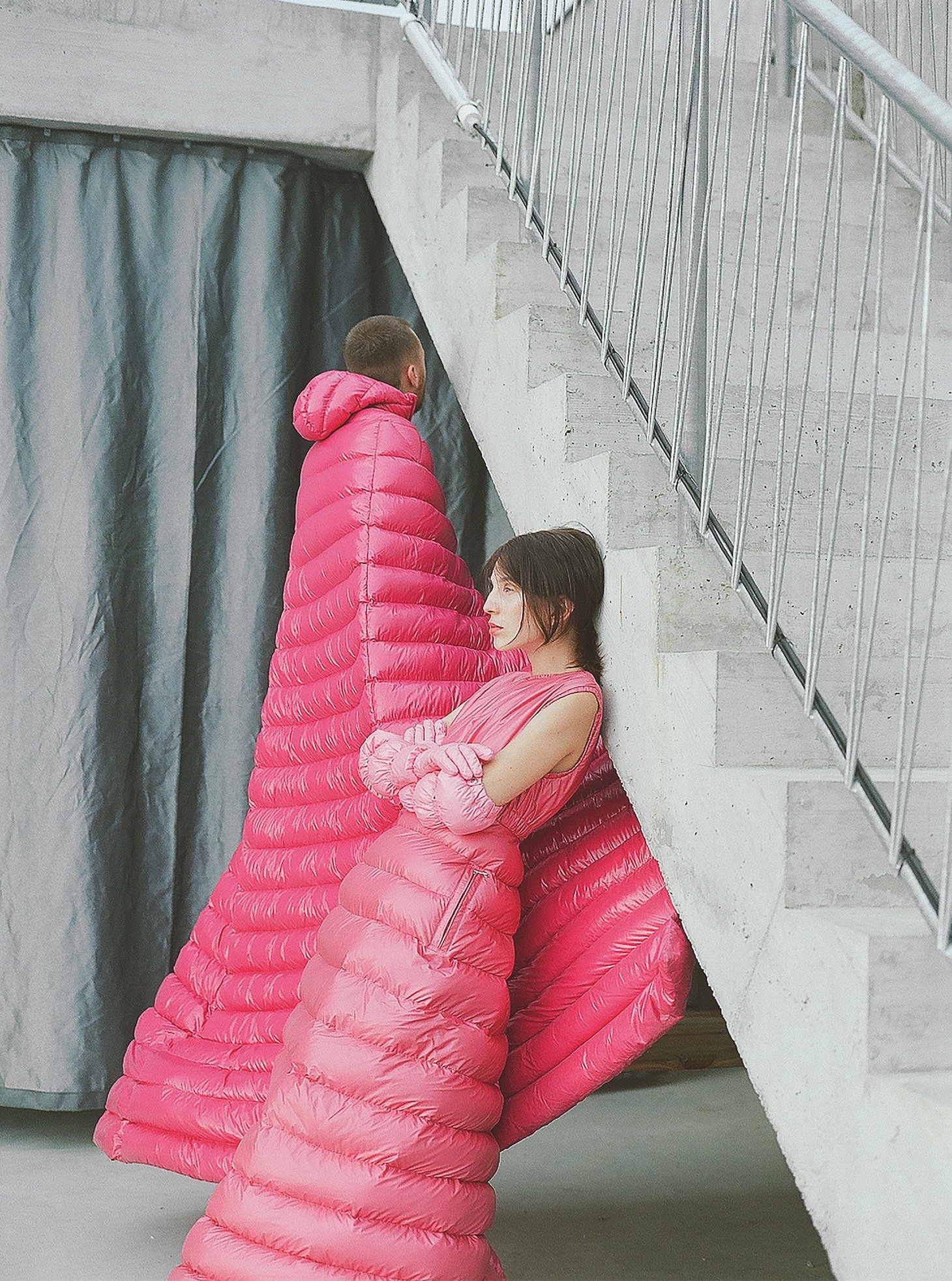
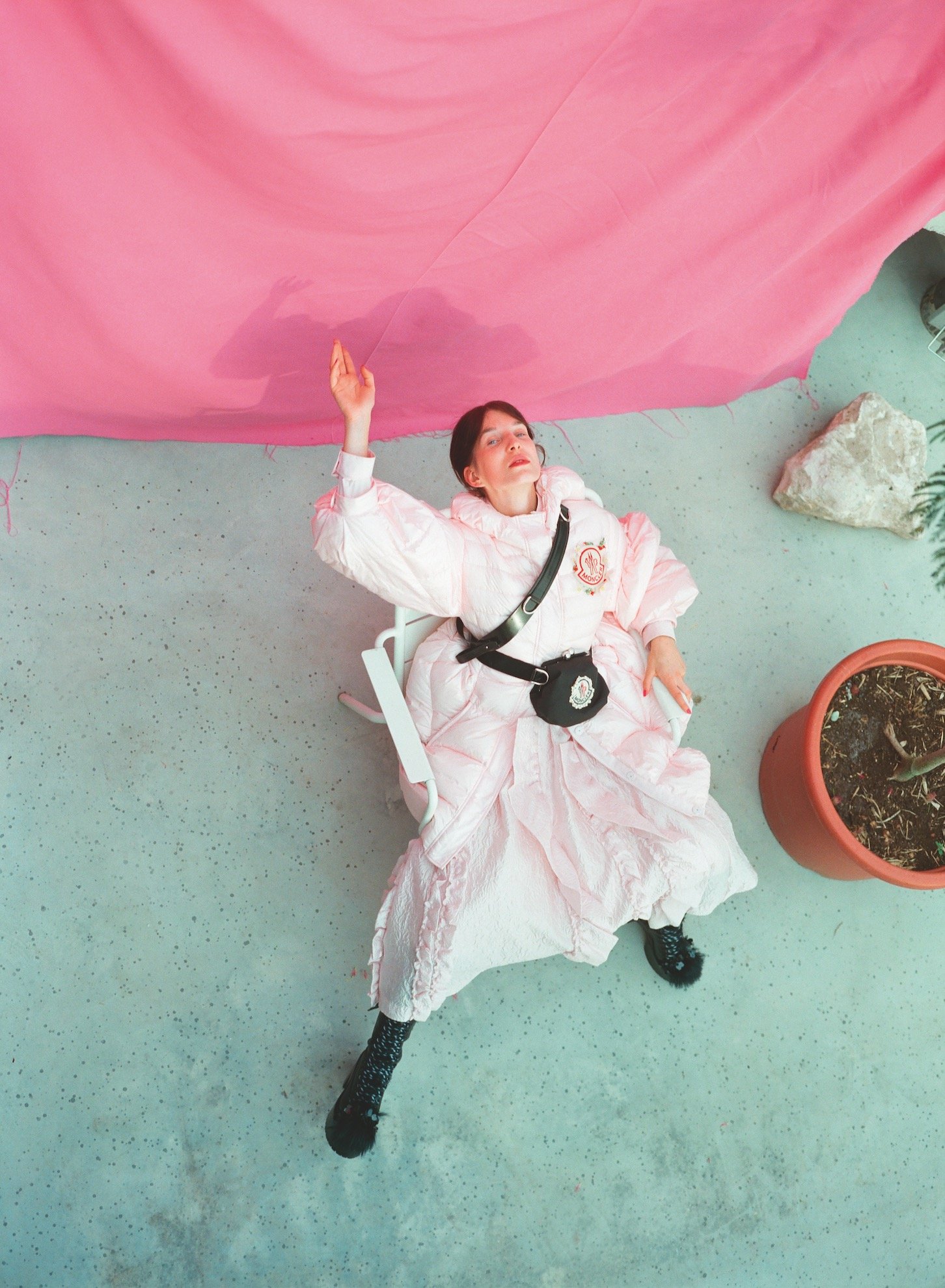
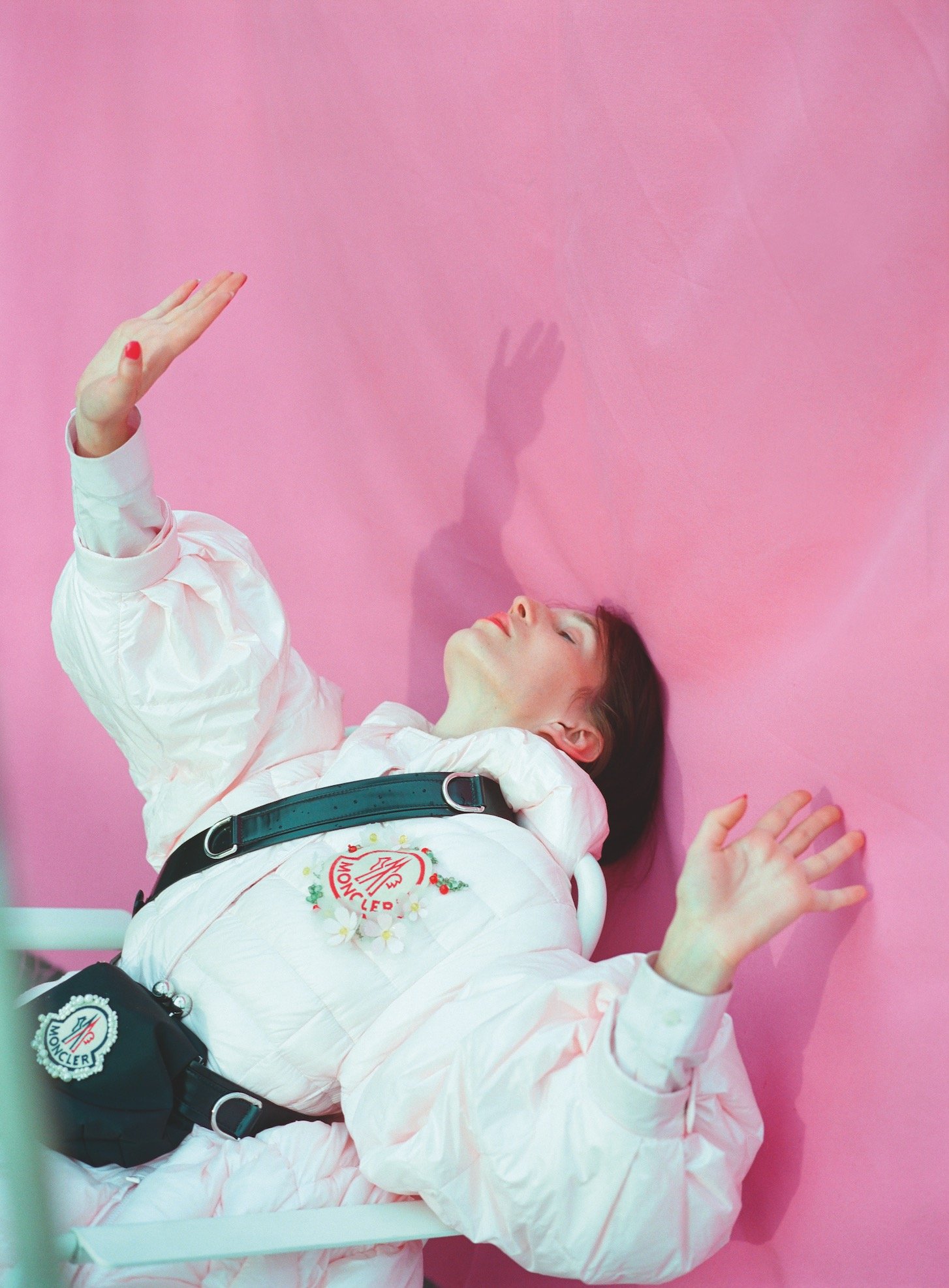
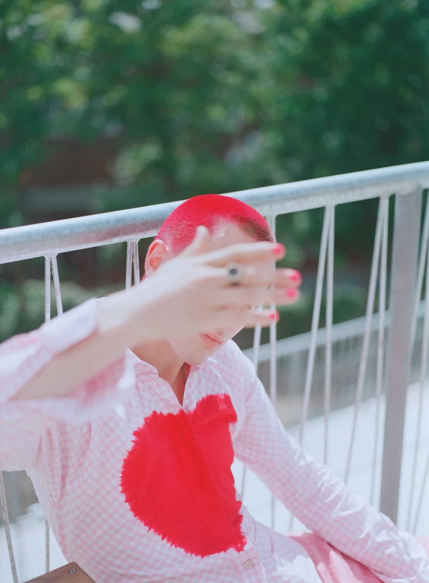
Photographs Theresa Marx
Styling Lucy Upton-Prowse
Make-up Anne Timper
Hair Chris Kurz
Models Veronika Baron and Victor Haisch
Location Terrassenhaus Berlin, Brandlhuber+ Emde, Burlon with Muck Petzet Architects
This article was originally published in Disegno #20. To buy the issue, or subscribe to the journal, please visit the online shop.