Colour as Resource
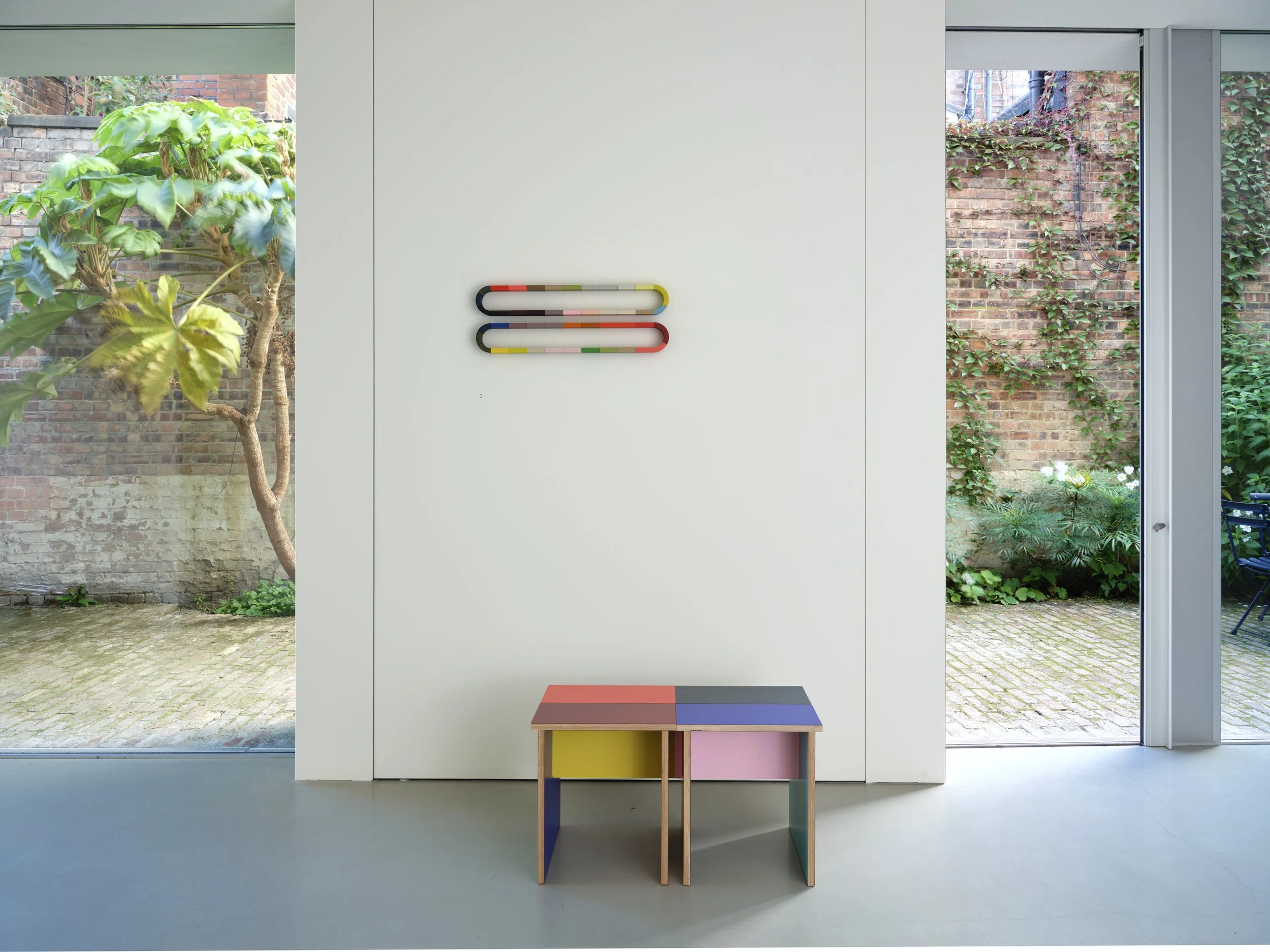
The Combination table by Sophie Smallhorn, displayed beneath a wall-mounted colour composition (image: courtesy of Sophie Smallhorn).
“It was about how much colour could I get into an object,” explains artist Sophie Smallhorn. “A lot of people design something and then put a colour onto it, but I wanted to design something from the beginning to hold the most amount of colour that I could.”
It is not an unexpected design approach for Smallhorn to have adopted. Across her wider art practice, which encompasses public installations, sculpture and print, she has specialised in work that investigates colour as volume, with her pieces regularly manifesting as constellations of primary forms cast in block colours. In works such as Cube, solid forms collage together snugly in lemon, cherry, aqua and gold, whereas Stack layers up tomes of pistachio, coral and gunmetal. “I use colour in a completely intuitive way,” she says. “There's no system there. When I'm bringing a piece of work together, I make the form to hold the palette.”
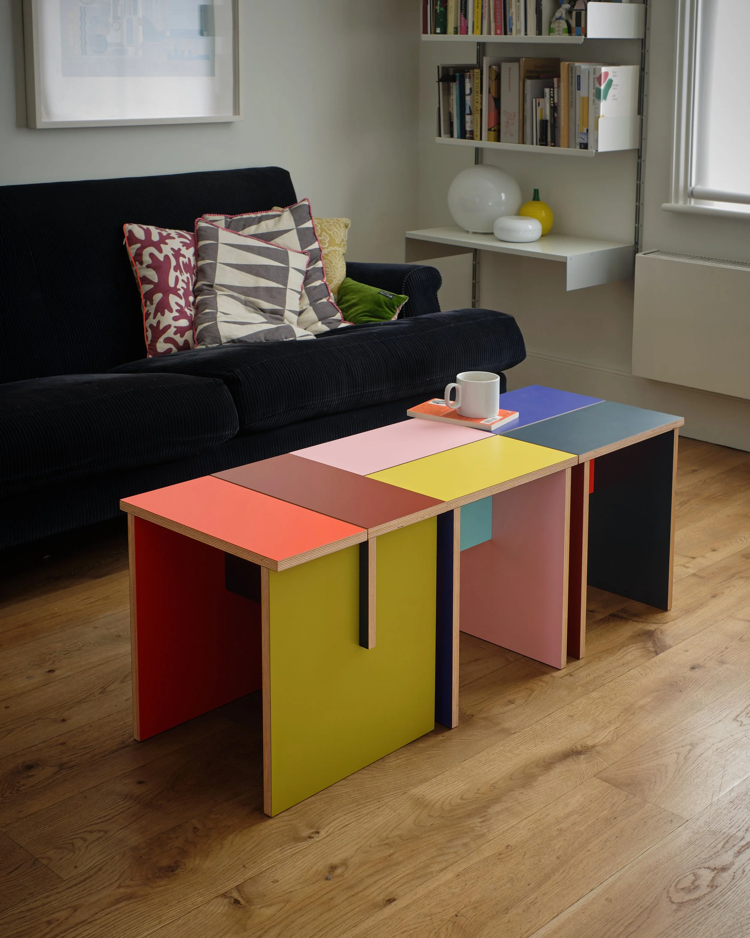
The design’s four colour compositions are assembled from six sheets of MDF, laminated with different colours on each side (image: courtesy of Sophie Smallhorn).
In Smallhorn’s most recent work, however, this approach has been taken out of the realm of art and installation, and set instead within the constraints of serial furniture production. The Combination table, Smallhorn’s first venture into production furniture, has been created in collaboration with plywood kitchen manufacturer Uncommon Projects. Removed from the outcomes of Smallwood’s typical practice, the project has been designed around the material constraints of colour, as prescribed by the production of the plywood from which it is assembled. “It’s a very simple structure where you can quite literally see how it’s slotted together,” Smallhorn says. “That then gives you an opportunity for little slithers of different colour within one viewpoint.”
Across the Combination range, Smallhorn has designed four different colourways, with each table created using five pieces of plywood cut from standard 4×8 sheets. The sheets are FSC-certified birch plywood that are laminated with a different colour on each side, with the individual table elements cut from different sheets before being reassembled to create a form made from motley planes of intersecting tones. “While the laminate range is very wide, it is still a determined palette, whereas when I paint I can endlessly refine colour,” Smallhorn says. “Working with laminates is a slightly blunter tool, but I can still achieve the same colour balance. I actually quite like working with restrictions.”
Image: courtesy of Sophie Smallhorn.
A previous collaboration between Smallhorn and Uncommon had taken the form of a magnetic poster hanger, with the object created using offcuts from the brand’s wider production. “Then we started talking about what we could do beyond that,” Smallhorn says. “Furniture was actually slightly back to my roots, because that’s what I did at college.” Although executed at a larger scale than the hanger, the Combination range was intended to follow something of the same approach towards material. “We knew that it couldn’t be made of offcuts,” she explains, “but we did want it to be incredibly efficient. The tables are designed around the 8x4 sheet, so the amount of different colours we could get and the amount of variance we could get out of that sheet drove the dimensions of the piece.”
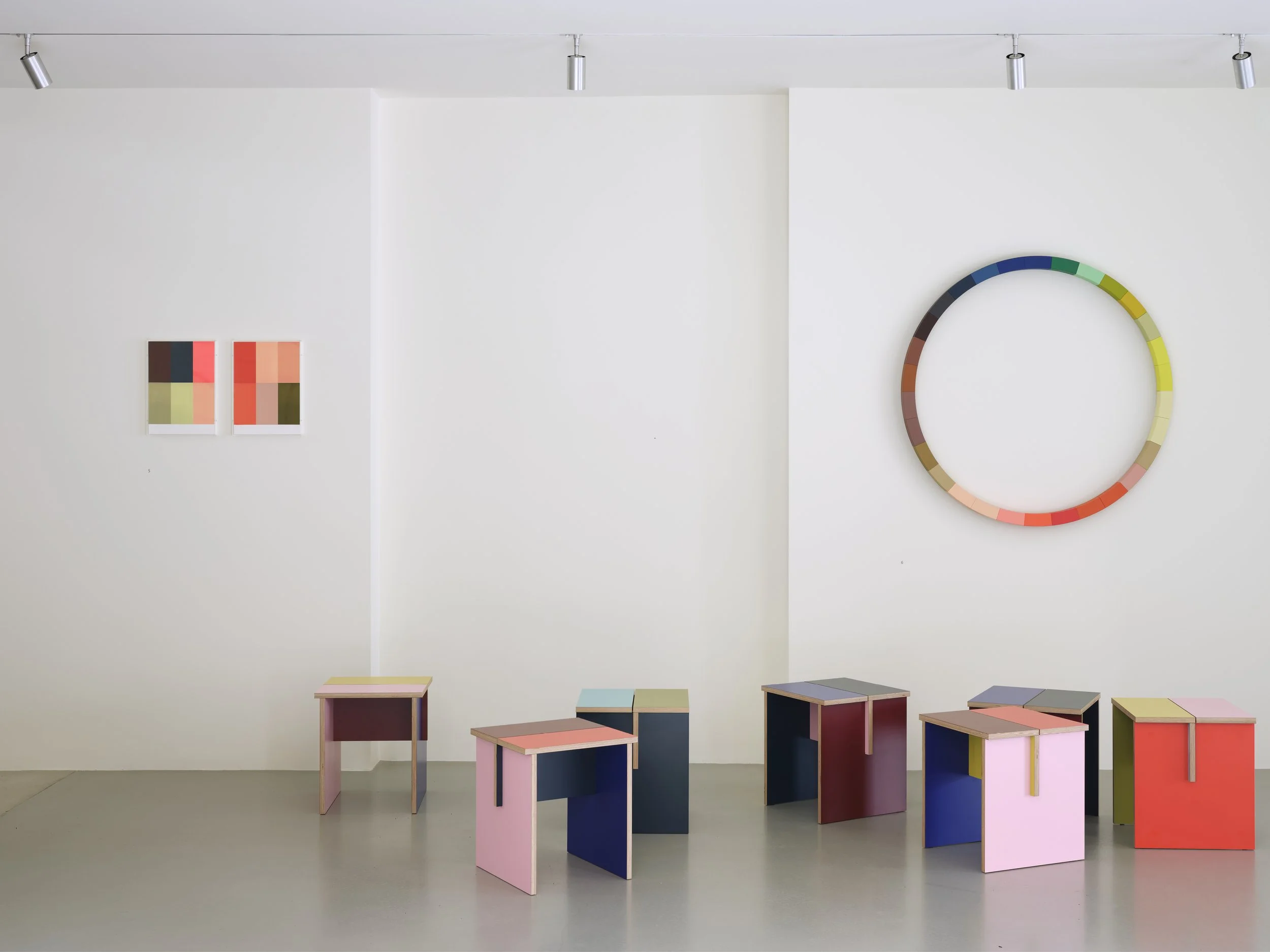
The four colourways of Combination are all different (“One’s slightly darker, one’s more sugary – you know, they’re four separate characters,” Smallhorn notes), but their different mixtures of shades are dependent on one another as a result of the drive to reduce waste from each sheet. The four variants are assembled from six sheets of laminated plywood, with this construction determining the resultant mixture of colours. “It led to a system where if we were using red on the outside of one table, then we would make sure it was on the inside of the next to leave the fewest number of offcuts,” Smallhorn says. “We had to work with that to get four variants that worked well together, and where there wouldn’t be a repeated colour on a single plane.”
Image: courtesy of Sophie Smallhorn.
The result are tables that reveal new tones from different angles, and which have been designed to work in modular constellations, allowing users to group them differently to highlight different volumes of colour. “A lot of my colour work is wall-mounted,” Smallwood notes, “whereas this is an all-round object where you can twist it to get the colours you want. Making furniture that lives within your space is quite different to what I normally do, because it has to be embedded differently in a space to an artwork on a wall.” While all of Smallwood’s work explores colour as volume, the Combination table moves her work into a position of greater dialogue with domestic space. “In whatever I do, whether I'm designing or making art or consulting, the colour is the easiest bit,” she explains. “So a lot always comes back to that: how much color can I get in that object? How many facets can I get into it? If I’m going to design something, I’m going to design it to hold the most colour I can.”


