
Stock Creep

Image courtesy of Eren Sarigul and Stills.
They are on the cover of your book, the side of your bus stop, pasted to the walls of the exhibitions you visit. They are camouflaged within your Instagram feed and folded into the menus at your favourite local restaurant. They are in your magazines, mail and medicine boxes. They’re living in every nook, corner and cranny of the internet, from the places you read your news, to the places you shop, from the sites you use to transfer images, to the memes that you share with long-suffering family members in yet another WhatsApp group chat. You can’t escape them because they are, in short, everywhere.
Stock photographs are one of the most promiscuous products of our time, explains Paul Frosh, a professor of communications and journalism, in his paper ‘Is Commercial Photography a Public Evil?’. Combining genericness of style and ambiguity of content with all the ease of digital licensing, these images openly flirt with the needs of different users and uses. Casually moving across formats and media, they slip seamlessly into our lives and subconsciouses. Stock images have created what Frosh calls “an overlooked but enveloping visual environment”, which has become “the wallpaper of consumer culture.” He argues that the multi-billion dollar stock industry has “successfully acquired dominance over vast terrains of public visual culture while itself remaining out of sight.” We live in an age of stock creep. The systems and platforms designed to collect, catalogue, display and monetise images have left an indelible mark on what we see in the world and, as a result, shape how we see the world.
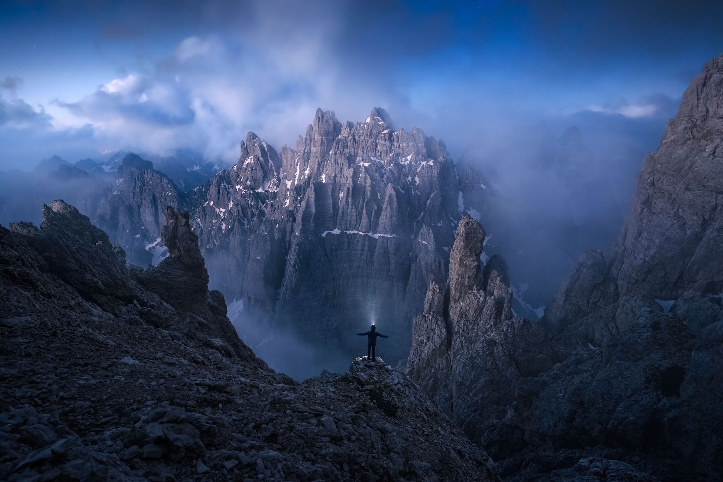
“A Man is Standing O a Mountain Ledge with His Arms Spread Out Facing a Mountain Ridge” by Bruno Pisani (image courtesy of Stills).
I first begun using stock images at university to jazz up hastily-put-together presentations. I would visit the likes of Getty or Alamy to find the image I wanted. Following this, I’d shamelessly screenshot the image in as high a resolution as my computer would allow, before cropping or photoshopping out the watermarks, handily avoiding the licensing fees. I didn’t think too deeply about my blatant thievery at the time, or about who or where these images came from – hey, I was just a poor uni student on a deadline for an assignment that very few people would see. I don’t remember the specific images, but I do remember being told by a tutor that I should think more carefully about my image choices: generic images, he said, were doing a disservice to my work. Oops and noted. I moved away from stock photographs.
When I started freelancing as a researcher and, later, as an assistant curator at a museum, I had to engage more deeply with the world of stock photography. In these roles, I wasted more hours than I care to remember trawling through endless masses of cheesy, mediocre, super-staged images. This particularly soulless activity quickly makes your eyes feel dizzy, your brain numb and, after a few hours, strangely warps your view of the world. With hundreds of tabs open, images start to blur into one. The ability to differentiate the OK from the terrible quickly erodes, and an existential crisis looms large. The question of “What even is a good picture?” quickly spirals into panicked thoughts about whether you are good at your job, if you have any taste whatsoever, and how you ended up here. Finally, you’ll dejectedly arrive at the question of all questions, “Who really am I?!”, before abandoning the task at hand to make a consoling cup of tea and moan to a colleague about those damned stock sites.
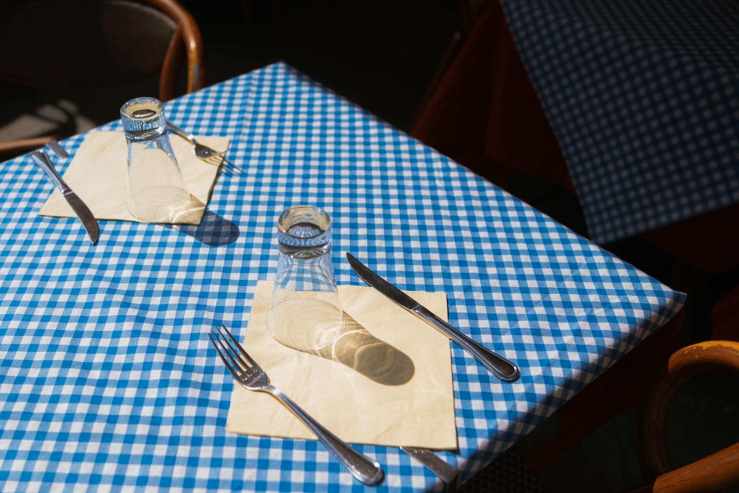
“A Square Table Set for Two with a Cup, Fork, Knife and Napkin” by Roman Fox (image courtesy of Stills).
All this may sound dramatic, but if you’ve ever been tasked with penetrating these platforms’ endless crap, I think you’ll know the feeling. They’re a masterclass in user-unfriendliness. Add to this the complexity of understanding various pricing brackets and licensing criteria, and I say no thank you to all that. I’d much rather engage with stock photographs at a distance, laughing at memes made from them, or scoffing at images of dogs in suits typing at computers. Silly stock photography! Thank goodness I don’t have to deal with that anymore! And yet, as we began working on this issue of Design Reviewed #3, I found myself pitching a story about Stills, the new kid on the very populated stock photography licensing block. 🤦
Stills bills itself as “the new standard in photo licensing”, and since the old standard leaves much to be desired, I found myself intrigued. What would a “new standard” look like? How would it feel? What would it offer? Where, I wondered, would it fit into an industry that Diana Kamin, in her book Picture-Work,[1] argues “has emerged, ballooned, fractured, and transformed” over the last century and is now “controlled by an ever-shrinking number of conglomerates”? Maybe I have as poor a taste in stories as I did in choosing images for presentations, because here I am, about to re-enter the stock photo hell that I’d so gleefully escaped, and I only have myself to blame.
First stop: www.stills.com.
“The ability to differentiate the OK from the terrible quickly erodes, and an existential crisis looms large. The question of ‘What even is a good picture?’ quickly spirals into panicked thoughts about whether you are good at your job, if you have any taste whatsoever, and how you ended up here.”
A smart light grey backdrop, a tastefully white banner, minimal text and lots of gloriously blank space. A classy welcome. The page is covered by a pop-up box, which, although annoying, is similarly smart. In fact, it’s probably the chicest pop-up I’ve ever seen – minimal yet assertive. It declares: “Stills is invite only. This is the only way to secure your invite.”[2] There is a space to enter my email address and I do, feeling like I’m signing-up to one of those exclusive dating apps where the super rich are matched with the mega rich, and then I close the pop-up. Back to the soothing grey.
I am struck by how little Stills’s landing page looks like, or feels like, the other stock photography websites I remember. Where they are crowded, shoving their products in your face in a chaotic scramble, Stills is calm. For a stock photo website, there are not many photos in sight. A glimmer of hope flashes into my mind. Stills, maybe, will be different.
Stills launched in August 2023 as the fifth brand created by its parent company, FM. According to FM’s website, all of its brands revolve around a central mission to “equip creatives with premium resources so they can deliver the most influential work of their careers”. FM began its work in this area in 2011 with Musicbed, one of the first companies to recognise the potential for licensing music digitally. “Musicbed kind of pioneered its space,” says Daniel McCarthy, CEO of FM. In 2015, FM expanded its offerings by licensing high-quality film footage through the aptly named Filmsupply. Once these two brands were established and “really rolling”, McCarthy says, FM turned its attention to a platform for licensing images.
“So, how do you design for designers? What do designers want and need from a stock photography platform? What do designers enjoy? And what do they hate (apart from comic sans)?”
Unlike with Musicbed and Filmsupply, setting up Stills came with a large dose of uncertainty. “It really was a big conversation internally, which was like, ‘Does anybody even need this?’” reflects McCarthy. “It just felt like: ‘Why now? And why really at all?’” The company’s reservation lay in the saturation of the stock photo market. “Getty is a billion dollar company, Shutterstock is huge and Unsplash is free, so there are so many options for photo [licensing].” There was already a lot to weigh up, “and then you introduce AI into the conversation,” McCarthy adds, “[and] you’re like, ‘Does anybody even need photographers anymore?’” But still, Stills exists, so a need was clearly identified.
I continue my exploration of Stills’s landing page, holding my breath for what this stock platform might offer me. “Built for Designers, by Designers,” a text in large font reads. Herein, then, lay the need, nay the audience, that the Stills team had been searching for – Designers with a capital D. When I return to the website a few days later, the copy has been slightly tweaked: “The platform built with designers in mind”. For the record, I think the former is catchier, but either way the core message remains the same: this is a stock licensing platform where designers as users are the POD and USP.

So, how do you design for designers? What do designers want and need from a stock photography platform? What do designers enjoy? And what do they hate (apart from comic sans)? How do they even use these kinds of images in their design process?
A day after I enter my email address into Stills, an email sidles into my inbox. “The wait is over,” it declares in white type laid-over a red-infused image of an astronaut walking across a desert-like landscape. A flicker of excitement. I’m in.
The site is easy to navigate. It feels more like an Instagram feed or photo gallery than a stock photography website. I begin to play around with some search terms, testing the waters. I type in “work”, expecting to find white-collar workers in glassy corporate offices looking manically happy. The first few images, however, are of a leatherworker’s bench with tools laid out. Other photographs show construction sites, a yogi, scenes of farming, a masked person behind a food counter, beekeepers, traffic cones, and a retro, pink hair salon. There is, of course, a photo of a smartly dressed person working at a laptop, but there is not a single image of a middle-aged man looking smugly in charge in sight. Ahhhh, refreshing.

“Wooden Table with Work Tools” by Igor Zacharov (image courtesy of Stills).
The quality and variety of these images are no coincidence. Stills’s content is highly curated because FM believes that what designers need and want are good images that they can use for client-facing projects. Having the best images is the main focus of the platform. “It starts first with curating the photographer and we’re very selective,” explains McCarthy. Photographers can apply to be represented by Stills by submitting their portfolio online. From this, Stills’s team accepts “less than half a per cent” of the many photographers who apply, McCarthy says. Even once Stills has chosen only the cream-of-the-photography-crop, there is a further selection process. “Of the photos submitted by those represented photographers, we’re only accepting a small percentage,” McCarthy explains. “There may be 1,000 photos submitted and only 200 will go live.” In its initial curating process, Stills approached big-name photographers, inviting them to sign up. Highlights of their rota include well-known photographers such as Nirav Patel and Charly Savely, and creative design agency &Walsh. The result of this rigorousnesses is, at least to my eye, that the images appear to be a cut above other stock websites.
In contrast to Stills, most stock sites take a more fancy-free approach to compiling their offerings. McCarthy draws on the example of Getty, the largest and most powerful platform of them all, to illustrate the distinction: “Getty is Getty,” he says. “Getty is great. Getty is 300m photos. Getty shows up at every event – every NFL game, every Taylor Swift concert, every inauguration. Getty saturates the world.” Blimey! McCarthy continues, “which I think there’s a place for and there’s a need for in journalism.” But, he goes on, “what’s hard to find is curated, relevant art that you can begin to build a brand around.” And here we come back to the designers’ needs that were not being met.
“There is, of course, a photo of a smartly dressed person working at a laptop, but there is not a single image of a middle-aged man looking smugly in charge in sight. Ahhhh, refreshing. ”
Once I’ve had a click around and browsed through a few different photographers’ profiles, a significant hurdle in reviewing Stills dawns on me. Simply put, I am not a designer and therefore don’t know if these images are useful to Still’s intended users. Time to phone a friend.
Grace Kim is a Melbourne-based graphic designer who I met in primary school many years ago. She founded and runs Studio 87, which specialises in brand design. Grace tells me that her work “goes from the strategy, to the design itself, and then to rollout, so I do a little bit more than just the graphics.” She uses a lot of stock photography in this process, typically spending about three to four hours on stock sites to source about 30 photographs at the start of every new project. The images give clients a sense of the look and feel of the branding direction, and work to inform their photoshoots. Sometimes, when clients don’t have budget to produce their own images, Grace also helps them license photographs through these platforms.
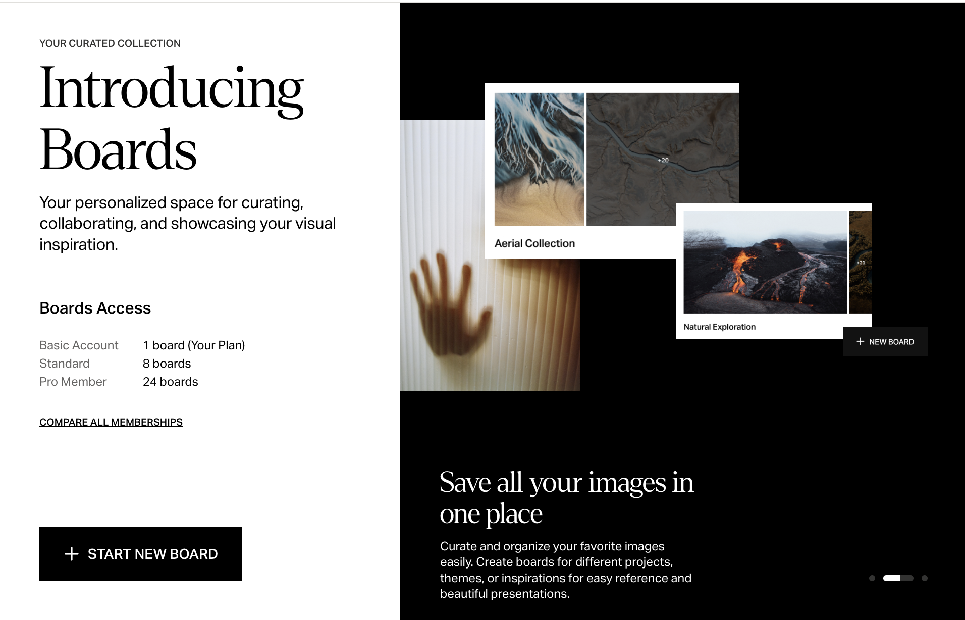
On my request, Grace signs up to Stills. To get a feel for the site, she uses Stills’s photographs on a test presentation deck, something she would typically create for a client. Her assessment? “I like what they’ve done,” she tells me. “The quality of the photos and images are definitely the best I’ve seen.” When I ask her to explain the difference, she says that on other stock sites, “you can either tell that they’re stock photography, or they’re a little bit too commercialised,” although she reflects that “perhaps it’s just gotten to a point where I’ve seen so many [stock] photos that I know where they’re from because the same ones keep circulating.” The images on Stills, on the other hand, she’s never seen before. “They feel like a breath of fresh air.” Importantly, she adds, “they actually look like they’ve been taken by photographers, which is nice.” She also likes the “Boards” feature, which allows you to compile images into a moodboard (think similar to Pinterest), and create a link which you can share with collaborators or clients. This, Grace explains, could streamline certain stages of the design process.
“It feels like an oxymoron to be peddling luxury, curated and exclusive stock photos when the whole premise of the industry is providing generic, multi-purpose, affordable products en masse. ”
To be doubly sure to cover my inexpert tracks, I reach out to another friend, Becca B Jones, a freelance photographer whom I met at university and who has worked for many years as an image researcher at a London-based press specialising in art and design books. Like me, she is not the exact target user of Stills, but unlike me she knows a lot about photography – how to take a beautiful photos, how to assess the quality of images, and what clients of photographers want.
Becca tells me that clients and their audiences increasingly are looking for more than just a single shiny hero image. “They want maybe a series of images, where you get a bit more insight behind the scenes.” These might be blocks of images that aren’t easy to replicate, for example. “Authenticity,” she explains, “comes up quite a lot.” This desire for authenticity is something McCarthy speaks about too. “We haven’t been launched for long, but what we’re finding is that there is a hunger from the market for really relevant, authentic work,” he says. “And not only that, but a place of curation.” These are things that stock photography has typically not traded in. In fact, it feels like an oxymoron to be peddling luxury, curated and exclusive stock photos when the whole premise of the industry is providing generic, multi-purpose, affordable products en masse.
Both Becca and McCarthy point out that a desire for authenticity may stem from a backlash against AI-generated images. McCarthy says that the emerging style of photography is “raw, full of emotion, less tack sharp, less overly produced.” He and his team have noticed that “the best photographers in the world right now are figuring out how to make their photos look like they didn’t try. It takes a lot of energy to shoot something that feels so authentically captured that it feels almost anti-produced.” This style is what Stills is focusing on curating and, when I put this description to Becca, she agrees that it’s accurate, adding that she sees Stills as “very much prioritising artistry, which I feel is quite rare on stock websites. It’s usually quite anonymous.” She highlights the fact that the site has a page dedicated to photographers as one example of this prioritisation. Overall, Becca concludes that Stills has “a really good library of images, creatively, they’re very strong.”
The only major drawback Becca and Grace raise is a lack of quantity. “When I used to source images [for publications],” Becca tells me, “the websites that I would spend the most time on were the ones which had a big bank of images because you want to be able to have lots of options. You might be looking for something really specific. In that case, you need lots of examples.” This is where something like Getty excels – it covers all bases through the vastness of its stock because it’s hard to predict when your images might come in handy and for who and to what end. It is an approach that could be described as: everything for everyone.
“The best photographers in the world right now are figuring out how to make their photos look like they didn’t try. It takes a lot of energy to shoot something that feels so authentically captured that it feels almost anti-produced.”
This all-encompassing approach has a precedent in pre-internet physical stock libraries too. The Picture Collection of the New York Public Library (NYPL), for example, was established in 1915 as a free, public resource for sourcing and borrowing images. Its stock – currently around 1.5m physical images – is broad in content, having been clipped from all manner of places including “discarded books and magazines, from book proofs and film prints, from postcards and travel brochures, from discharged personal and institutional photo archives” writes Kamin, who dedicates a whole chapter of Picture-Work to the picture library’s history and impact. From 1929 to 1968, the collection was directed by Romana Javitz, who believed that the image library was “for use for information, inspiration, or pleasure by its user; its applications cannot be foreseen in advance,” writes Kamin. “Javitz observed the same image put to different use, copied, altered, rephotographed, reprinted, and interpreted widely”. To illustrate this varied use of images, Kamin draws on the example of a 16th-century drawing of beggars by Hieronymus Bosch, which Javitz documented as being used by “an orthopedist who was tracing the introduction of hand-grips on crutches; a fashion designer who used a bag worn by the beggars as the basis for a new type of purse, [and] a public health lecturer who used the same print to illustrate the medieval community’s neglect of the disabled.” Designers, then, used the library, but so did many others.
While Stills is founded on a much more curated approach, McCarthy says that the FM team are adding thousands of images to the platform every week, so it will hopefully not be long until Stills has more to offer in the quantity department. Whether image quality can be retained as volume increases remains to be seen, but things look hopeful. “I think if they keep going, if they get to tens of thousands of images, they’re definitely going to be the go-to for designers,” Grace tells me. “If you have a choice between shitty and good, you won’t go with shitty, so I think it’s just a matter of time.”
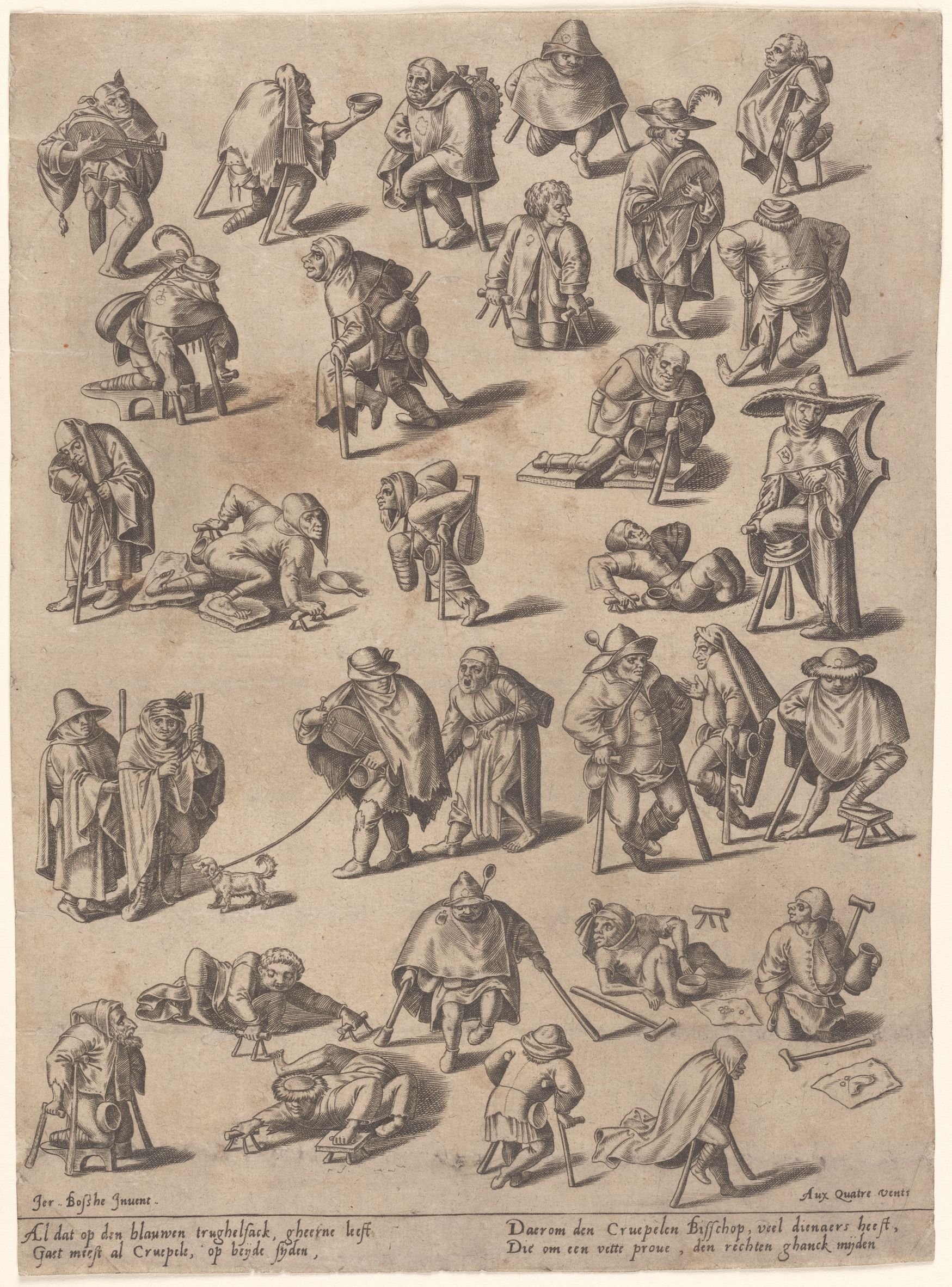
Drawing of beggars by Hieronymus Bosch (image courtesy of the New York Public Library).
With quantity, however, comes the problem of findability. No matter how good your images are, if a user can’t find the images they need, they can’t license and use them. A collection’s infrastructure, then, is as crucial as its content.
To think about how structure influences the success or failure of an image collection, I look to Javitz. As the NYPL’s picture collection expanded in size and scope, Javitz developed “a flexible, straightforward organization system that empowered the user,” writes Kamin, which “openly challenged the bibliographic hierarchy of information” set in place by previous picture libraries. The old system was “logical to a professional cataloguer but impenetrable to the average user (for instance, bays or oceans would be found under F, ‘Forms of Land and Water—Oceans’)”. Instead, Javitz’s new system relied on simplification and was organised by “straightforward subject terms and minimal subcategories.” These were divided alphabetically into topics such as “‘Accidents,’ ‘Butter,’ or ‘Curiosity,’” writes Kamin, explaining that “[sometimes] they are subdivided – ‘Animals—Fighting,’ ‘Animals— Fox,’ ‘Animals—Humans as’”.[3]
Stock libraries build on this, with keyword categorisation and searches at the core of their design. On Stills, as with every other stock site, you can find what you’re looking for by typing a word into a box. Sometimes you might search for a literal thing, say “banana” (which, when I search it, provides me with “29 banana Premium High Res Images”) or more elusive, conceptual or emotive terms such as “friendship”(which bizarrely produces only one image of a fern, although “friend” gets me 50 sweet images of companionship in many forms).

“Water Splashing Out of a Water Glass on a Desk with Other Objects Around Like a Watch, a Calendar, a Pen, coasters, an Apple and a Newspaper” by Lindsey Swedick (image courtesy of Stills).
The NYPL’s team was largely limited to one keyword per physical image, which dictated the folder it would be placed in. One exception to this constraint is when they have had more than one copy of an image. Jay Vissers, a senior librarian, tells Kamin a story about finding “a duplicate image of a urinating cow in the ‘Cow’ file,” which he promptly moved “to the ‘Urination’ file, having noted a sustained public interest in the latter”. Digital image libraries, meanwhile, have the advantage that a single image can be tagged in endless ways, meaning that the aforementioned cow image could be tagged with any number of keywords including “cow”, “urination”, “livestock”, “relief”, “funny nature”, “bowel movement”, “liquid” – well, you get the picture. A further advantage to digital collections is that searching for images can go beyond relying on keywords with the introduction of filtering categories.
Playing with Stills’s filters, I’m having fun checking and unchecking boxes in the filter column on the left, dropping down menus at a whim, and seeing the images on the right-hand side of the page reshuffle accordingly. There seem to be more filters on Stills than other stock websites I’ve come across.[4] On Stills, I can choose the framing; shutter speed; whether the photos are taken inside or outside; the number of people in my images; the camera angle; if the people in the images should face towards me or away from me; and much more. I can select from a list of 24 search categories that include “architecture”, “creative industries”, “sports”. I can search images by colours or hex code or photographer.
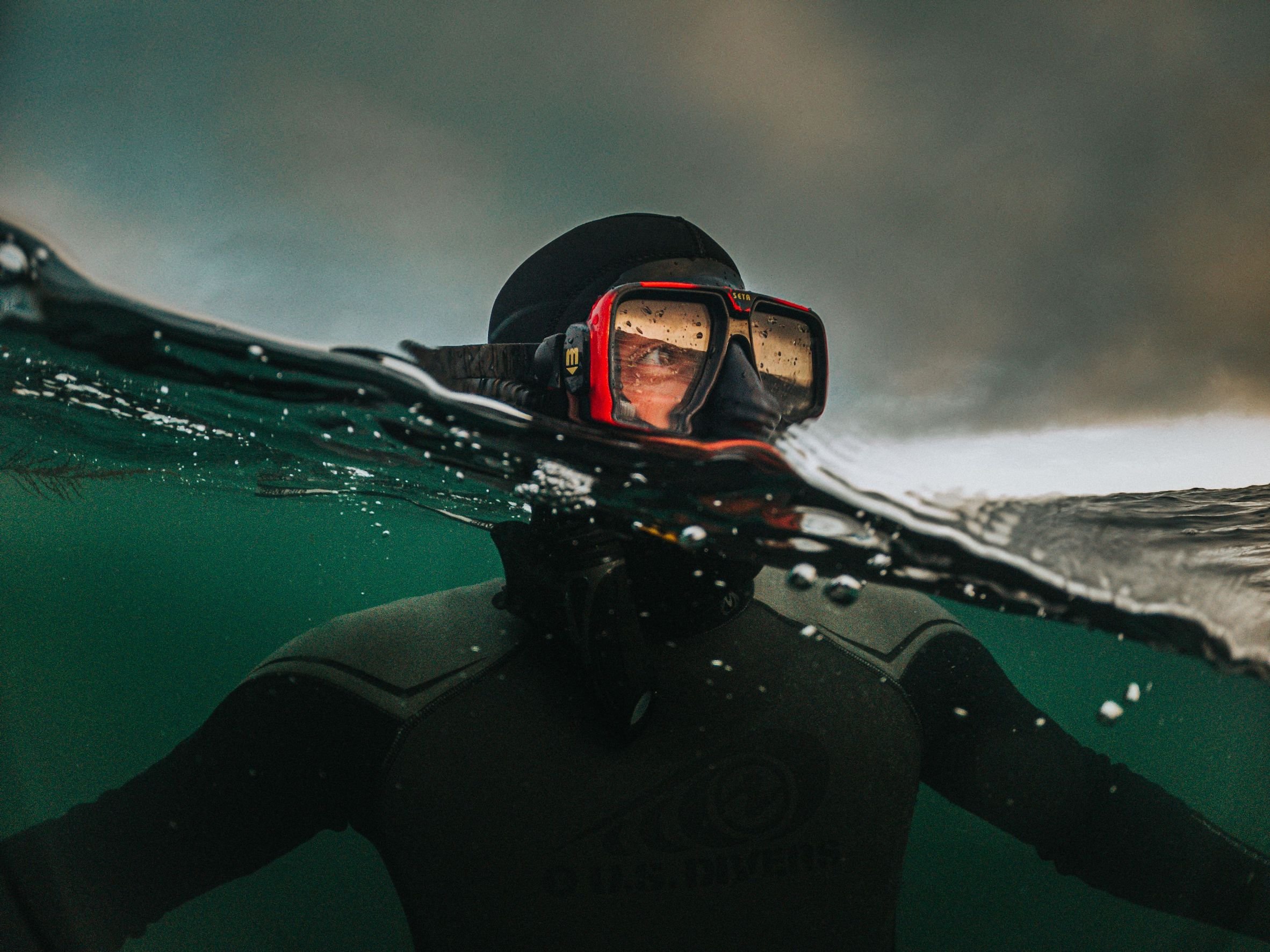
“A Man Swimming in the Sea Wearing a Helmet and Swimming Suit” by Ben Strang (image courtesy of Stills).
Stills’s choice of filters was informed by the central idea of the designer as the user. As such, in creating the site, the FM team set out to discover whether “we really, really really, understand designers and their problems and whether we are solving them properly,” says McCarthy.
He tells me that what is on the website currently is just the start. “There are a lot of features coming,” he explains. “The roadmap is pretty full of tools and features that would be functional for a designer.” And, indeed, since I have started writing this piece, more have been added, including one called “Composition” which is based on designers’ frequent need to overlay images with text. McCarthy explains that “while it is important to sometimes search by colour or mood or emotion, it also is really important to be able to search by layout. Can I put text on this photo? If I can put text on this photo, is it a full-bleed photo? Can I put text on the left? On the right? Is it bottom heavy? Top heavy? I don’t want to spend three hours photoshopping backgrounds and trying to make this thing work in my ad.”
As Composition is a new tool, the FM team will monitor how it is received. “In the end, you’re tracking usage,” says McCarthy, adding that “we’re really trying to shift all the brands to become much more client-focused, and feedback-focused”. A digital interface makes it possible to gather quantitative data about whether a feature is popular or not. McCarthy describes an instance with Musicbed where FM created a pull-out drawer of features, but internal user tests revealed that although “it had been there for a year, nobody knew it existed. As soon as our team saw it, they were like, ‘Oh my gosh, this is a game changer!’” A simple redesign of the way it interfaced with users and, hey presto, it became fundamental to the user experience.
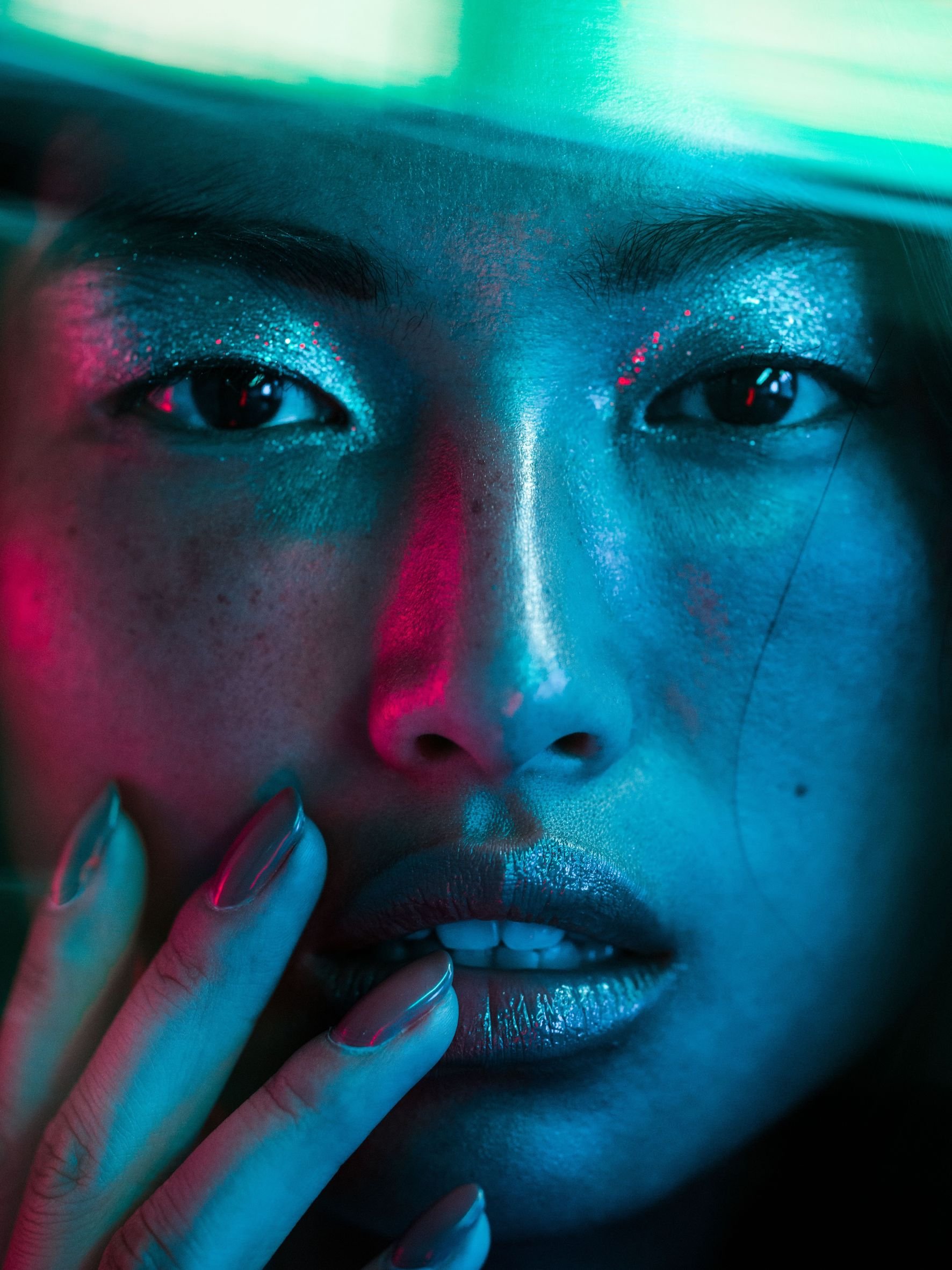
“Asian Woman Touches Her Lips with Her Nail Polished Fingers” by Nolis Anderson (image courtesy of Stills).
I continue to play with the filters on Stills, wondering if there’s a secret like this to discover here too. I click the “people” filter and feel a creeping sense of ethical dubiousness which inevitably comes with the categorisation of people into “age”, “ethnicity” and “gender”. In recent years, the main critique that has been levied at licensing platforms is the sexist, racist, patriarchal and capitalist values they perpetuate and, as such, uphold. “Traditionally, the stock system is often accused – by clients and industry insiders as well as critics – of encouraging conservatism and the constant reproduction of formulaic images which reflect, construct and reinforce cultural stereotypes,“ writes Frosh in his aforementioned (and provocatively titled) essay ‘Is Commercial Photography a Public Evil?’. As we are strongly influenced by what we repeatedly see, peripherally or otherwise, stock images impact what we value as a society and what we don’t. While this critique generally pertains to the content of photographs, the filtering tools and design of these sites play into this too.
Frosh continues, arguing that this perpetuation of stereotypes is seen by many “as something which can only be resolved by eliminating stock photographs (along with the stock industry, and perhaps, ultimately, capitalism).” But then he offers an alternative, more nuanced, option. “Another solution is to intervene in order to generate more and more varied stock photographs and categories, including categories that cut across existing categories.” With this approach, he argues, stock photography has the potential to become a public good, with the power to change our visual culture for the better. We already see this happening with alternative image sourcing platforms being founded by community groups and organisations to address some of the gaps in the stock giants’ collections. The Gender Spectrum Collection, for example, was established by Vice in 2019 “after noticing a scarcity of stock imagery that realistically depicted transgender and non-binary people.”[5] Large stock photo sites also seem to have begun to address their rotten roots and expand their representation and diversity. Kamin gives the examples of Getty’s 2014 Lean In campaign, which was a “collection of ‘powerful’ representations of womanhood, implicitly acknowledging the previous lack of these types of representations.”
“Traditionally, the stock system is often accused – by clients and industry insiders as well as critics – of encouraging conservatism and the constant reproduction of formulaic images which reflect, construct and reinforce cultural stereotypes.”
Stills was presumably created with knowledge of this critique in mind, and because I’ve been generally impressed with its content, curation and range of filtering options, I am genuinely surprised when I drop down its gender filter to see only “male” and “female”. When I ask McCarthy about this, he looks thoughtful and makes a quick note to himself on his notepad. “That’s a great call out,” he replies. “We’ve talked about it a lot.” He explains that complications arise with categorising gender specifically, because “the talent [models and photographers] don’t tag their own photos.” Instead, it is a team of contractors who do the tagging. “So then it becomes [a question of] what does the talent look like? It’s really complicated with race [too] because you’re like, ‘What do you mean what do they look like? Right? Do they look Black? Do they look Asian? Do they look female?’” All these questions, he says, come with the risk of causing offence and with liability issues. “It really is just trying to make sure, I would say, that on the one hand you’re trying to tag the photograph properly, but on the other hand you’re also trying to be very careful not to try to tag it improperly. It gets kind of complicated.”
This complication of categorisation of people has arisen in the NYPL Picture Collection too. Kamin writes about one folder that was reclassified in the early 2010s to “transgenderism” in order “to respond to public inquiry and to redress previously harmful classification decisions, such as the placement of images of drag performances under ‘Impersonators’.” This was revised again in 2022 when the librarians noted that “‘transgenderism’ was not the preferred term in the transgender community,” writes Kamin. The librarians acknowledge the challenges of classifying images in constantly changing sociopolitical contexts, but confronts these challenges head on: if you design a system of classification, it can also redesigned to be inclusive and adaptable as things inevitably shift and evolve. If physical libraries can be malleable, digital ones can too.

“A Woman is Looking Over Produce at a Street Market” by Josua Stabler (image courtesy of Stills).
“What it comes down to for us,” McCarthy tells me, “is ‘What do the clients want?’ There’s what the photographers want, there’s what the content wants, there’s what the talent wants, there’s what the kind of community-at-large wants – but what are our clients asking for?”
To understand what their clients want, Stills has a feedback forum in which users can make suggestions to FM. “We take our cues from the community.” There is diligent interaction from Stills on this forum, with each comment receiving a reply or further questions from a staff member. The suggestions are tagged so that users can see if Stills plans to implement them. The forum is a curious, insightful and unpredictable place, with posts such as requests for more images of “pickleball content” from Zuhair L; comments such as “LOVE THE CONTENT. Just wanted to say :)” from Susi P; and various suggestions as to how to improve the filters, categories and the user experience. In terms of diversity, users on the forum have requested more images of wheelchair users, more plus-sized models, and more representation of indigenous groups – all of which have slightly grown in number since I began looking at Stills over a month ago. Perhaps the addition of more gender-inclusive tags is just a suggestion away. Stills does seem to be adaptable, the website has developed and changed as I’ve written this piece, and McCarthy seemed receptive and engaged with my questions.

“A Man in a Cowboy Hat Poses on the Grasslands While Dirt is Thrown in the Air" by Lauren Withrow (image courtesy of Stills).
In the end, it again comes back to the need that Stills was founded on – what does the designer, as the user, need? A seemingly simple question, but I have a sneaking suspicion that when you are designing tools for designers, it is not really simple at all. For one thing, it relies on a huge amount of intuition, foresight, user testing, analysis, design development and iterative work. For another, a designer’s needs are not isolated. No designer is an island, because they are asking similar questions to the ones that Stills itself is asking: ‘What do my clients need?’ And then those clients are asking, ‘What do our customers need?’ or ‘What do our users need?’.
Stock images tend to be licensed for designers to create public-facing works – advertisements, websites, posters, banners, social media campaigns and the likes. As such, we are all users of stock image websites by proxy, consuming their photographs whether we choose to or not. Whether we are designers are not. My hope is that if designers have access to better images through more considerately curated platforms like Stills, then, as a result, we (the public) will have a better visual culture and our lives will shift to be slightly richer too – more creative, more beautiful, less generic. But what the users as a public need is a complex question that traverses many terrains. While Stills perpetuates some of the less palatable aspects of the stock licensing industry, it remains early days. It has a chance to address this and, I believe, the willingness to do so. I like to think that Stills will not become just another stock creep on the stock image market.
[1] The full title of the book is Picture-Work: How Libraries, Museums, and Stock Agencies Launched a New Image Economy. It is due to be published by MIT press in November 2023 and is one of the few examples of deep, scholarly engagement that I found about the history of the stock photography industry. It was invaluable to this piece and is a highly enjoyable read.
[2] Since I started writing the piece, the pop up box has changed – such is the chagrin of reviewing online media! It is now (or currently) much less classy. It features a man in a snorkel and reads: “Join Stills. Start a free account.No credit card needed.” The site doesn’t appear to be invitation-only any longer. This makes me feel less special, so I’m sticking to my original experience.
[3] One of my favourite organisational categories of the NYPL that Kamin highlights is called “Rear Views” which she writes “primarily contains images of the back of the human figure.” An image spread in Kamin’s book features a number of photos from this category which are literally just images of people, fully clothed, facing away from the camera. I like its implication of something cheekier than its mundane (but, I’m sure, very useful) reality.
[4] Although, in the name of fairness, I recently revisited Getty and Alamy and there are now far more search functions than there used to be and the sites seem somewhat friendlier in content and design overall.
[5] See ‘Relief’ by Vic Parsons from Design Reviewed #1, in which an image from The Gender Spectrum Collection was used to illustrate the article about chest binders.
Words Lara Chapman
This article was originally published in Design Reviewed #3. To buy the issue, or subscribe to the journal, please visit the online shop.