Best Foot Forward
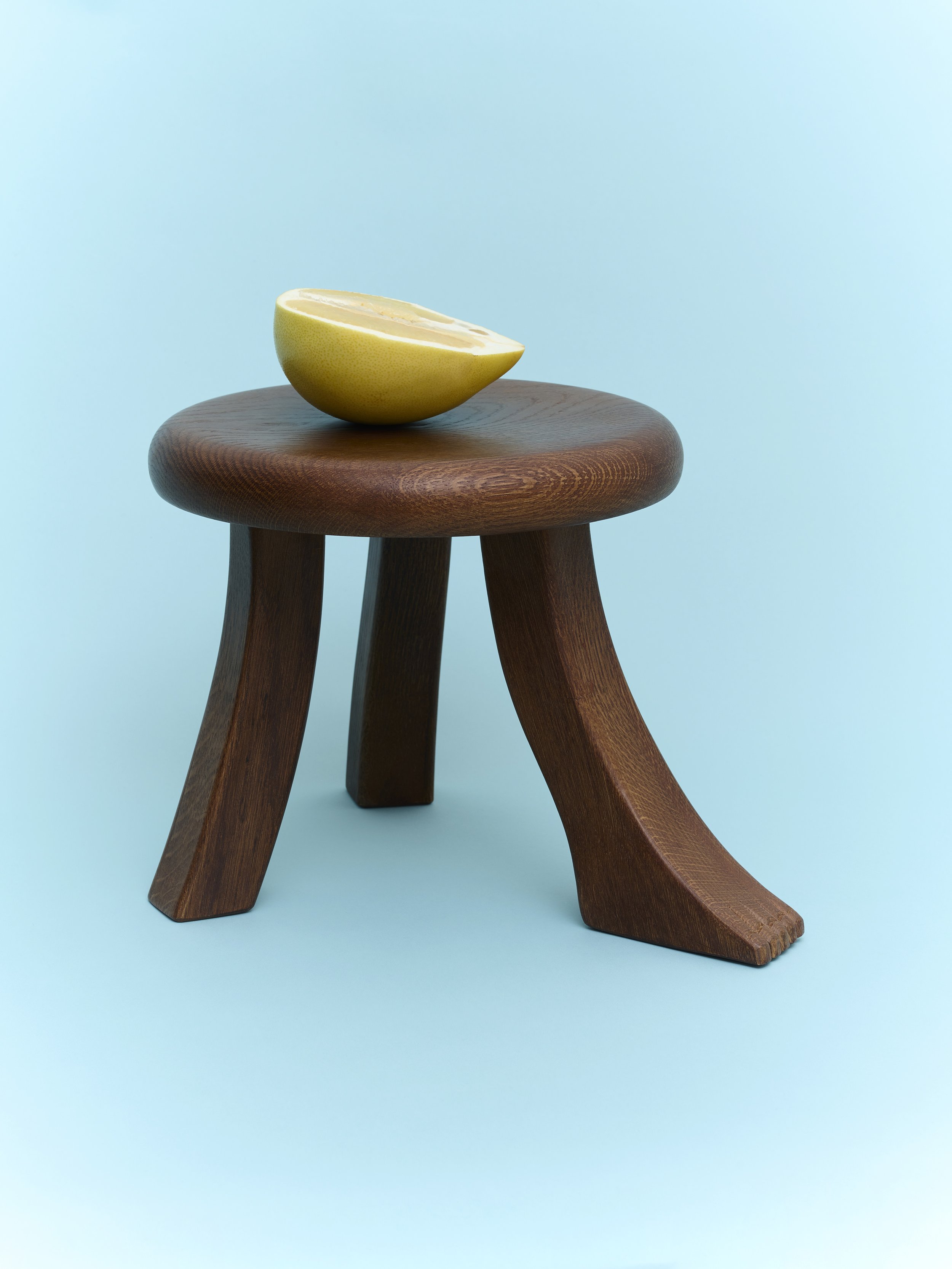
Foot Stool by Project (image: Fabian Frinzel).
When Jurgita Dileviciute moved into a new apartment during lockdown in 2020, three friends – who had met in London, but were now scattered across Europe – tried to help her furnish the flat. “But nothing we found seemed good enough,” Theresa Marx remembers. “We couldn’t find things we really liked.” To pass the time, the four began designing their dream pieces over video call. “We never thought we’d start a company – it was just the joy of Skyping together and creating things.”
When Marx found her work as a photographer drying up, a victim of the pandemic, she focused instead on these designs. The four convinced a furniture-maker to produce one of the pieces and Project 213A was born – named for the flat in which all four members of the group had lived at some stage. This one-time home appears as a graphic element in their logo – suitably domestic beginnings for a down-to-earth brand.
Not long after this came the Foot Stool. At a glance, it recalls a traditional three-legged milking stool – barring the addition of a jaunty foot. To make the piece, they approached a master craftsman based in northern Portugal (specialty: carved crucifixes for church organs). He was not impressed, says Marx. “He just looked at us like, ‘Are you for real? You see the work I do and you want me to make this?’” In the end, he relented, elevating the surrealist design through a mix of craftsmanship, a collaborative process, and the use of local materials: oiled chestnut and oak. Today, as orders flood in from stockists worldwide, he has apparently accepted the creation’s idiosyncrasies.
With its members’ backgrounds in cinema, finance, fashion and photography, Project 213A relies more on gut feeling than formal design expertise. “When I tell product designer friends how we do things, I can see panic in their eyes,” Marx says. “A lot happens by pure luck.” One fortunate accident occurred while designing a bench: lacking materials to make a scale mock-up, they boshed together a mini version. They then realised that, if the bench was turned upside down, it worked better as a magazine rack.
Without furniture or product design backgrounds to draw on, the expertise of the artisans the company works with plays an important role. The cracks punctuating the brand’s Wooden Side Table – a JB Blunk-esque piece hewn from solid wood – were the result of advice from a maker. The original design was crack-free, requiring holes for evaporation to be drilled; allowing cracks resulted in a far more interesting object.
“We want to be respected and taken seriously, but we don’t take ourselves very seriously,” says Marx. “The design industry can relax a bit.” With pieces like the Foot Stool, they remind us that, really, it’s nothing more serious than that: a foot stool. Albeit one that’s putting its best foot forward.
Words Isabella Smith
Photographs Fabian Frinzel
This article was originally published in Disegno #35. To buy the issue, or subscribe to the journal, please visit the online shop.


