Chronology and Its Discontents
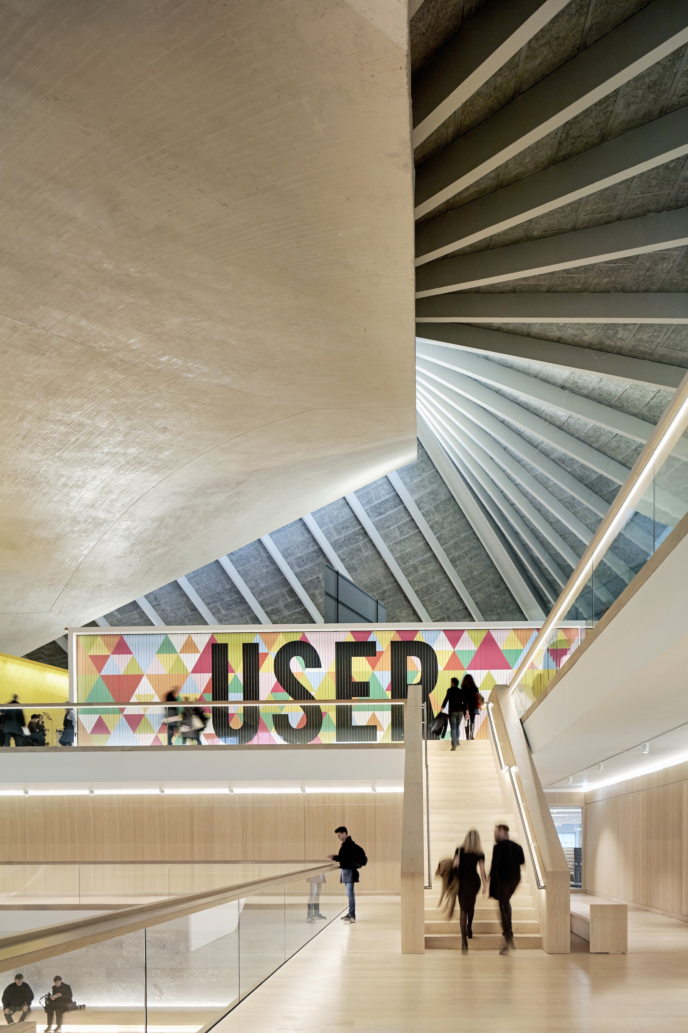
Designer, Maker, User is the current display of the London Design Museum’s permanent collection. It employs a thematic, rather than chronological curatorial approach. (image: courtesy of the Design Museum).
I recently watched Tenet, the latest Christopher Nolan film, which takes as its premise the possibility of temporal “inversion”. Characters are able to reverse their direction in time, experiencing themselves going back into their own pasts, even as the world around them continues toward the future. For the film audience, this is initially confusing. And it stays that way. But out of the morass of the movie’s confused tangle of a plot, I plucked a more-or-less coherent thought: this is what museums do.
Not literally, of course. But Nolan’s idea of time travel as a kind of scissoring action, with timelines sliding past one another in mutual witness, strikes me as an apt metaphor. It’s common enough for museums to be described as time machines, which implies a Back to the Future-style jumping around from one discrete moment to another. But I would argue that this is not really the experience that most visitors have, even if curators think they’re providing it. Very few exhibitions and even fewer permanent collection galleries are focused tightly on a single moment in time. Years, decades, or even centuries, and often multiple geographies as well, are compressed into a single space. Chronological displays are not actually chronological at all, in the sense of a rigid sequence from early to late. Numerous other variables – purely physical considerations like the size and shape of the works, for starters – are in play. In practice, museums with historic collections tend to offer a variegated “pastness”, composed of many temporal overlaps, which audiences implicitly contrast to their own unfolding present.
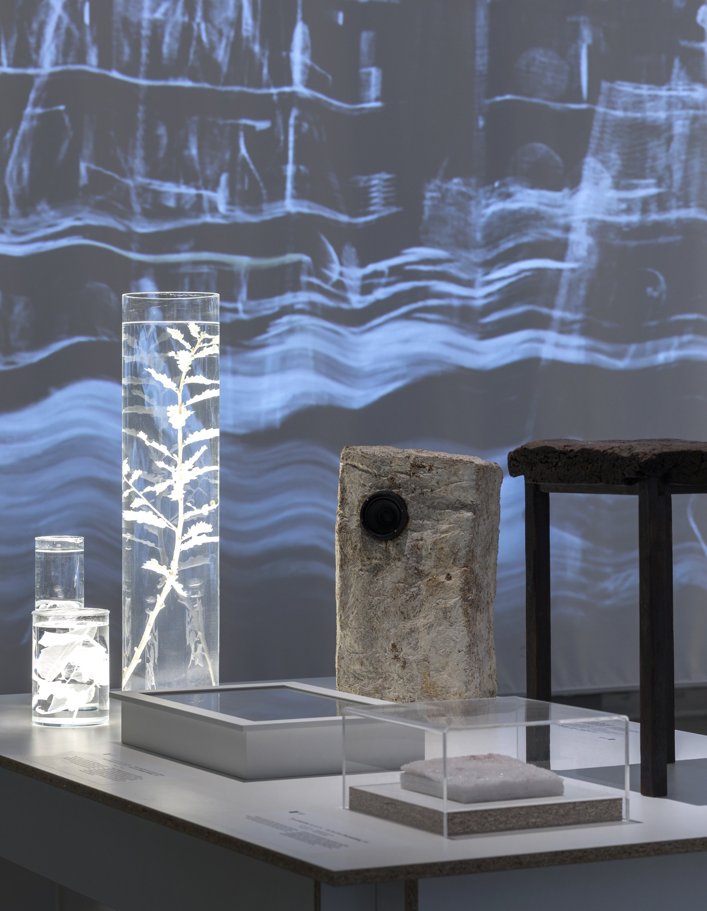
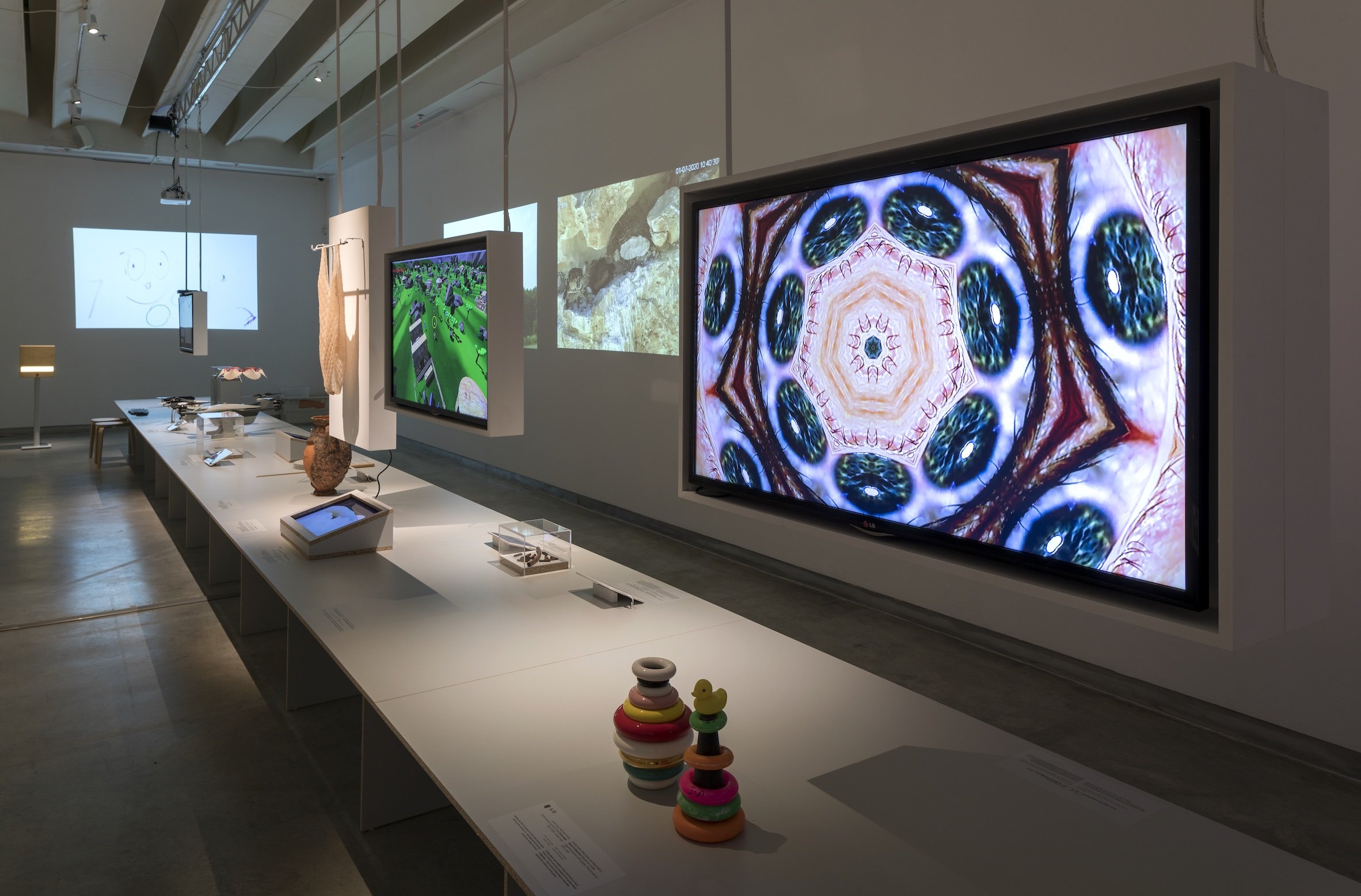
Black Box at Design Museum Holon (image: courtesy of Design Museum Holon).
This topic is timely, if you’ll forgive the expression, given recent events at the V&A. A brief summary, in case you’ve somehow missed it: in February 2021, museum leadership announced a reduction in overall staffing levels, necessitated by income shortfalls resulting from the pandemic. In conjunction with these redundancies, they floated the idea of a thorough curatorial restructuring. Seemingly forever (actually, since the 1890s), the V&A’s departments have been organised by medium: Furniture, Textiles and Fashion; Sculpture, Metalwork, Ceramics and Glass; Theatre and Performance; and Word and Image, comprising paintings, works on paper, and books. The Asian department was an exception, on the grounds of area- and language-based expertise. The new plans would have replaced this configuration with four mega-departments, three devoted to Europe and the Americas – medieval through late 18th century; the 19th century to 1918; and modern and contemporary – with a fourth covering Africa, the African Diaspora, and Asia.
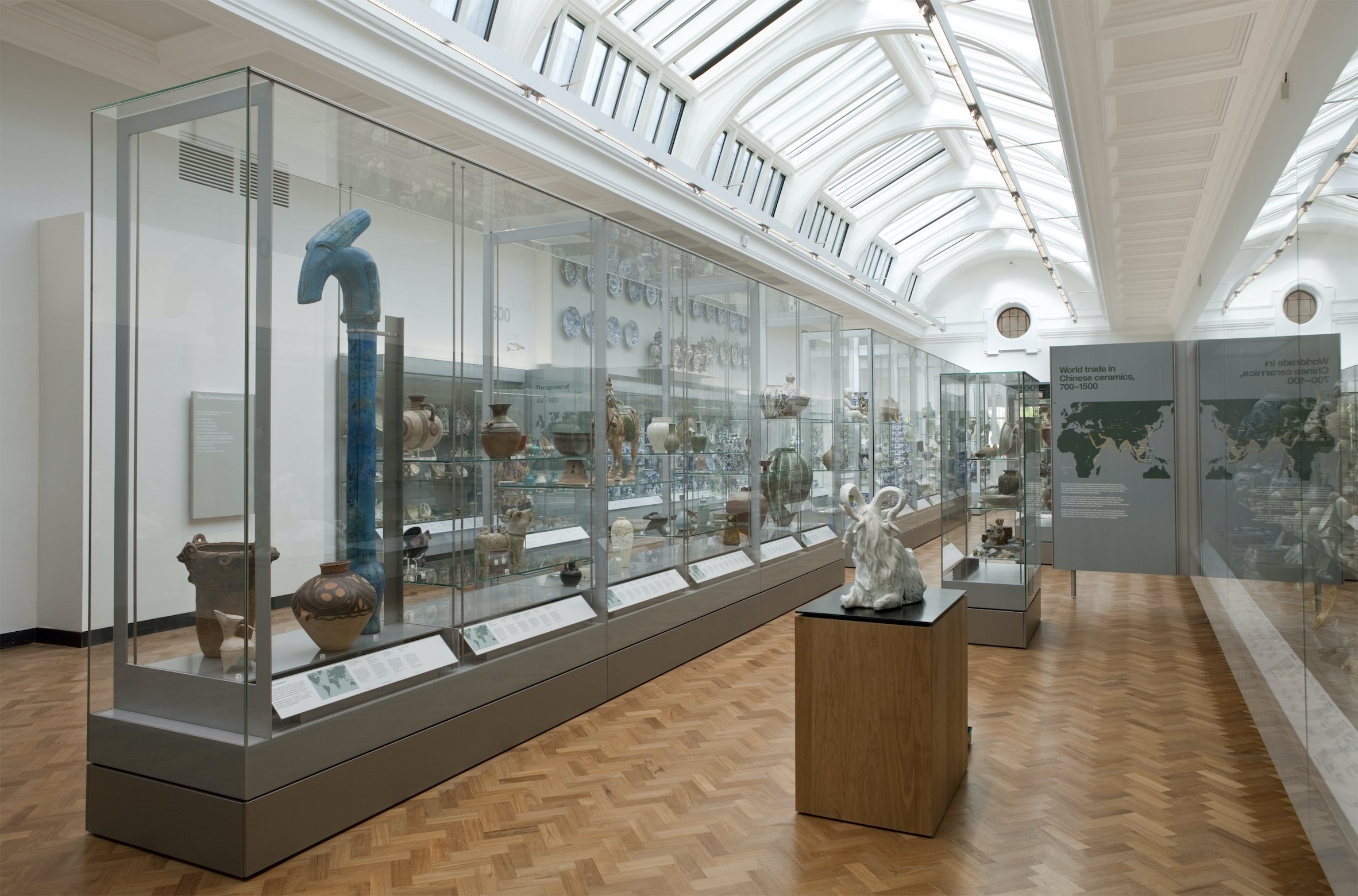
It’s important to note that the V&A’s galleries are already divided into medium-specific and geographical-chronological displays, an arrangement that seems certain to continue into the foreseeable future. Even so, the outcry about the proposed reorganisation was immediate and passionate. Critics both internally and externally objected to the new structure’s “West and the rest” logic, and to the dissolution of the popular Theatre and Performance collections – which had their own museum in Covent Garden between 1987 and 2007, but now seemed like they might lose their autonomous character entirely. The decisive argument, however, turned on the V&A’s unique, medium-based expertise. As my fellow craft historian Tanya Harrod wrote in The Spectator, this is the V&A’s intellectual DNA, and it has probably never seemed more relevant: “Just at the moment when there is widespread popular and academic recognition of the ontological dignity of material things and their creation, it is baffling that the world’s greatest museum of art and design should have its collections sliced along outdated 1066 and All That chronological lines.”
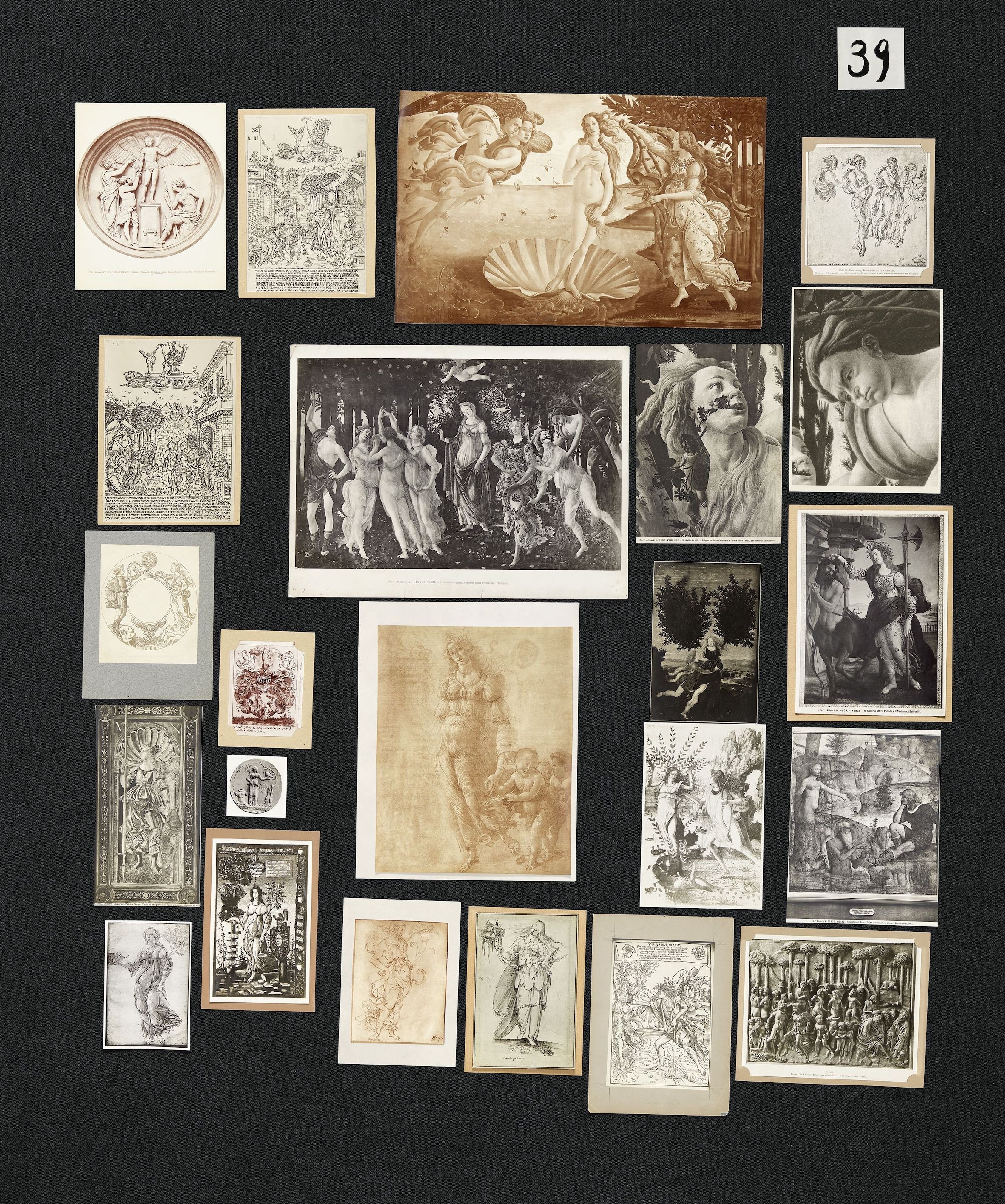
Aby Warburg’s Mnemosyne Atlas was a non-chronological attempt to map the “afterlife of antiquity” (image: courtesy of Haus der Kulturen der Welt).
On 1 April, however, it was announced that the restructuring would itself be restructured, essentially preserving the V&A’s existing curatorial organisation, though with a handful of minor modifications. Whew. Yet for all the uproar, the incident did usefully focus attention on the merits and drawbacks of chronology as an ordering principle. It’s a topic that museums have been wrestling with for two decades or so. A bellwether was the opening of Tate Modern in 2000, with galleries organised by grand themes such as “Landscape/Matter/Environment” and “Nude/Action/Body”. Many critics panned the curation, concluding that (as an editorial in The Burlington Magazine put it) the cross-temporal juxtapositions were “often perplexing for a first-time visitor, increasingly irritating for a regular one.”
MoMA staged an experimental three-season shuffling of its own collection at around the same time, and according to equally blunt themes such as “People, Places, and Things.” In this case, it was an explicit attempt to explode the canon that MoMA itself had done so much to construct. The thematic exhibition structure was calculated to “take modernism out of the hands of the anointed few,” as Roberta Smith commented in The New York Times, and “show it instead to be an effort of hundreds of people working alone or together in a range of styles and mediums.”
A gallery devoted to the V&A’s Ceramics and Glass department (image: courtesy of the V&A
It’s an approach that has informed curation ever since. The Design Museum – another London institution whose collection has never been its strong suit – opened in its new Kensington home in 2016 with a thematic presentation in its permanent galleries: Designer, Maker, User. More recently, the Design Museum Holon, near Tel Aviv, has displayed its permanent collection in an exhibition called Black Box, which aims to “expose the museum’s entrails,” and explore “a somewhat invisible aspect of the design world – the nature of the relations between objects and people”. The very first object on display – a primordial stone tool – implies that a chronology on the grandest of scales will unfold. But the exhibition immediately shifts gears, with a project by Ami Drach and Dov Ganchrow about “man-made contemporary prehistoric hand-axes”. That’s about as scrambled as chronology gets, and the rest of the exhibition follows suit, with sections focusing not on historical periods, but rather big issues in design: presumptions of value, research methodologies, discarded objects, and so on.
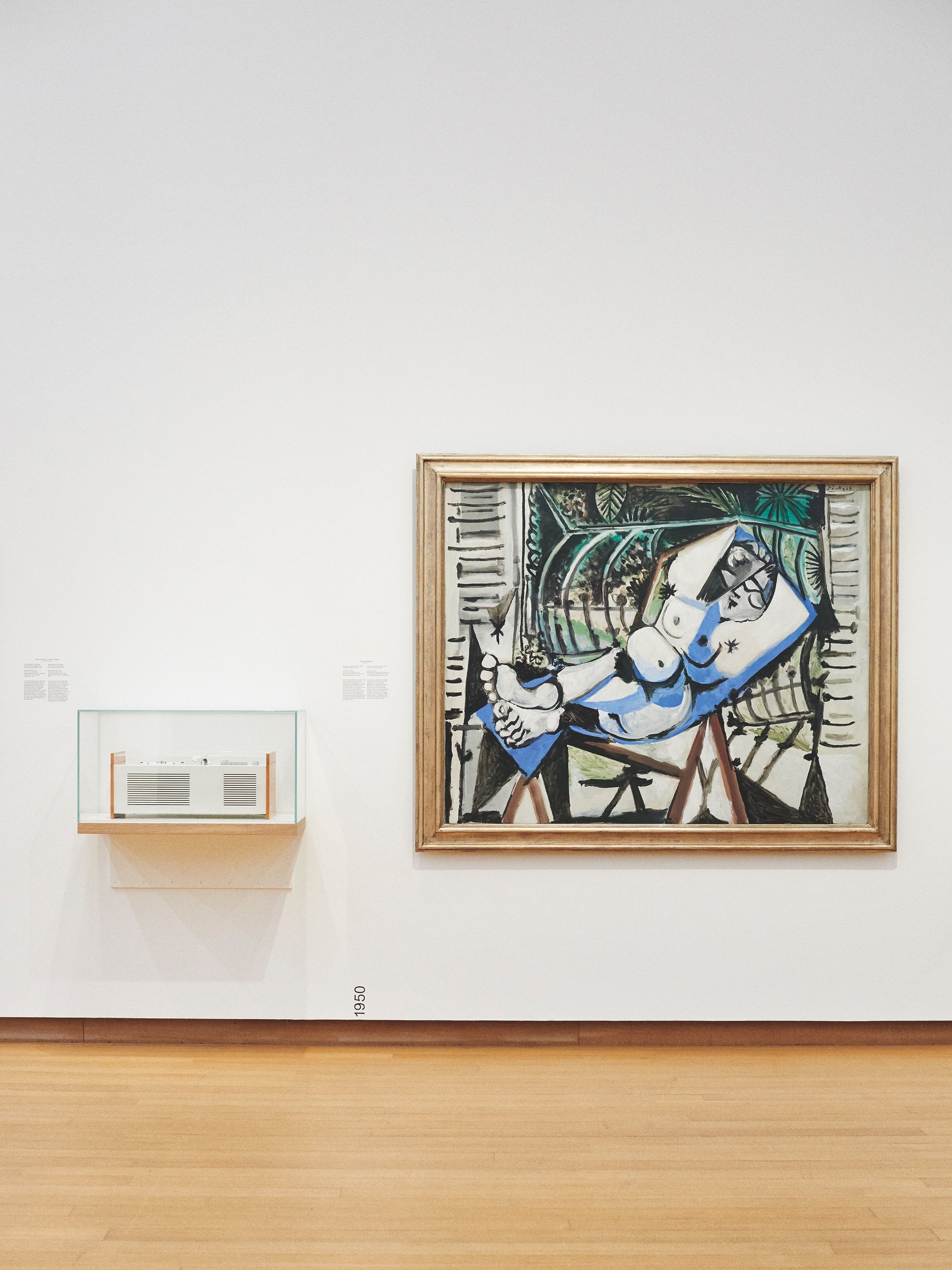
To be sure, chronology still reigns in many museums. The Stedelijk in Amsterdam (working with Rem Koolhaas’s office, OMA) and the Stockholm Nationalmuseum have both reopened in recent years with sequential installations of fine art and design, with objects from the two disciplines freely intermixed. This is also the current approach of MoMA, which reopened in 2019 with a permanent collection presentation that was much-lauded (including by me, in these pages). In this case, the museum’s canonical storyline was left intact, but with periodic asynchronous interruptions, exposing the blind spots in the conventional modernist narrative.
The mixed chronological display at the Stedelijk, which exhibits Picasso’s Femme nue devant le jardin next to Hans Gugelot and Dieter Rams’s 1956 Braun Phonosuper. (Photograph: Renée de Groot).
As the V&A’s recent experience suggests, debates about the virtues of chronology seem likely to intensify further. Consider the slow-moving controversy, itself generational in scale, over architect Peter Zumthor’s ambitious rebuilding plans for the Los Angeles County Museum of Art (LACMA). While most of the debate has focused on the plan’s financing, and its inexplicable reduction in overall gallery space, there is also ongoing disagreement over the institution’s curatorial priorities. LACMA’s director Michael Govan envisions a programme with constantly shifting adjacencies, no permanent collection galleries per se. “Museums are almost waking up from a slumber,” he has said, “from a legacy of a hundred years of categorizing the world once and leaving it that way.” Others, though, aren’t so sure – among them Los Angeles Times critic Christopher Knight, who has cast doubt on radical fluidity as a way to form strong and lasting bonds with its public: “Busting up a colonial-era organizing structure is worthy, but to achieve it, maybe the collection’s important art should just be lined up chronologically in the new galleries. Put the oldest work first, the newest last. Done.”
It’s not difficult to see why chronology is such a vexed issue nowadays. The canon-busting instinct has itself become mainstream. Most museum collections being what they are – the accumulated freight of centuries of white supremacy and imperialism – it is far easier to dispense with the skeleton entirely, going boneless, rather than transplant a new spine into it. For a global museum, or even one that wants to reflect the diversity of a single nation or culture, any one sequential storyline is always going to be problematic, centring some places and experiences at the expense of others. Then too, there are prevailing cultural winds that erode our sense of linearity, and may be reshaping audience expectations. If you want to see history disintegrate before your eyes, just enter a term into Google Image search. You’ll get an array all but unknown to previous generations (with Aby Warburg’s 1924-1929 Mnemosyne Atlas an honoured exception). It’s an atemporal view – to cite the title of another MoMA exhibition, a single, shared, “forever now.”
Black Box at Design Museum Holon (image: courtesy of Design Museum Holon).
Chronology and its discontents: it’s a pertinent topic for all museums, but perhaps particularly for those specialised in design. Until very recently, our field happily organised itself according to period styles – baroque, rococo, neoclassical, etc., offering the foundational building blocks of design history. The V&A accounted for the 20th century in just this way, in a series of major exhibitions, beginning with Art Nouveau and continuing through the Arts and Crafts Movement, Art Deco, Modernism, Cold War Modern, and on finally to Postmodernism. I co-curated that last show with Jane Pavitt, and we were often asked what we would do after postmodernism. Our reply was: after postmodernism, there is no we. The “grand narrative”, as Jean-François Lyotard famously put it, has given way to multi-perspectival fragmentation.
Now, 10 years on from our exhibition and three solid decades since the phenomenon of postmodernism itself, we’re still picking through the pieces. Proponents of chronological display will argue that time’s arrow gives audiences something to follow. And that may be; as Christopher Nolan’s films amply attest, departing from sequential narratives can be confounding. But an arrow is only worth following if you know what the target is. What museums should be offering their various publics is not unanimity, but diversity – more stories, and more ways of telling them. History, and life itself, are pretty confusing, last time I checked. Maybe it’s not all bad if our museums are too… from time to time.
Words Glenn Adamson
This article was originally published in Disegno #29. To buy the issue, or subscribe to the journal, please visit the online shop.

