Milan Diaries 2023: Day Four
Loewe Chairs showcases the fashion house’s foray into furniture (Image: Loewe).
For our fourth day in Milan, the Disegno team highlights furniture for musical instruments from Yamaha Design Laboratory, fashion house Loewe’s fabulous foray into a furniture, and Paola Navone’s generous Take It Or Leave It lottery.
Take It Or Leave It at OTTO Studio (image: Antonio Campanella via The Slowdown).
Taking a gamble
Roll up, roll up. Radical Italian designer Paola Navone is giving away her worldly possessions in a lottery exhibition organised by New York-based media platform The Slowdown. The insouciant title,Take It Or Leave It, encapsulates the rules of the game: one draw per person, no re-draws, and you can opt to take the item you win away with you or put it back to leave for someone else. Curated by Daniel Rozensztroch, former artistic director of Merci, the installation is the world’s most fabulous estate sale and church fête tombola rolled into one. The objects have been collected over a lifetime of Navone’s international travels, and lottery drawers are in with a chance of winning one of one thousand objects that run the gamut from ceramics to coat hangers, antiques to tchotchkes, silverware to inflatable silver angel wings (actually, those have already been won, much to Disegno’s chagrin). While those of us with pack rat tendencies may be horrified by the idea of giving away our prized possessions, Navone is relaxed about the whole endeavour. While each object has its story and meaning to the designer, she originally acquired them as inspiration for her own craft. Now that she has poured it all into an illustrious architecture, design and interiors career that has already spanned half a century, so she’s ready to release them to a new life – and start her own surroundings from scratch. Lottery participants are photographed with their winnings (check them out over on The Slowdown’s Instagram) and are invited to report back with a photograph of the pieces in their new home. It’s a generous and light-hearted respite in a week that’s so often about commerce and acquisition.
Take It Or Leave It: OTTO Studio, Via Tortona 31
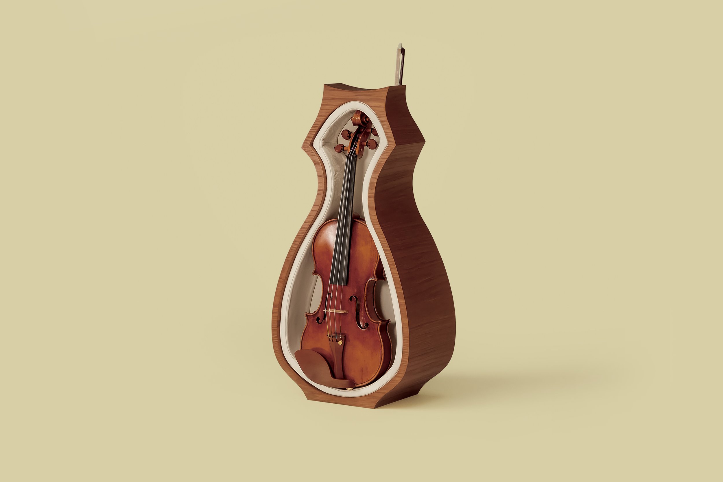
Meow by Yamaha Design Laboratory turns a violin case into a cute addition to a room (image: Yamaha).
Instrumental pieces of furniture
It is important to acknowledge the people that you are close to in your life and validate their presence and feelings. Phrases such as “I see you”, "I understand how you feel” and “you are important” are often used to do this. But what if we could extend this feeling of generosity and appreciation to the objects in our lives too? How can they be celebrated, seen and validated? The design team at Yamaha Design Laboratory usually focuses their attention purely on designing musical instruments – cellos, pianos, saxophones and the like – but for Milan Design Week 2023 they wanted to acknowledge the importance of musical instruments and their position in our lives. As they told the Disegno team, they are as much “friends” and “colleagues” as they are tools. Yamaha’s exhibition You Are Here presents 12 furniture pieces designed to display instruments in playful, sculptural and functional manners when not in use. The title of the exhibition highlights the value of being present in the moment, and the pieces aim to encourage musicians to make their instruments part of the home, rather than being stored away, out of sight, when not in use. The violin display unit, for example, called Meow, takes shape of a cat and proposes that we can have a similarly affectionate relationship with instruments as we do with feline friends. A violin sits vertically in a leather-lined hollow while the timber frame that surrounds and supports the instrument creates a silhouette of an upright cat. The back of the unit has a slit for storing the bow, which transforms the musical tool into a sculptural cat’s tail. Other furniture pieces offer pragmatic solutions to storage and playing together. Wake Me Up is both a stand and a stool for the saxophone. Made of brass, the stand sits vertically and cradles the instrument in a leather support. When flipped on its side, the strand transforms into a seat, the leather becoming a support for a human to sit on instead. The designers utilised their understanding of craftsmanship, detailing and material knowledge that they usually apply to instruments to create new furniture typologies, demonstrating their care for, and relationship with, the instruments. In creating new pieces of furniture for the home that bring instruments into the centre stage, the Yamaha team acknowledges that family members may not all be human, but are, nevertheless, deserving of recognition in our lives. You are here, the furniture playfully whispers, and we love you.
You Are Here: Via Pietro Maroncelli 14
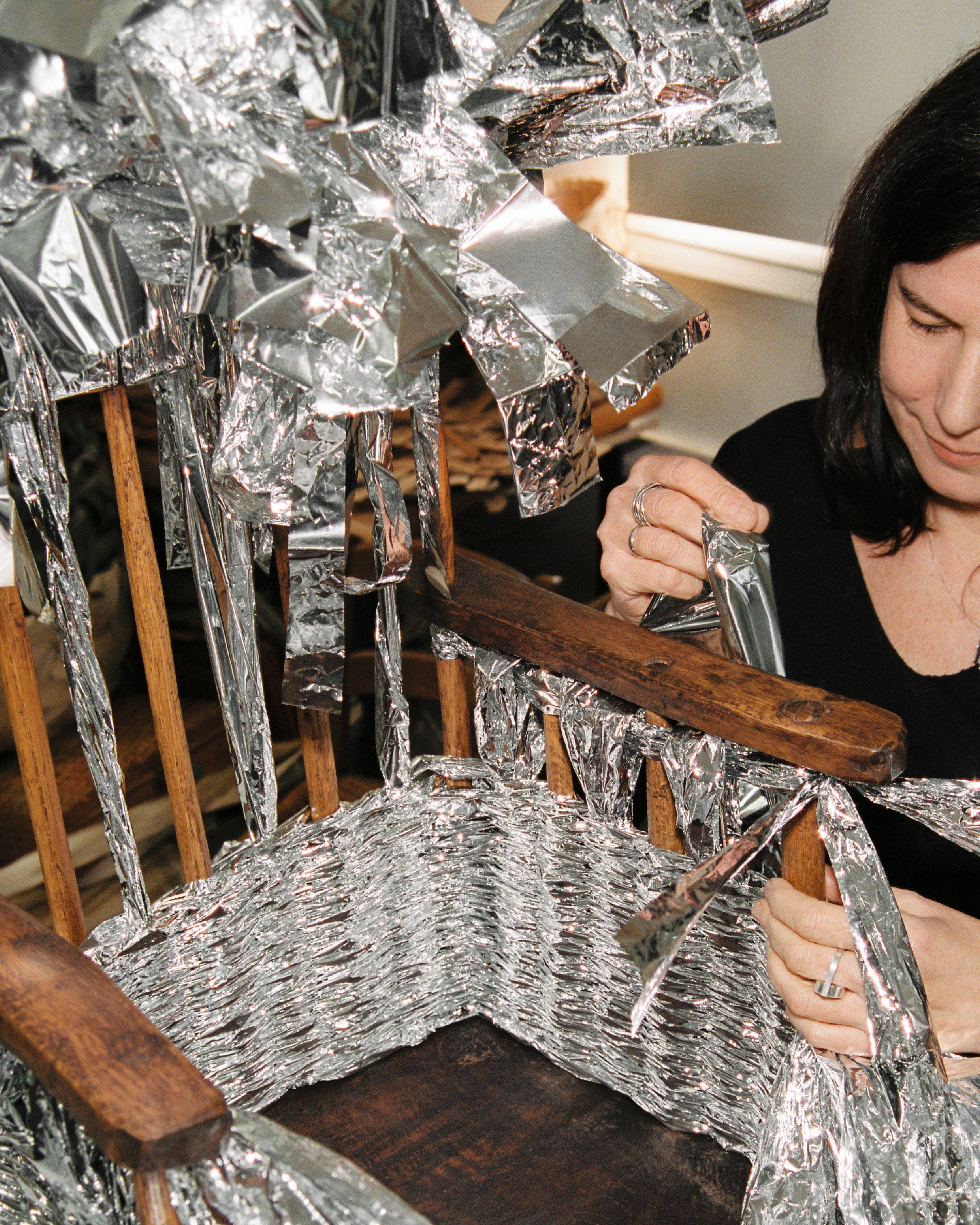
Shiny foil blankets woven into an antique Welsh stick chair for Loewe (image: Loewe).
The wicker brand
Buzzy fashion house Loewe made an impression with its re-entry to Milan Design Week last year with its experiments in leather weaving (see Milan Diaries 2022: Day Three). If that was dipping a toe into the design world, this year’s offering is a head-first dive in with the perennial benchmark that is chairs. Design reached peak chair somewhere around last century, but Loewe has cannily put a crafty spin on the exhausted genre. Creative director Jonathan Anderson oversaw the acquisition of 30 antique Welsh stick chairs from around the world – typically high-backed yet humble chairs that were made by craftspeople and carpenters in 18th-century Wales, rather than specialist chair-makers or designers. Each individual chair has been given a fashion makeover by Loewe, which saw them invite craftspeople to decorate using materials such as felt, raffia and colourful plastic – along with a rather fabulous tinsel-ly look achieved by weaving in foil from thermal blankets. Normally seen making marathon finishers and stranded hikers look like baked potatoes, the foil here elevates a chair to a throne of high camp. Also on display are Loewe Lloyd Loom chairs, made by Belgian company Vincent Sheppard by weaving wicker around a metal frame. The kitsch theme continued with a chair painted in cherry red with white splotches to imitate a toadstool mushroom. Loewe has leaned into this cottagecore aesthetic by decorating the courtyard and gardens of the imposing Palazzo Isimbardi with large mushrooms, the red-and-white caps perched on bollard-like stone bases that could support the sturdiest of fairies. It’s a suitably madcap Alice in Wonderland affair, and while a display of Loewe bags underscores the collection’s catwalks roots, it’s a strong foray into fashion furniture.
Loewe Chairs: Palazzo Isimbardi, Corso Monforte 35
Portal Vase by Origin Made with a Kumiko Cabinet by Staffan Holm (image: Jonas Bjerre-Poulsen).
Band of designers
“We were joking, ‘We should have called it Slat Life instead of Still Life.’ But that just doesn’t sound right,” designer Gabriel Tan said at the second of the panel talks for his exhibition Still Life – The Art of Living, by Origin Made. There are certainly plenty of slats on show at the second-floor apartment near Porta Venezia, which Tan has restyled for the duration of Milan Design Week. There is delicately slatted Secto lighting, along with the gridded fronts of ink-stained Kumiko Cabinets by Staffan Holm for Ariake. In order to create a fully furnished apartment for visitors, Tan collaborated with brands and designers to complement Origin Made’s own design collectibles. Also on show are Ethiopian made rugs from Sera Helsinki. The concept, then, is a collaboration between like-minded brands, allowing them to build on one another’s work, rather than exhibiting independently during what is often a noisy and competitive week. Seen together, parallels in the different makers’ crafts become apparent, such as a preference for working in wood – a material choice that even extends to a smart home panel from Mui Lab. Its tactile interface is a thin wood veneer panel that lights up, instead of the cold and techy glass screen or speaker interface typically seen with smart hardware. The result is a calming, paired-back space that rises above the hum of the city outside in a quiet nod to collaborative craft. From a designer’s standpoint, Still Life offers an opportunity for smaller brands, designers and makers to band together for greater impact. It is something that is echoed in how Tan himself works, splitting his time between Singapore and Porto. As head of the Japanese brand Ariake, he’s interested in how people divided by geography can still work together to make contemporary pieces using geographically distinct techniques.
Still Life – The Art of Living: Via Alessandro Tadino 2
Bello! by Lars Beller Fjetland and Hydro (image: Sjur Pollen).
Hello, Bello!
Bello! may sound like a very shouty name for a bench, but its presence at Norwegian Presence is more of a cheery wave. Seeing as its ridged semi-hollow form was inspired by pasta, it’s only fitting that it made its debut at Norway’s showcase in Italy: the homeland of carby goodness. Bello! was designed by Lars Beller Fjetland in collaboration with Hydro, the Norwegian specialist in renewable energy and low-carbon aluminium, and is made from 90 per cent recycled aluminium. The name, of course, is a fun portmanteau of Beller and Hydro. The aluminium was recovered from drinks cans, car parts and window frames, then heated and extruded through a vast machine in a process that’s rather like an upscaled version of how penne and rigatoni pasta is made. A ridged surface adds a comfy texture to the bench while underscoring the pasta connection. Along with pasta, Beller Fjetland had brutalist architecture and planes, trains and buses from the 1930s through to the 1970s on his moodboard for Bello!. As such, he hopes that it will find a home in transportation hubs, as its elongated aluminium form makes it suitable for seating large numbers of people in both indoor and outdoor location. Bello! Has some excellent bedfellows at Norwegian Presence, where you can also enjoy pieces by Svingen Arkitektkontor and Wu Xian, Ann Kristin Einarsen, Studio Sløyd, Live Berg and Osloleire, Martin Høgh Olsen, Stine Aas and Siv Støldal, Anna Maria Øfstedal Eng, Ida Hagen, Tobias Berg, Noidoi, and Jomi Evers, all set in a moodily monochromatic exhibition designed by Kråkvik & D’Orazi.
Norwegian Presence: Via Pietro Maroncelli 2


