
A Home Is Not Always A House
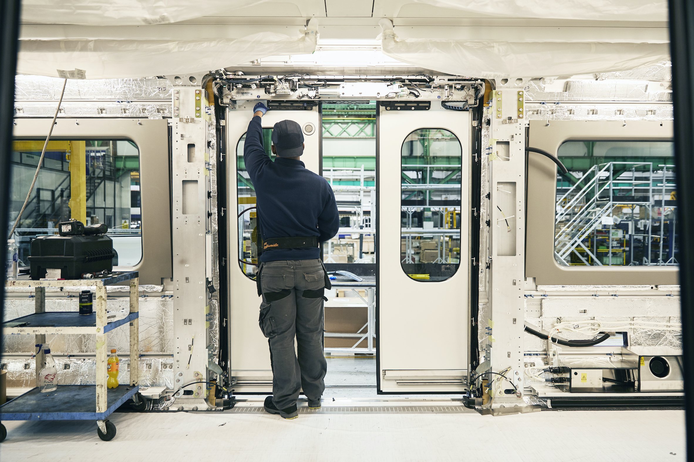
An Elizabeth Line carriage under construction (image courtesy of Map Project Office).
It’s 2014, 3am, and someone is trying to break through the door into my berth as the train progresses leisurely through Hungary. I’m glad I took a stranger’s advice to buy a strong bike lock for the door. 2016, I’m teaching in Norway and take a trip one weekend on the Bergen Line, northern Europe’s highest railway. The train emerges from a tunnel into Finse station (the highest point on the route at 1,222m above sea level) and the windows are suddenly covered with snow, which I’ll find out later is the fallout from a freak storm and avalanche. We are dug out, put on coaches and escorted over the mountains by snow ploughs like it’s any other day. My friend meets me in Oslo 10 hours after I should have arrived and explains that the 7.30am, the train I was originally supposed to catch, is still fully engulfed. On the way back from Kazakhstan in 2018 my flight is delayed and I have to layover in Kiev, where I get lost in the snow looking for my hotel and take refuge in the nearest metro station. I descend for what seems like hours onto the deepest metro platform in the world.
I’ve sat, reclined and dozed on trains all over the world whilst looking vacantly out of the window, and while they may have been in different countries, the carriage interiors all have their likenesses. The way their windows, and the visual detritus around them, frame different landscapes in similar ways lends some homogeneity to the view. To the extent that once, while riding a train through Eskişehir in Anatolia, I thought for a moment I was passing some sleepy Scandinavian town.
However, there is one train network that, to me, is completely unique and resists all attempts to find a parallel. It seems a bit of a boring choice since it’s the one I use every day, but in both carriage design and atmosphere the London Underground network is the one I miss most when I’m away, to the point that I now associate its musty smell, which I once thought repulsive, with a sense of home. When I first visited London, I approached the gates of the Tube at Victoria station and, disturbed by the rush of people coming toward me, decided to turn back and walk instead. Getting used to riding the Tube is a right of passage and acquiring an affection for its different smells is achieved only gradually. To my mind, it’s the most varied 250 miles of train track in the world. And people behave on it in ways I’ve not seen on any other train.
Since I moved to London in 2011 I’ve witnessed: the cutting of toenails; a full manicure (Morden to Highgate); the scraping of dead skin from the heel of a foot; tea being drunk from real mugs rather than travel mugs. There have been couples breaking up, getting together, and those enjoying a film while in each other’s arms. I’ve seen a woman using the draft from the window between carriages to dry her hair, and countless people at the peak of rush hour delicately and accurately applying makeup to their eyes as the train jolts and sways. More usual than these examples, without the distractions of the internet, people read, listen to music and bravely sleep while in the company of strangers. People often have a favoured carriage they get on every day, and perhaps also a preferred seat.
I may have seen these things purely because I’ve spent so long sitting on the Tube’s dusty seats. But what marks the Tube out from other trains is that, due to the imbalance of work and life in the city, people treat the London Underground as an extension of their homes, using it to complete their morning rituals on the way to work, and in the evenings to get some extra time unwinding before bed. On other trains the prevailing atmosphere is one of patient anticipation of reaching a destination. On the Tube, people are comfortable doing private rituals in a public space; they seem as if they feel completely at home. It’s more than a pause between two places, it’s a momentary dwelling stretching between people’s actual homes and their places of work and play.
It may seem strange to see a train carriage as an interior, and even more so as a home. But the home can blur into public places. In her book, Strayed Homes: Cultural Histories of the Domestic in Public, Edwina Attlee extends the domain of the places we call home to include all the places we use to order and maintain ourselves, rest and sit down for a while. “The soap-dispensing machine stands in an unmanned launderette,” she writes. “It enables me to wash my clothes. The sleeper train, hideously uncomfortable though it is, enables me to rest as I travel. And the experience of these spaces cements the idea that home, the container of housework and of rest, can stray.” Greasy spoons, pubs and fire escapes are also included.
Attlee cites François Dallegret’s illustrations for Reyner Banham’s 1965 article ‘A House is Not a Home’ as more speculative examples of the roving dwelling and, with their multiplying pipes, pistons and moving parts, these houses could be easily mistaken for train carriages. Banham’s vision for a “transportable standard of living package” that was “uprooted from its dependency on static utilities” for an array of permanently mobile homes, was one of those ideas that already existed in the form of the train, albeit in more fleeting and subtle form. Perhaps the Tube is hard to see in this way for some, but I’m sure even those who hate it have welcomed its balmy warmth on rainy and dark winter evenings.

The Elizabeth line seating, designed by Wallace Sewell.
It’s with this notion of how the home can stray that I first took a trip on the Elizabeth line, which partially opened in summer 2022 and now stretches more than 100km from Reading and Heathrow in the west, through central tunnels and across to Shenfield and Abbey Wood in the east – connecting west to east and city to country. The tunnel I descend into from Tottenham Court Road Station is much larger than any of the others I’ve seen. While the line is obviously a new breed of light and bright transport interchange, there are still nods to the grids present in the Tube’s other walkways – the glazed tiles of the older lines, the iron and bolted panels used on the Jubilee line – only it’s all more curvy and fluid. A variety of architects have designed the Elizabeth line stations and this one is by Hawkins\Brown. The concrete panels from which its walkways have been constructed are solid at low level and perforated up high, lightening the material at the point at which it feels most oppressive on the Jubilee line. Here, there are no harsh corners and all surfaces blur into one. The platform, when I reach it, is both industrial and opulent, although there is less emphasis on the quasi-Victorian celebration of engineering that Roland Paoletti integrated into his design for the Jubilee line stations. These stations are now almost creepy in their dated futurism, while the approach to the Elizabeth line is less dystopian and feels more like a vast science lab. While this will become subtler with age, right now the gleaming whiteness of everything hurts.
Once on the platform, it’s hard to see the other end due to the space needing to be able to fit rolling stock that is just over 200m long. A vast strip-light emphasises the vanishing point plunging somewhere in the distance. The people on the platform seem miniature, as everything else has been oversized to match the larger scale. Massive circular chrome pendant lights hang from the ceiling – one instance of a circular motif that recurs across the tunnel’s form and the holes pressed into its cladding, and through to the Tube logo and the braille-like pattern of dots that covers the walls of the station. The similarity of all these elements means that Tottenham Court Road’s Elizabeth line station doesn’t have all the visual clutter that blights other, older stations, exacerbated by the infinite distractions of stressed people running around trying to catch trains. The new station is minimal, clean and airy, but almost disturbingly quiet, my ears being accustomed to the screech of the Northern line.
The scale and hush of it all, however, makes waiting for the train seem special, like waiting for the monorail at an amusement park or a flight. When it arrives, it comes smoothly into the platform with a satisfying swoosh, and its doors open and close with similarly satisfying sounds. Inside, much like London Overground rolling stock, there is a clear view down the entire length of the train and, when travelling at quieter times of day, not being isolated in one carriage may feel safer with more people able to hear and see what is happening. The width of the carriage is generous and there is room under the seats for easier cleaning, and to store bags during busy periods. The strip lighting above defuses down the sides of the carriage, rather than glaring directly into your eyes if standing (if you’re tall like me, this usually feels like being at the dentist). Unlike on older lines, where the advertising banners are falling over each other, here there are gaps to avoid visually overwhelming sight-lines. The interior of the carriage is palatial and relaxing, matching the architecture of the platform so as to feel part of the same space. On a first glance, it’s seriously high spec, but without feeling corporate – a tricky balance to strike.
The train’s interior has been created by industrial design studio Map Project Office, in collaboration with the practice’s founders Edward Barber and Jay Osgerby. Jon Hunter, head of design at Transport for London (TFL), describes selecting the studio because TFL wanted to take an “architectural approach” rather than seeing it as yet another train. The designers, Hunter says, viewed it as a “space people can occupy”, asking the question: “What are the principles that people want in their own house?” While trains are usually designed with an emphasis on mechanical equipment that is then wrapped in plastic, giving them an odd and “gloopy” finish, Hunter explains that the Elizabeth line has a far neater interior with clean surfaces and lots of pleasing details. It has, he suggests, a “human scale”. Hearing him speak, Hunter has an almost obsessive passion for trains and he’s certainly refreshing in thinking of them in a way that feels reminiscent of the optimism around train travel in the 20s and 30s, expressing a love for 1938 Tube stock as “one of [his] favourite trains”. He says that he’s “fascinated that [trains have] been overlooked for so long, in terms of actually trying to get that experiential factor back in,” feeling that advances in this area have been made across boats, cars and planes, but that trains have remained static. It is something he wanted to put right for the Elizabeth line. To move train design forward, he explains, it needs to be treated more like architecture, reinstating the romance of the railways that was “definitely lost in the 50s and 60s”.
Map has used the grandeur of rectilinear lines to emphasise the length of the train – strip lighting, ventilation grills and advertising boards stretching into the distance – while employing more organic geometry for the elements that people will directly interact with. Great care has been taken over the castings for the grab poles, which feature smooth, polished finishes reminiscent of those found on Bakerloo line trains, as well as the marshmallow curves of the standbacks that surround the doors. There is even a curve to the transition between different floor coverings, one acting as a welcome mat and the other indicating the main body of the train – a contrast that will prove useful for the partially sighted. The hanging straps, rather than cutting into your hand, are gummy and feel just right even after long periods of time. The enclosure itself has also been diffused through the use of dark tones at low level, midtones at eye level, and light tones for the ceiling, opening up towards a sky that isn’t there – a well-used architectural trick that I’ve never seen employed in trains before, making it feel less claustrophobic.
As the train progresses quietly – almost too quietly – I think about how the rolling stock compares to other trains I’ve been on, and all their quirks and differences. London is a big place and explorers of the city often concentrate on eccentric details to bring it down to size and make it more manageable. The way people talk about Tube trains is no different. I’ve heard people mention all manners of things and, interestingly, these are often not the facets that have consciously been designed, but more those that have come about by chance. Central line: the way the curved windows stretch the reflection of your face into something approaching King Charles. Northern line: changing branches at Oval can sometimes mean you get back on the train you’ve just alighted from. Bakerloo line: when the doors open, the fabric on the empty seats inhales and exhales dust. Victoria line: it’s fun to pretend you have phone signal when nobody else does. District line: you think it’s busy and stifling now, but imagine when people were allowed to smoke cigarettes and a cloud of smoke was released as the doors opened at each station. I’ve heard that the Northern line was supposed to go to Paris, and that UKIP once pledged to turn the Circle line back into a circle. These myths give the Tube personality, and perhaps make an inhospitable place feel something more akin to an insufferable but needed friend, or a place that we know really well – like a home.

The Elizabeth line train livery.
It’s a tricky design brief to bring elements of the home into a carriage while knowing, even with the space’s intimate scale, that you’re designing for a footfall of approximately 306,000 passengers each day. Although it may be a momentary home, a Tube carriage is one that, over the course of a day, surpasses the capacity of even the largest football stadium in the world. In response to these constraints, Map’s carriage is rugged and industrial, built to last, but also has moments of homely softness. There are the purple seats, for example, mirroring the new Elizabeth line model roundels, that offer a subtle sign of its connection with other TFL services. The seats’ moquette pattern was designed by UK-based textile studio Wallace Sewell, founded by Harriet Wallace-Jones and Emma Sewell, who were also behind the textile designs for the London Overground and the Central line. In interview, Sewell speaks about growing up with classic moquette designs by Misha Black’s Design Research Unit (the District line) and Marianne Straub (the Northern and Bakerloo lines) and associating them, even though she didn’t grow up in the city, with what she thought London felt like – to the extent that when the commission finally came around, she felt as though she had been “designing it for years”. While the design for the Elizabeth line is based on classic tube iconography, the studio has taken some influence from Black’s tiled District line patterns and transformed it into a glitch that looks like a malfunctioning computer screen, all to capture something of London, or what it feels like to work there.
Wallace-Jones describes the jacquard loom weaving process that creates moquette as being much like placing pixels of colour next to each other. The studio was limited to only four Pantone colours, using a Seurat-esque pointillist technique to add tertiary tones for balance, which then creates a mysterious “fifth colour by mixing”. In the way the eye draws its colours and patterns together, each person may see them in their own unique way, appealing to many tastes rather than enforcing one fixed aesthetic. It’s engrossingly abstract, hypnotising even. Like a magic eye trick, the pattern means children, commuters and drunks can see whatever they want in it.
At the moment, everything looks a bit too clean and fresh for it to be a genuine piece of the London Underground and, most importantly, it smells too good. Scott Barwick, however, who headed up the Map team’s work on the project, had the carriage’s future form in mind when designing, using the look, feel and nostalgia of the Bakerloo line to predict how the Elizabeth line carriages may look in years to come. In interview, Barwick describes how his team picked materials and construction methods that age well over time: stainless steel castings for grab poles, speckled rubber floors that will gain greater texture from intensive footfall, and high-density polyurethane armrests that will take on a shine with age. All materials, Barwick says, that “wear in, not wear out”.
I’m on the Elizabeth line going to Woolwich and, at Liverpool Street, the whole train seems to empty out. I take this opportunity to walk down the carriage – it’s moving forward, but I’m going backwards, while facing forwards. I’ve never felt the need to do this on a train before. The view down the carriage is not uncannily repetitive as it is on the Circle line and others, it’s more a changing landscape or like looking down a street of varied shops. At the ends of the train, where I got on, the seats are grouped in forward and back facing transverse seating (otherwise known as “Chicago-style”) extending across the carriage, whereas nearer the middle of the train the layout modulates to have seats that face inwards, as is familiar from most Tube carriages. Train manufacturer Bombardier, which was amalgamated into French manufacturer Alstom in 2021, designed the seating to allow for passenger flow, Barwick says. Those boarding at the Elizabeth line’s termini at Shenfield and Reading can enjoy the forward-facing seating of longer train journeys, and avoid the crush of people when the train hits central London, while the classic Tube-style seating allows for greater capacity over comfort, suiting those who are only onboard for a short period. Taken as a whole, the train melds a suburban commuting experience with the urban.
I hop off for a short period at Custom House station to see what it’s like and to see the train from more of a distance. The Elizabeth line stations become less grand as they leave the city – suggesting some kind of hierarchy, which is a shame – but they have a scale that matches nicely with the types of settings you’re released into after your journey. I watch a train smoothly travelling east. Its livery is minimal stripes of blue along the bottom of the windows, black around them and white above, all finished off with a parallelogram of purple on the driver’s cabin, angled backwards as an allusion to acceleration – a design whose intentions, Barwick says, were meta or postmodern, suggestive of how the landscape transforms as you move through it. When the train is stationary, it looks abstracted and reduced in complexity, as it would when travelling at great speed and viewed from a distance. Either way, it doesn’t hammily illustrate speed like the Great Western “dynamic lines” livery does, which looks like wavy car lights captured with long-exposure photography. Instead, it is genuinely what going fast feels like – an effect echoed once again in the textile designs.
I get back on and the train is much busier, and most of the little details I noticed previously have become lost in the crowd. People are quietly dozing in the company of strangers, and I’m envious that I can’t be as trusting as them. Standing now, I can see two people sitting closely next to each other. Their elbows at first appear to be touching, but the armrest is split-level and two people can use it at the same time without nudging each other or encroaching on personal space. I think this detail sums up the success of the Elizabeth Line’s design: it gives people space and flexibility, and it doesn’t impose anything on you. This is truly unique on the Tube network. People from out of town often think it’s weird that strangers don’t speak to each other on the Tube, but little do they know that this unwritten rule is one of the saving graces of travelling in the city. The Elizabeth line design is the same. If you want to enjoy the experience there are lots of elements to choose from, and if you don’t – or if you’re drunk or having a bad day – the design won’t bother you and won’t impose anything either.
As I reach Woolwich I think about how public services should work so well that they almost disappear. This fine balance between leaving an impression and leaving none at all, is the Elizabeth line train’s greatest achievement. Places that feel like this, which leave you alone when you need space and embrace you just the right amount when you need that, to me at least, can only ever be little bits of home. Yet there is still work to be done. Pubs, cafés, launderettes, and all these quasi homes have one thing in common: age. The Elizabeth line is still too young for someone to feel comfortable cutting their nails onboard. It has all the ingredients in place to be a Tube icon and a strayed home, but this will only come with time.
Words Matthew Turner
Photography courtesy of Map Project Office
This article was originally published in Design Reviewed #1. To buy the issue, or subscribe to the journal, please visit the online shop.