A Spanish Lens
Haze by Begum Cana Özgur for Nanimarquina.
Milan’s annual design week and its attendant Salone del Mobile trade fair are overwhelming. From all around the world, designers, brands and manufacturers converge on the city, each exhibiting the work of the past year.
In such a context, achieving focus is a challenge – there is too great a profusion of design to successfully encapsulate within a digestible overview of the field. As such, the introduction of a framing device that can narrow the ambit of the week, and which may offer a viewpoint from which to look out onto the design it contains, becomes essential.
This year, Disegno has partnered with Interiors from Spain and ICEX, an organisation within Spain’s Ministry of Industry, Trade and Tourism, to explore one such lens: a survey of new designs launched by Spanish brands during the 2023 Milan Design Week.
In some respects, the selection of a nation state as a unifying principle is arbitrary. Design is an international field, and its constituent brands, designers and manufacturers mingle and collaborate freely across borders: Spanish brands do not solely collaborate with Spanish designers, just as Spain’s design talent is not limited to partnering with manufacturers and institutions from within their nation’s borders. Indeed, many of the country’s most prominent designers (Patricia Urquiola, El Ultimo Grito and Tomás Alonso, for instance) are not based in Spain but frequently work there, while those who have established studios within their home country (such as Jaime Hayon, Martí Guixé and Xavier Mañosa) have achieved acclaim through both their domestic and international projects.
But this is to miss the point – the commingling of both external and internal influences in Spanish design is what renders it an effective microcosm of the contemporary design scene at large. Within Spain’s design scene are companies and designers who work with cutting-edge industrial manufacture, just as there are others who explore experimental craft practices that dig into the country’s material heritage and making traditions. There is no single signature within Spanish design – rather, it encompasses a broad range of attitudes and approaches towards the work of contemporary design. To look at Spain’s design scene is, in this regard, to look at the field at large.
With this mind, Disegno is proud to have worked with Interiors from Spain and ICEX on a survey of new designs shown by Spanish brands during the 2023 Milan Design Week. The results, which follow below, are not exhaustive, but offer a flavour of the experimentation, craft, and industrial know-how that characterises Spain’s design work. By extension, it also offers a sense of the preoccupations of the industry at large.
Improvisación by Gian Padilla for Nanimarquina.
Improvisación by Gian Padilla for Nanimarquina
The Barcelona-based rug brand Nanimarquina has long been known for the quality of its craftsmanship and its attention to the textile making traditions in India, Pakistan and Nepal – the countries in which it produces its designs. This year, this ethos was in full evidence with new designs from Ronan Bouroullec (whose use of a graphic motif in his Doblecara design has inadvertently made the piece double-sided) and Begum Cana Özgur (whose Haze design luxuriates in overlapping colour fields). Yet it was a new project by Honduran textile artist Gian Padilla Suarez that most caught the eye. In comparison to other works within the collection, Padilla Suarez’s Improvisación is a comparative leap into the unknown – the textile has not originated as a finalised design subsequently executed by craftspeople, but rather emerged through more spontaneous weaving carried out within Padilla Suarez’s studio. In a field that is increasingly interested in the interconnection of industry with craft traditions, Nanimarquina's Improvisación is admirable in its approach – a product that has purposefully blurred the design and making processes that have gone into its creation.
Soft Blown by Nichetto Studio for Lladró.
Soft Blown by Nichetto Studio for Lladró
The Valencia-based brand Lladró presents a familiar tale: a company rich in traditional craft capabilities that is now questioning how these techniques can be applied in a contemporary context. Founded in 1953, Lladró possesses formidable making skills in porcelain, with its expertise having historically resulted in decorative ornaments and figurines. The company’s output has always been beautifully made, but recent years have seen it seek a more contemporary output that can place its material of choice within a clearer design context. Soft Blown, a lighting collaboration with designer Luca Nichetto, represents a compelling step in this direction. Styled after the work of balloon artists, Nichetto’s lamps are assemblages of different porcelain forms that exhibit the full range of finishes and textures possible with the material. Lit from within, the porcelain glows in soft pastel colours, leaning into the natural qualities of the material, while also pushing an aesthetic that moves Lladró in a fresh direction: with their gently inflated forms, beautifully clashing patterns, and seemingly ad-hoc assemblages, the lights seem to owe as much to internet aesthetics as they do to traditional craftsmanship. It is a smart pairing – traditional craft, anchored in 2020s visuals – that speaks of porcelain production as a living, changing practice. Rather than remain static in familiar forms, it is capable of generating new contemporary outcomes.
Supra by Note (design studio) for Ondarreta.
Supra by Note (design studio) for Ondarreta
Certain product categories are difficult to propose a fresh take on, not least the injection-moulded polypropylene chair – if any furniture typology is already well represented on the market, it is the polyprop chair. This is a fact that the Basque brand Ondarreta was keenly aware of when it began work on Supra, a single-shell seat designed by Stockholm-based Note (design studio). The chair’s construction is interesting (suggestive of a separate seat and back, but actually moulded as a single piece), but it is Ondarreta’s decision to experiment with the translucency possible with polypropylene that makes the piece stand out. As opposed to the opaque, bright colours that are more familiar within the typology, Ondarreta’s chair is executed in translucent shades of white and yellow (which resembles honeycomb), through which different levels of light and shadow are cast – the chairs are darker where more structure is present at the join between seat and back, lighter and more ephemeral towards the edges of the seat. It is an unusual and compelling aesthetic – particularly when paired with the raw, industrial aluminium structure that is used on some versions of the task chair Supra – that evidences how fresh consideration of materiality, even in a sector as crowded as polypropylene chairs, can reap rewards.
M64 by Miguel Milá (featuring Claudia Valsells) for Santa & Cole.
M64 by Miguel Milá (featuring Claudia Valsells) for Santa & Cole
Any number of new launches from the lighting brand Santa & Cole (which recently launched the street lighting company Urbidermis) could have made this selection – not least Antoni Arola's beehive-esque Shiro light, and golden-canopied Lámina Dorada – but Disegno’s eye was most drawn to an update to one of the brand’s familiar lights: Miguel Milà’s 1964 M64 pendant lamp. Having begun working in the late 1950s, Milà has proven himself an industrial designer par excellence many times over (and yet he remains criminally underappreciated outside of Spain), and a prescient figure whose work championed authenticity and craft over novelty: “The point is not to design yet another lamp so we have one more, but rather to take the one that already exists and make it better,” he told design historian Viviana Narotzky in Disegno #5. This ethos was in full effect in the M64, which remains a beautifully designed pendant, and which has now been updated in a range of new colours developed by artist Claudia Valsells. This willingness to delve into the archive and work with what is already present, as opposed to the valorisation of newness for the sake of newness, felt compelling, contemporary, and fully in the spirit of Milà’s work. What is more, it was an ethos in evidence across Santa & Cole’s stand – the brand also revisited André Ricard’s beautiful 1973 Duo table lamp.
The A desk divider by Naoto Fukasawa for Kettal.
A by Naoto Fukasawa for Kettal
Given societies’ experiences of the pandemic, much has been written about a rising interest in outdoor furniture, with a number of interior furniture brands having swiftly launched outdoor collections in response. It was satisfying, therefore, to note a quasi-reversal of the trend at Catalan outdoor specialist Kettal, which brought its experience of lockdown to bear in a different direction. The A collection, designed by Naoto Fukasawa, is a new series of office furniture and accessories that aims to bring natural materials and design touches redolent of nature into office space. It is, the brand explains, an attempt to integrate the more domestic design elements of the home offices that proliferated during the pandemic into the context of more formal workplaces. Fukasawa’s solid wood stacking chairs and tables are beautiful, but the inclusion of additional materials within the accessories range lifts the collection as a whole. Table lamps and sockets appear in ceramic (lending tactility to elements that might otherwise be drily functional), but Disegno was particularly smitten with desk dividers executed in woven wicker. It is a small touch, but a neat one – the inclusion of a material more typically seen in basketry within the context of a commercial office collection provides a welcome reminder that workspaces should encourage values other than productivity. Elements of human care and consideration are important too.
Marietta by Yonoh for Capdell.
Marietta by Yonoh for Capdell
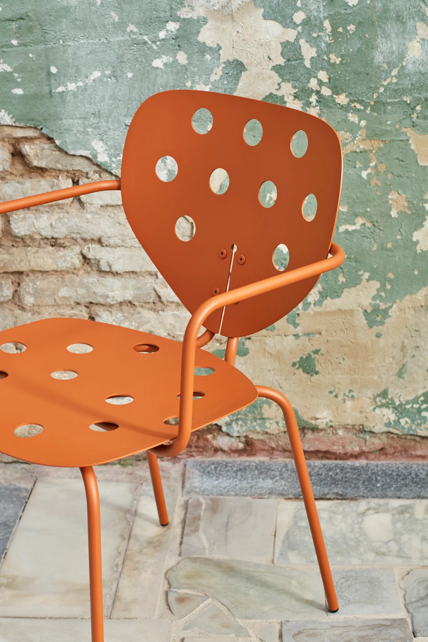
“Marietta” is the Valencian equivalent to Spanish’s “mariquita” or, in English, ladybird – a linguistically circuitous route towards a collection of chairs, stools and armchairs that is remarkably direct in its inspiration. The Marietta seats, designed by Clara del Portillo and Alex Selma of Yonoh for Capdell, draw on a ladybird’s wings for the form of their backrests (the effect is particularly pronounced in a perforated metal version), while their thin metal structure recalls the insect’s legs. It makes for a charming, irreverent design – which is also lightweight and stackable as a result of its construction – and which set Disegno to thinking about how well suited insects seem to be towards serving as the inspiration for furniture: segmented forms that balance volume atop spindly legs. Fritz Hansen has Arne Jacobsen’s Ant chair, while Gubi enjoys Gamfratesi’s Beetle. In Yonoh’s Marietta, Capdell has a fine new addition to the pantheon of bug-based seating designs.
Sips by Christophe Mathieu for Marset.
Sips by Christophe Mathieu for Marset
Christophe Mathieu’s 2017 Bicoca lamp for Marset delivers exactly what you would want from a table lamp – a portable, colourful form, whose character derives from a jauntily tiltable shade to direct the light. It is a welcome addition to a category that brands the world over seem to be exploring with increasing frequency – small, affordable, USB-charged lights that can be easily moved around to lend character to a space (without the need for larger, more costly, fixed lighting solutions). Mathieu’s new offering within this category, Sips, is notably less flamboyant than its predecessor. Gone are the pop colours – abandoned in favour of more sedate white and chocolate brown tones – while Bicoca’s skew-whiff lampshade has given way to a fixed bell-shaped form. Marset bills its new design as suited to “culinary and leisure spaces”, in contrast to the more domestic leanings of Bicoca, and the design is clearly intended to provide understated illumination for commercial settings such as cafés, bars and restaurants. There is a pleasingly cheeky interplay between the lamp’s large base and small shade (whose forms reference one another in all but size), but Sips is an altogether more discrete design than its predecessor – a mature, focused addition to the brand’s wider catalogue.
Lapala by Lievore Altherr Molina for Expormim.
Lapala by Lievore Altherr Molina for Expormim
The Valencia-based brand Expormim has become known for its use of rattan, with the company celebrated for its application of a traditional material within a contemporary design context. (“As far as we know, we are the only company still producing rattan furniture in Europe,” the brand’s design consultant Javier Pastor said in Disegno #26. “All of our product is produced in Spain – we want to create real history in our own context.”) Lapala, a wicker chair designed by Spanish studio Lievore Altherr Molina in 1998 is a fine example of this – a seat designed to offer a simple take on the familiar Mediterranean braided chair. Over the course of its lifespan, the chair has been variously re-edited and adapted by Expormim, with tweaks to its ergonomics and the construction of its legs, as well as the launch of an outdoor version that replaces the original’s rattan with nautical rope braided around a stainless steel frame. As of today, multiple versions sit within the company’s stable (testament to the fact that companies can fill gaps within their collections by looking inwards for solutions and adapting what already exists). The exterior rope and interior rattan editions differ in their materiality, but share a similar commitment towards craft as part of Expormim’s production process – the outdoor edition requires six to eight hours of handweaving to produce; the indoor version ten.
Knit by Studio Meike Harde for Vibia
Catalan brand Vibia drew international attention in 2022 with the launch of its Plusminus lighting system – a design by Diez Office in which lamps can be clipped onto a conductive textile belt (featured in ‘The Electric Ribbon Trick’ in Disegno #32). Plusminus was a fascinating system that utilises textile as a means of stripping away conventional cabling – a means, Vibia’s CEO Pere Llonch noted, of “getting the freedom to conduct light in a space.” It was a pleasure, then, to see Vibia continue its experiments with textiles’ introduction into lighting, albeit in a radically different form. Knit, designed by Studio Meike Harde, is a series of floor and hanging lamps in which a the lamp’s diffuser is wrapped in a jacket of knitted polyester threads, that trace a beautiful diaphanous textile across its surface. While Diez Office’s approach utilised textile as a functional element of its design, Harde’s use of the textile is decorative, but the two designs ultimately swim in similar waters – each explores a different way of making lighting more tangible and tactile.
This article was Made for ICEX.


