
Design Line: 25 – 31 March

Some rebrands are not what they seem on this week’s topsy turvy Design Line. Pepsi drops the sugar and dons a new logo, while Heinz creates a custom red tattoo ink to match its ketchup sauce. But if you thought you saw the Pope embracing fashion with a Moncler jacket, you may have been taken in by AI. The internet is a tricksy place, but at least Google is promising to make its advertising system more accountable.

The Pope Francis x Moncler collab no one asked for (image: Midjourney via Twitter).
AI Pope looking dope
A momentous day on the internet this week, as even the most Online people fell for a well-designed AI-generated image of Pope Francis wearing an oversized white puffy jacket. It started out innocently enough. A construction worker who goes by the name Pablo Xavier told Buzzfeed he was tinkering with Midjourney after ingesting psychedelic mushrooms, when the idea of the Papal parka dropped into his head: “It just dawned on me: I should do the Pope. Then it was just coming like water: ‘The Pope in Balenciaga puffy coat, Moncler, walking the streets of Rome, Paris,’ stuff like that.” He posted the result on Facebook and Reddit AI art fan pages, but it broke containment after people ripped the image and reposted it on platforms such as Twitter. Without context, the image went viral. While the dope Pope in a coat is hardly the most terrifying form of text-to-image misinformation, the fact that it was easily accepted as fact by so many is a little worrisome. At the same time, some high-profile people are getting seriously nervous about the capabilities of AI. Apple co-founder Steve Wozniak, author Yuval Noah Harari and Twitter CEO Elon Musk have all signed an open letter this week from the Future of Life Institute requesting that AI labs take a six-month pause on training any AI system more powerful than GPT-4. “Powerful AI systems should be developed only once we are confident that their effects will be positive and their risks will be manageable,” states the letter. It raises some good points, but whether a strongly worded missive is enough to put the brakes on the AI arms race remains to be seen.

It’s a sweet farewell to sugar (image: PepsiCo via Fast Company).
A new plan for the can
It looks like it belongs on the side of an oil barrel and that, dear reader, is exactly why we like it. This week saw Pepsi announce its first rebrand since 2008, at the centre of which is the decision to replace its former logo. Created by New York’s Arnell Group, this former logo’s alleged design proposal included phrases such as “Pepsi Energy Fields”, and traced an aesthetic lineage from Vāstu Sāstra, via Vitruvius, onto the Modulor, and eventually arriving at “Pepsi”. Leaving aside the purported batshittery of its justification, Arnell’s logo was a nice enough example of late 2000s graphic design (marking Pepsi’s move from its more opulent, skeuomorphic three-dimensional logo of the 1990s and early 2000s, to the flat design language beloved of the time), just as the new logo seems to speak of current fashions within graphics. The 2023 logo, which has been led by Pepsi’s chief design officer Mauro Porcini, is purposefully redolent of the designs used by Pepsi during the 70s and 80s (feeding into a wider interest in company’s raiding their graphic archives – as recently seen in redesigns by Burberry, Eurostar and the UK’s National Portrait Gallery), while the logo is also intended to be haphazardly slapped on top of a mixture of photography and graphics in a manner suited to internet aesthetics. The brand has, however, retained some of the oddness of its former logo’s justification: the inclusion of black in the new logo is, apparently, a “master brand statement” that speaks of Pepsi’s desire to move away from sugar – go figure.
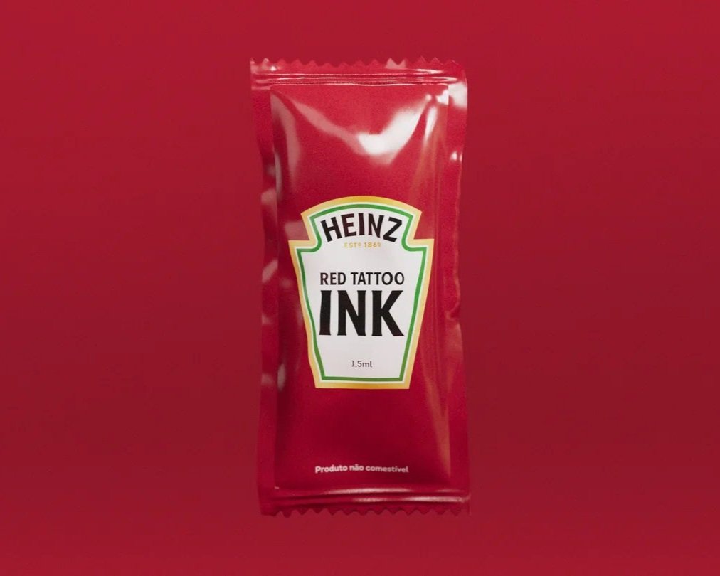
Caption (image: Soko / Heinz via It’s Nice That).
A most permanent condiment
How much do you love ketchup? Enough to get it tattooed permanently on your body? Spurred on by tribute tats circulating online, sauce manufacturer Heinz announced this week that it is developing precisely colour-matched ink for its fans in Brazil. Heinz Tattoo Ink will be made in the exact Pantone shade of its famous condiment: Heinz 57 Red. “Heinz fans love getting tattoos with our brand and products,” said Thiago Stelle, brand leader for Heinz Brazil. “We had to do something extraordinary for them and[…] bring a new alternative to address the issue of harmful pigment ingredients.” Health concerns over tattoo pigments have been growing. The EU moved to ban certain coloured tattoo inks in 2022, while a study published in America last year warned that up to 50 per cent of compounds in tattoo inks pose the risk of becoming carcinogenic when exposed to bacteria or sunlight. Heinz promises its red ink will be a safer alternative, and has partnered with Brazilian creative agency Soko to launch the ink with a set of 57 (duh) tattoo stencils designed by top tattoo artists. Maybe they’ll do an orange ink for some baked beans-themed ones for the Brits, next.

Save the wetland, save a buffalo (image: Deniz Sabuncu).
More Climavore
Since its launch in 2015, the Climavore project from Cooking Sections (the practice of Daniel Fernández Pascual and Alon Schwabe) has been a font of good sense: as human activities continue to fundamentally reshape the climate, the ways in which we produce and consume food need to adapt to the new realities of ecosystems, and set about trying to mitigate further damage (as well as, potentially, helping to heal environments that have borne the brunt of climate collapse). The project has already produced fascinating research around water scarcity, dead zones, and fish farming, so we were delighted to learn this week that Climavore has gained fresh impetus through a partnership between the Community Jameel organisation and the Royal College of Art (RCA), where Fernández Pascual and Schwabe are senior research fellows in the School of Architecture. The partnership will run for three years, providing ongoing support for Climavore’s exploration of the disappearance of wetlands and its investigation of dryland microclimates as informative for understanding how to farm in drought conditions. “As the climate crisis continues to impact all aspects of how we live,” noted George Richards, director of Community Jameel, “we must challenge ourselves to develop new understandings and new solutions to ensure a more just future for all.” It’s a fine sentiment, and one that we’re looking forward to see play out over the coming three years.

That’s the Grade II-listed Channel 4 building to you (image: RSHP).
Don’t change this channel
This week, Historic England announced that the Channel 4 building in London has been granted Grade II listed status. At under 30 years old, it’s one of the youngest buildings to gain heritage protection. It’s also the second Richard Rogers-designed building in London to be listed, after the better-known Lloyds Building. Completed in 1994, the TV headquarters was designed by the late Rogers in the high-tech style that the architect helped make famous. With its inside-out design, glazed walls and aluminium cladding, the building was designed to reflect Channel 4’s mission as a state-owned broadcaster that offered an alternative to the more traditional BBC, which is headquartered behind the Art Deco-style Portland stone walls of Broadcasting House. But after the UK government announced it was considering selling Channel 4, fears arose that the building would be sold off. “We put it on our 2019 Buildings at Risk list and are delighted to see it being given the protection it deserves,” said Caroline Croft, director of the Twentieth Century Society, “Although it’s much less high profile than Roger’s Lloyd’s building, both were really significant UK commissions.” With so many 20th-century buildings at risk of demolition, this comes as a welcome piece of good news.
Transparent ads
When you think of Google, what’s the first word that comes to mind? “Transparency”? Almost certainly not, which is a situation the tech giant would like to remedy. This week saw Google announce its Ads Transparency Center – a searchable hub that lets you track the history of adverts that a business has run online, including data about previous ads, the regions in which they have been shown, and information on dates and formats. It’s information that should probably have already been available, but the arrival of the Transparency Center is part of a wider trend within Google to improve its record regarding online advertising (remember, it was as recently as 2019 that France fined the company €50m for a “lack of transparency, inadequate information and lack of valid consent regarding advert personalization”). As such, the new initiative can be seen as part of a lineage that includes Google’s 2020 decision to require advertisers to verify their identities and countries of origin; its 2021 decision to allow users to access some information about the companies behind the ads they’re seeing; and the 2022 launch of My Ad Center, which allows for customisation of what adverts you’re delivered. Google may remain a long way off being seen as a bastion of transparency, but its recent baby steps are welcome nevertheless.

Toshiko Mori wins the Philip Hanson Hiss Award (image: Ryan Lester/Architecture Sarasota via The Architects Newspaper).
A challenger appears
Here on Design Line, we sometimes make light of the sheer number of awards on the architecture and design calendar. But the inaugural Philip Hanson Hiss Award’s decision to honour Toshiko Mori suggests they want to push the boat out from the usual list of white older men that clutter these shortlists. In 1995, Mori was the first woman to receive tenure at the Harvard University Graduate School of Design. As well as blazing a trail for women, she is a champion of sustainability, serving on the Global Agenda Council on the Future of Cities for the World Economic Forum. The award was set up in the memory of Philip Hanson Hiss III (1910-1988) to “honor today’s pioneers of innovative design within the built environment” and commemorate Hiss’s work championing the Sarasota School of Architecture in post-war Florida. Mori has revamped a number of structures in the Sarasota area and, while mindful of the 20th-century masters whose works she built on or around, she has consistently refused to be overawed by the legacy of Frank Lloyd Wright, Marcel Breuer, Paul Rudolph et al. "I'm respectful but not subservient,” she told The New York Times in 2005. “I like to challenge strong men.” We’ll toast to that.