
Design Line: 18 – 24 March

Design twists on the classics are getting a lot of mileage this week on Design Line, including a traditional craft interpretation of Pokémon, a contentious update of New York’s official logo, and a new look for design brand Alias from Studio Temp.
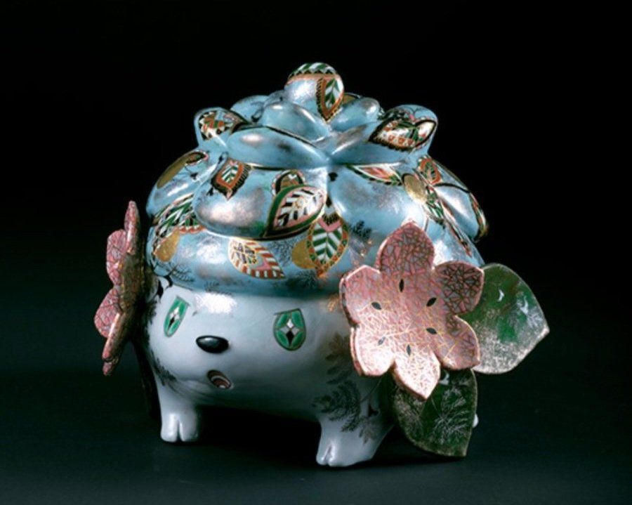
Shaymin (シェイミ) as interpreted by ceramicist Kasumi Ueba (image: Taku Saiki, courtesy of National Crafts Museum).
Taking monsters seriously
Japan’s design traditions are rightly celebrated within the international design community, with the country's kogei (traditional crafts) regularly attracting admiring glances for their sensitive use of materials and elegant minimalism. On the flip side, Japan is equally celebrated by a different international design community for the vibrancy, wackiness, and sheer maximalist kawaii of much of its digital output across video games and anime. These two strands of Japanese design make for strange bedfellows, but there is value in placing them in dialogue with one another and gaining a fuller appreciation of the diversity of the country’s design work. As such, it was a pleasure to see this week’s opening of Pokémon X Kogei at the country’s National Crafts Museum, a show that has invited 20 craftspeople to interpret Pokémon as craft objects. The results are delightful: a ceramic pot that bulges out into the fire dragon Charizard from Yoshiko Masumoto; a porcelain Shaymin hedgehog by Kasumi Ueba, rich in intricate ornament. The 20 objects are fine examples of the quality of Japanese craft, but also shine a light on the more gleeful side of the country's design work: Pokémon are sophisticated pieces of contemporary character and game design, every bit as deserving of admiration as Japan’s more traditional crafts. In Pokémon x Kogei, we seem to have the best of both worlds: kogei receives a little of Pokémon’s pop culture lustre and, in exchange, the pocket monsters’ design credentials are burnished by proximity. What’s not to like?

We heart [checks notes] bagel-taxi-bodega-coffee (image: We Love NYC).
They don’t heart NY
Three years in, it’s a fair assessment that the pandemic has really taken it out of us. Who wouldn’t attempt a glow-up to try and dredge up some enthusiasm for the future? But the city of New York may have overshot the mark somewhat with its post-pandemic rebrand, at least if the headlines this week are anything to go by. “The Big Apple's Rebrand Is an Iconic Failure,” declared Bloomberg, as memes taking the mickey sprouted over the internet. The Partnership for New York City Foundation unveiled it’s “We ❤️ NYC” campaign – complete with New York-themed emojis and a gif – in an attempt to gin up a mood of “post-pandemic resurgence” for the city. It’s an attempt to riff on the widely beloved “I ❤️ NY” design that graphic designer Milton Glaser whipped up with a red crayon on scrap paper in the back of a taxi in 1976. That original sketch lives in the city’s Museum of Modern Art, but whether the curators will be rushing to acquire any of the 30 emojis in the shape of a lox bagel or a pigeon remains to be seen. With its sans serif font and 3D-rendered heart, the new logo is a weird attempt to “update” a design that has aged pretty well. Combined with a flyer from the New York Department of Sanitation about new bin collection times that made rats look, frankly, adorable, it’s been a rocky week for the city’s communication design.
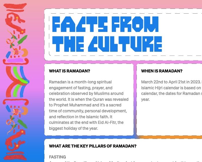
Brands, it’s time to do the reading (image: The Mojo Ramadan Report).
The rules of engagement
“Young Muslims aren’t looking for a John Lewis ad.” So speaks the The Ramadan Report, a new US research study from Mojo Supermarket and House of Gül that explores the historic lack of engagement with Ramadan from the marketing industry (despite “nearly 4M people in America celebrating the holiday”). There is much of value in the report, which was produced through interviews with 140 Gen Z and Millennial Muslims across the United States, not least its warning against hollow corporate tie-ins (a topic covered in Disegno #27 by Francesca Sobande) and its clear, common-sense advice. The report notes, for example, that brands should refrain from performative action and instead recognise “opportunities to help young Muslims with their routines [during Ramadan], from food and coffee, to shopping and exercise,” by “[understanding] their pain points and bringing them valuable solutions throughout the month”. Key, the authors note, is for brands to engage authentically and display a lasting interest in Muslim communities: “Engage the community throughout the year, not just during the month of Ramadan.” Whether welcoming marketing into any cultural celebration is ultimately a good thing is debatable, (just look at what the marketeers have done to Christmas and Pride) but The Ramadan Report’s writers are correct to point out that, in a world awash in advertising and branding, the lack of engagement with Ramadan is palpable. “I wish more companies that are mainstream would acknowledge us like they do other religions,” explains Zane, one of the report’s respondents. “I don’t know if I want Ramadan more commercialized or not, but it does make us feel left out.”
Kiss from a phone
Kissing is great. Disegno is a pro-snogging publication. But we remain on the fence about MUA, a device for long-distance kissing designed by Chinese startup Siweifushe. The pink device slots onto a smartphone and holds a pair of fleshy silicon lips. Once paired with a partner’s MUA, motion sensors allow users to kiss their device and send it. The recipient can then replay the kiss, holding the device to their own mouth. To add to the veracity of the smooch, MUA also heats up and replays sounds. Its inventor, recent graduate Zhao Jianbo, said he was inspired by missing his girlfriend during the Covid-19 lockdowns. He told The Guardian this week that he’s already had orders for 20,000 of the machines since he started selling them in January. It’s not just a device for the loved-up to enjoy, either. Singletons can download other people’s kisses from the accompanying app (hmm). The MUA isn’t the first uncanny mouth-based graduate project to come out of pandemic isolation: RCA students Sandeep Hoonjan and Xianzhi Zhang made a pair of phones with realistic tongues and ear-ticklers to recreate haptic sensations over a distance. It all sounds like a plot from Black Mirror, but at least it’s a plague-safe mode of locking lips.

New alias who dis (image: Studio Temp via Hypebeast).
A new alias?
Founded in 1979, the Italian design brand Alias likes to describe itself as “nonconformist”, priding itself on expressive design pieces such as Vico Magistretti’s Broomstick, Giandomenico Belotti’s Spaghetti chair and Riccardo Blumer’s Laleggera, alongside additional collaborations with designers including Jasper Morrison, Michele de Lucchi and James Irvine. Whether a brand selling beautifully designed furniture for the home can ever be nonconformist is debatable, but this week saw Alias seek to refresh itself with a new graphic identity from Studio Temp, and the announcement of David Lopez Quincoces and Francesco Meda as having been appointed to lead the company’s “new creative outlook”. The redesigned identity, which draws heavily on a serif font, bright purple, and fun illustrations (alongside vibrant new photography of the brand’s existing products) is nicely done and certainly stands apart from the more classical inflections of comparable companies’ branding. A promising start, then, but whether Alias can live up to the redesign’s promise to provide “Something else” from what is already on the market remains to be seen. Of the 24 designers featured on the brand’s collaborators page, for instance, 23 are men – you can’t help but think that the more nonconformist thing, in an industry that continues to be heavily male dominated, would be for Alias to start working with some women too. Of course, Alias is far from the only brand to reflect this gender imbalance – we have high hopes that, with its redesign, it may begin to address it.
From runway to test track
The collaborations between carmakers and high fashion keep coming and they don’t stop coming. We’ve already seen Iris van Herpen’s take on the Rolls-Royce Phantom and Moncler’s (thankfully digital-only) take on a Mercedes-Benz (see Design Line 18 – 24 February) . This week Hyundai joined the fashion fray with an “up cycled couture collection” from designer Jeremy Scott. The clothes are made from the offcuts of Hyundai’s electric vehicle production – think bits of seat belt and wheels, headlights and windscreen wipers. Scott recently left the fashion house Moschino after 10 years as creative director, where he birthed iconic collections such as the autumn/winter 2014 McDonald’s-themed runway show, complete with Happy Meal handbags and accessories that looked like French fries. He’s bought this pleasingly bonkers sensibility to Hyundai with a black evening gown that has a hub cap tied into a big silky bow. It’s a bit barmy, yes, but it’s good to see the waste from an ostensibly more sustainable mode of vehicle put to use.
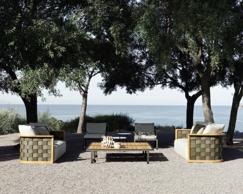
This could be us, but it’s still a bit nippy out there (image: Molteni&C).
The outdoors is in
For those who keep abreast of the rhythms of furniture design, it has been no secret that recent years – particularly in the aftermath of pandemic lockdowns – have seen a surge of interest in outdoors furniture. Interior brands such as Poltrona Frau and De La Espada have made the move outside, while companies already occupying the space, including Vondom and Kettal, have seen renewed prominence at trade fairs. This week saw the turn of heritage design brand Molteni&C to join the outdoor party, with the launch of a new collection of garden furniture overseen by the brand’s creative director Vincent Van Duysen. Drawing together works from heavyweight designers and studios including Van Duysen himself, Foster + Partners, Nicola Gallizia and Ron Gilad, alongside archive pieces from Gio Ponti and Luca Meda, the collection seems a clear statement as to the growing importance of this market to design. The outdoors is showing no signs of going out of fashion.