Design Line: 10 – 16 June
It’s a coup for museums in this week’s Design Line, as London’s Design Museum teams up with Mailchimp to announce an emails-themed exhibition, while the San Fransisco Museum of Modern Art acquires a pod from the demolished Nakagin Capsule Tower. Meanwhile, the Venice British Pavilion goes green for Grenfell, and ZHA unveils a design for the site of the Surfside condominium collapse.
Capsule collecting
When the Nakagin Capsule Tower was demolished in Tokyo last year, the fate of its pods with their distinctive round windows remained uncertain. Designed by architect Kisho Kurokawa, Nakagin was intended to provide a home away from home for businessmen (and, yes, they were typically – and sadly – only men), with each capsule pod equipped with the latest Sony equipment and an in-house secretarial service. In keeping with the metabolist movement, Kurokawa intended for the pods to be swapped out and upgraded throughout the building’s lifetime, but the plan never came to fruition and the tower fell into disrepair. This week, San Francisco Museum of Modern Art (SFMOMA) announced it has acquired Capsule A1302, which originally belonged to Kurokawa, along with a series of photos taken by Noritaka Minami documenting the residences in the tower in the years before its demise (see ‘Obsolescent Masculinity’, Disegno #32). It’s an exciting score for SFMOMA. “It’s so rare to collect a 1-to-1 scale piece of architecture,” Jennifer Dunlop Fletcher, the museum’s curator of architecture and design, told the Los Angeles Times. “It can fit inside, outside and that’s phenomenal for us.” An estimated 23 of the 140 capsules were up for grabs post-demolition, although some have ended up repurposed for more ignoble pursuits than a museum collection. A pod collected by Yodogawa Steel Works, for instance, has been converted into a house on wheels by architect Toshihiko Suzuki, who once worked under Kurokawa. Nakagin Capsule Tower was built for the homo-movens, or the man in motion, and now it can move the man around quite literally.
The Design Museum is opening its inbox for Mailchimp (image: Mailchimp).
e-Xhibition
Reader, we present a dilemma. If you were to consider the technologies that have most transformed society in the last half century, there is little doubt that email would come out close to the top of the pile: a medium that has fundamentally changed communication across all areas of society. From a design perspective, there are rich stories to be told about the medium’s interface design, its cultural and sociopolitical impact, and the way in which it has changed the nature of how (and what) we share with one another. It is, as such, a fine topic for a design exhibition. On the other hand, are you mad: who wants to attend an exhibition about email!? Fortunately, we may not have to wait long to find out. News broke this week that the email marketing platform Intuit Mailchimp is to stage an exhibition about email at London’s Design Museum in September 2023, which promises to tackle “the cultural power of email – its origins and where its going with advancements in technology”. The premise is a strong one, but the show will need to grapple with one of the central issues facing contemporary design shows the world over: that many of the fields and technologies currently shaping society and which deserve critical attention (viz. those that deal in data and digital services) do not necessarily make for visually compelling or digestible exhibitions. How do you make the stuff of office laptops into an enjoyable and insightful cultural experience? It is an issue that can feel particularly acute for a show when, as in the case of Mailchimp, an industry player takes the lead – what makes the exhibition a well rounded and critically engaged assessment of the field, as opposed to a branded celebration of one particular company (even if said company does expertly handle Disegno’s own monthly newsletter)? In this respect, the exhibition recalls the Design Museum’s planned 2022 show around streaming that was to be executed in conjunction with Netflix – a show that, sadly, disappeared from the museum’s schedule shortly after it was announced. Nevertheless, consider us intrigued – in the proper hands, and with proper treatment, a show about email could be an absolute gem.
“Feel the hardcore beauty of Tesla” (image: via Interesting Engineering).
You got a fast (built) car
Constructing a car on an assembly line usually takes a factory anywhere between 18 to 35 hours, according to auto manufacturer JVIS. Electric carmakers Tesla has now claimed it can do it in 45 seconds flat. A display featuring robotic arms rigged up at the company's Giga Laboratory concept store in Shengdu, which opened this week, is designed to demonstrate the prowess of Tesla’s Gigafactory Shanghai to potential buyers. “Customers can feel the hardcore beauty of Tesla,” tweeted Tesla Asia, with the brand’s typical bombast. The Gigafactory Shanghai, Tesla’s first overseas venture, began production in 2019 and announced it had made its millionth car in August 2022. The manufacturing plant, which is the size of 120 football fields, can make up to 22,000 cars a week. Plans to expand capacity were scrapped in January this year, however, as demand for electric vehicles in China slowed. Tesla is clearly hoping this display of rapid robotic assembly will gee up demand for its product, although whether you’d actually want a car that took less than a minute to make is debatable.
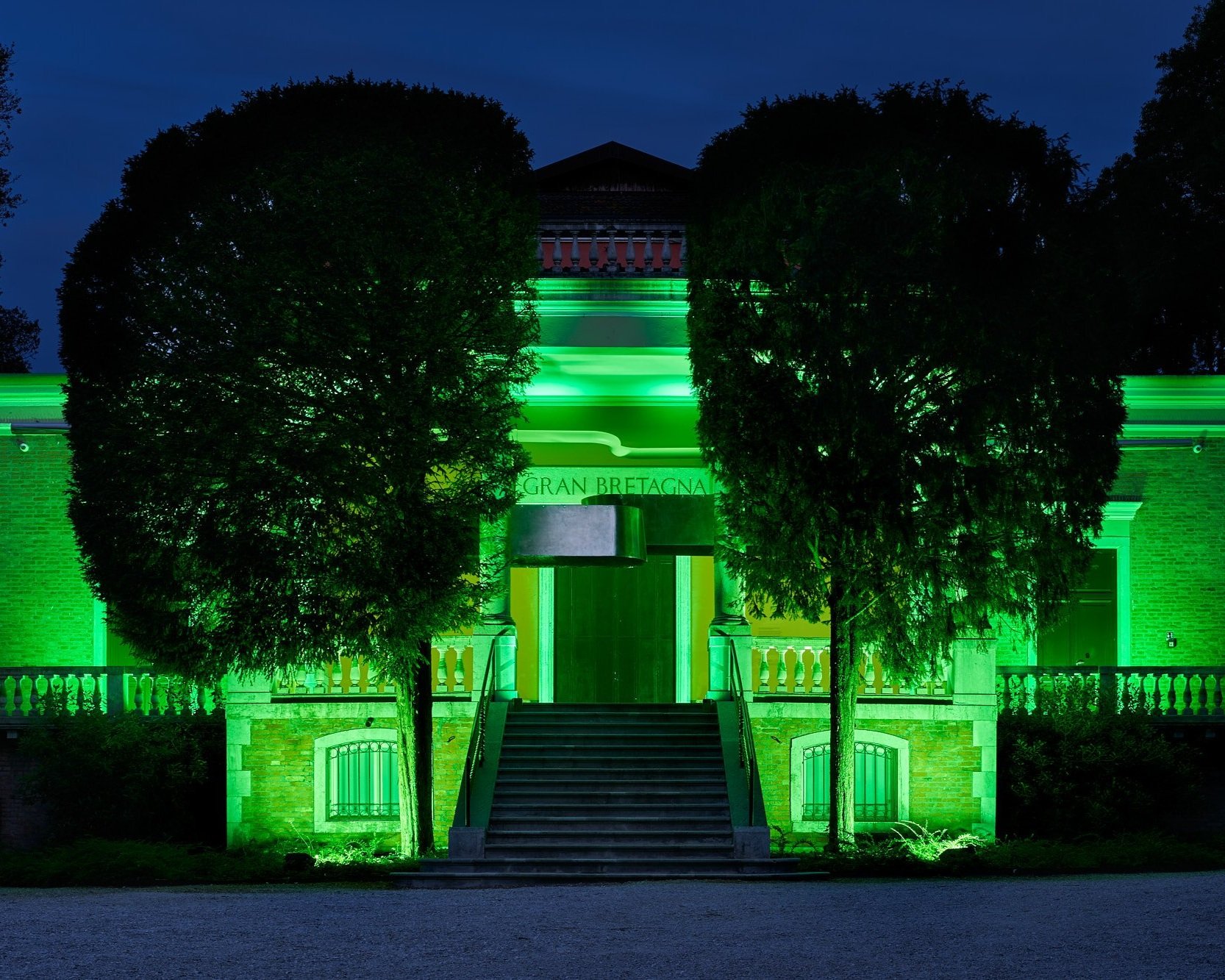
The British Pavilion goes green for Grenfell (image: Clelia Cadamuro).
Shine a light
In 2017, 72 people were killed in the Grenfell Tower fire: a loss of life that was entirely avoidable, and for which the Grenfell Tower Inquiry’s final report is due to be published next year. A physical memorial for the site has been promised by the British government, although a more fitting and pressing memorial would to be ensure that those responsible for the disaster are held to account and for comprehensive changes to social housing policy and building codes to be brought in to ensure the tragedy is not repeated. To ensure this kind of change, it is essential that the tragedy be remembered, and for the urgency of its message not to fade as we move further away from the date of the fire. Credit to the British Pavilion at the 18th Venice Architecture Biennale, then, which marked the sixth anniversary of the fire this week by partnering with the Green for Grenfell campaign to illuminate the building green – a colour “that has become a symbol representing hope and solidarity for those impacted by the tragedy of the fire” – and hosting a programme of materials around Grenfell Tower. “This tragedy was a result of systemic negligence and injustices rooted in architecture, policy and building industry,” note Joseph Henry, Meneesha Kellay, Jayden Ali and Sumitra Upham, the curators of the pavilion at this year’s biennale. “This pavilion stands to support communities who have been excluded from discussions around the planning of the built environment in the UK.”
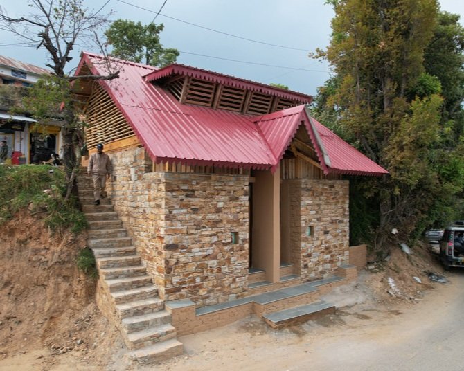
This loo can spend a penny for its own maintenance (image: Nishant Singhani).
More than a toilet
Everyone has to use the loo, but public toilets are often unloved and overlooked regardless of where you are in the world. India is particularly stretched in terms of sanitation, with a 2014 report by the WHO finding that 597 million people in the country practised open defecation (a charming euphemism for a nature poo), posing a huge public health risk. Between 2014 and 2019, India’s government spent $30bn on Swachh Bharat, a project building 100m toilets with an accompanying celebrity promotional campaign. But the question of who maintains these new facilities has already become an issue. In order to address this conundrum, design studio Compartment S4 unveiled a toilet for a market in Uttarakhand this week, which blends basic facilities with commercial enterprise. Called Toilet, No Toilet, the structure is built into a hillside and split across two levels. The stone lower level houses the toilets, while a bamboo and wood upper storey provides space for a café and shop. Revenue from the commercial side will be used to cover the cost of maintaining the toilets, while also creating local jobs. An on-street toilet with an attached café is a neat inversion of more traditional off-street toilets found in shops, and Compartment S4 hopes the hybrid model of public facilities can be replicated elsewhere. A place where you can buy a coffee and fund your next pit stop? Sign us up, we say.
Nothing says respect like a floating pool (image: ZHA/Damac).
A pool for a grave
This week, Dubai-based developer Damac submitted designs for a 12-storey building designed by Zaha Hadid Architects (ZHA) with a suspended rooftop pool to be built on the site of the Surfside collapse. On 24 June 2021, 98 people died when the Champlain Towers South in Miami suffered catastrophic failure. The most recent report suggests that it was the failure of a poorly designed pool deck that set the collapse in motion. Water intrusion from storm surges (an escalating threat in the climate crisis) is understood to have seeped into the building’s foundations, causing cracking in the concrete of the underground carpark. The final report into the disaster won’t be released until 2025. Despite the tragedy, the oceanside location clearly remains hot property. Damac purchased the land for $120m in 2022, and wants to build 57 residences there. Survivors and victims’ families had hoped for the site to be turned into a memorial park, which is now due to be located nearby instead. The neighbourhood already has starchitect-designed buildings, including the Renzo Piano-designed Eighty Seven Park. Renders from ZHA show a facade of curvy balcony structures and a glass-bottomed pool connecting two sides of the roof, in the vein of Embassy Garden’s Sky Pool in London. “No work of architecture can ever remove the pain of the past, nor should it,” said ZHA director Chris Lepine. “[But] a truly ambitious work of architecture can respect such a significant site.” A flashy pool on a graveyard as a symbol of respect? We’re not so sure.
Could you be the one to design the new Girlguiding uniform (image: via DesignWeek).
Guided by design
Looking for your next fashion design challenge? Girlguiding may have just the thing for you. The organisation for empowering girl is looking for a new uniform that can hold a torch to the existing range that was created by fashion designer Jeff Banks in the 1990s. The uniform will be worn by Rainbows, Brownies, Guides and Rangers, and need to integrate the traditional neckerchief and badges, which members earn through completing skills training and doing good deeds. A girl-only organisation, Girlguiding aims to teach young women confidence and life skills, and has a solid trans-inclusive policy (a very important thing in this current atmosphere of hostility towards queer youth). The group's social orientation is clear in the list of requirements for the uniform design, which must be a “social equaliser and help unify members across a diverse base” and “be affordable and not present any barriers to any girl or adult being able to wear it.” Along with accessibility, the manufacture of the uniforms should “support the lowest environmental impact”. Girlguiding recently underwent a brand refresh undertaken by design consultancy Landor & Fitch, and the winning uniform designs will roll out in 2026. It’s a worthy design tender to enter, and we look forward to seeing who rises to the challenge.


